Introduction
First of all, I want to congratulate you, for your courage in taking the first step to learn how to trade on the market, because most people desire to be financially free,
but few of them take any action to actually be so.
Whether you are a beginning trader or an advanced trader, trying to find a consistently profitable method, this course will provide you with one of the most powerful techniques used by most banks and financial institutions.
This course is a result of years of experience, research and thousands of hours of screen time. I am currently an independent trader, I work from the comfort of my home, and you will learn the same strategies and tactics that I am going to share with you in this course.
You may be asking yourself, why do I share this knowledge and why should I reveal secrets that make me money? I have been asked these questions more than a few times, and if I was in your shoes, I would ask the same.
Let me tell you something, trading is totally different from any other business. If I show you my strategy and how I make money, it will not affect my own results.
Because when you start trading the same way as I do, we will take approximately the same trades. And if we are a big community of traders who take the same trades, we will be able to move the market in our direction, because this is how the market moves, if the amount of buyers is more than sellers, the market goes up, and if the amount of sellers is more than buyers the market goes down.
What motivates me to share my knowledge is the fact that I’m a big believer that everyone can become a profitable trader. You can become a successful trader if you have two important things: the right trading method, and the right trading mindset.
My course will provide you with the right trading method, because it will show you how the big boys trade the market, you will understand how banks and financial
institutions manipulate the market and trap retail traders, and you will study in detail the principles of their trading strategies which are mostly based on supply and demand.
This trading method will give you the ability to identify market turning points in advance before they happen, and where prices are going to go before they go there.
And if you have this knowledge, you will take trades with low risk and high reward.
That is the key element of success, as a trader.
Knowing when banks and institutions are selling and buying in the market will increase your odds of success, and your trades will have high probability to go in your favor, because you will not follow retail traders’ analysis, but the footprints of banks and big institutions.
This trading method is advanced, and if you are a beginner trader, you should have a basic knowledge of trading before taking this course; this is the reason why I decided to start with the basic knowledge that everyone who wants to trade on the market, needs to know.
As a trader, beginner or advanced, you need to know how to read your charts, because charts have a specific language, and if you don’t know how to speak this language, you will not understand what the market is telling you . This language is called: Japanese candlesticks.
The first basic skill that you should acquire as a trader is the ability to understand the candlestick pattern formations, because they will give you information about the buyers and sellers’ state of mind and will help you predict future price movements.
The second basic skill is the market structure. You need to know how to identify and differentiate between different types of markets, such as trending markets, ranging markets, and choppy markets. And you should be able to identify different types of moves, such as impulsive and retracement moves.
You should be able to identify support and resistance, which are considered to be turning points in the market. These levels have psychological influence on sellers and buyers, because once again they are considered to be turning points.
If you are an advanced trader, you can skip the first lessons that cover the basic knowledge and start directly with the supply and demand strategies. But if you are a beginner, I highly recommend you to pay attention to the first lessons, and give yourself time to study all technical concepts, because this will allow you to understand and master the advanced trading methods.
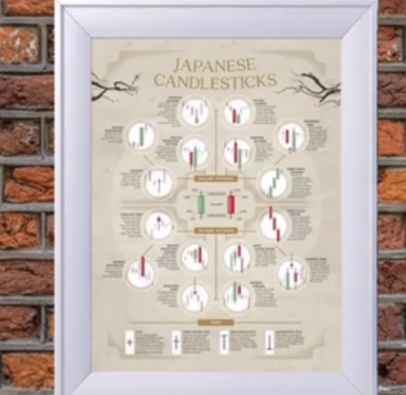
Japanese candlestick patterns
In the 18th century a wealthy Japanese businessman, Munehisa Homma, developed a technical analysis method to analyze the price of rice contracts. Today this technique is called candlestick charting and is widely used when drawing financial charts. Homma, from Sakata, Japan, began trading at the local rice exchange around 1750. He kept records of the market psychology in the form of candlesticks and discovered a way to make his trading decisions based on candlesticks formations.
Homma is regarded as the Godfather of candlesticks because of his research on price pattern recognition. He is credited with giving rise to a researchtechnique which became the basis for trading in Japan. Homma subsequently dominated the Japanese rice markets and built a huge fortune.
His trading techniques and principles eventually evolved into the candlestick methodology, which was then used by Japanese technical analysts, when the Japanese stock market began in the 1870s.
The method of using candlesticks and candlestick charts was picked up by famed market technician Charles Dow around 1900, and candlestick charts remain arguably the most popular form of technical analysis chart in use by today’s traders and investors.
Basic candlestick anatomy
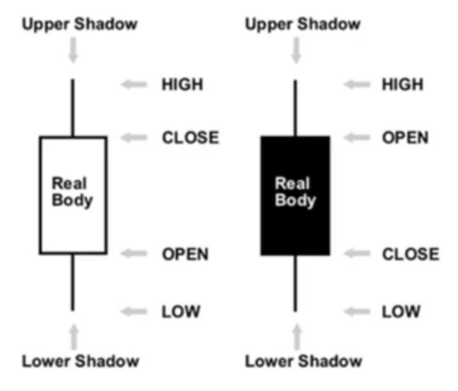
Whenever you look at a price chart, you will select a time frame for that chart,it can be ,a minute, an hour or even a daily time frame. Rather than plotting the open or close price for that time frame, the candlestick gives you information about what went on during that period of time.
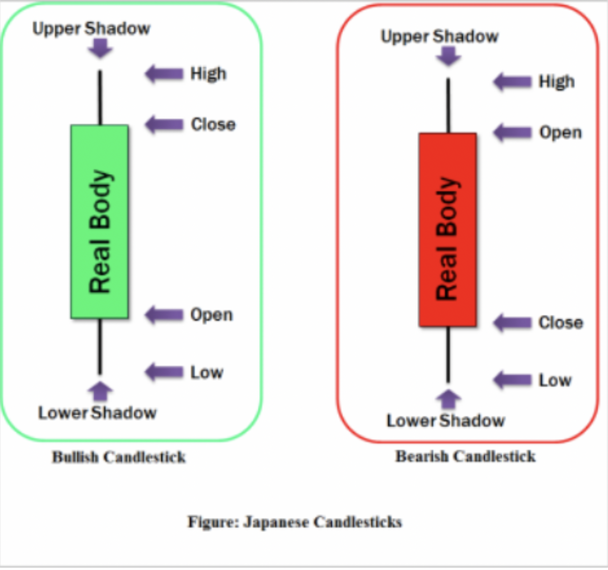
Candlesticks give you the following information:
-The open price
-The close price
-The high price
-The low price
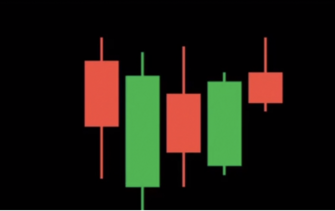
If the close price is lower than the open price , we get a bearish candle which indicates that sellers were in control during this period. In this example, we have a black candle, but you can change the colors if you want, what matters is the open and close.
If the close price is higher than the open price, we get a bullish candle which indicates that buyers were in control during this specific period of time.
Having all this extra information, gives you a heads up about market sentiment and can offer invaluable clues about the way the market will move.
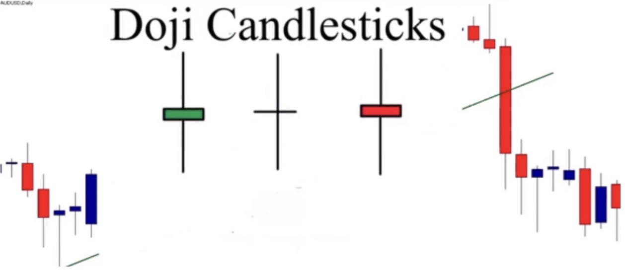
The Doji :
The Doji is a candlestick where the opening and closing prices are the same (or almost the same). It can take many forms, as shown here, depending on what the trading activity was in that period.

The Doji candlestick indicates that neither sellers nor buyers have gained control, and that price has ended where it began. It is a sign of indecision in the market.
Let me show you an example below
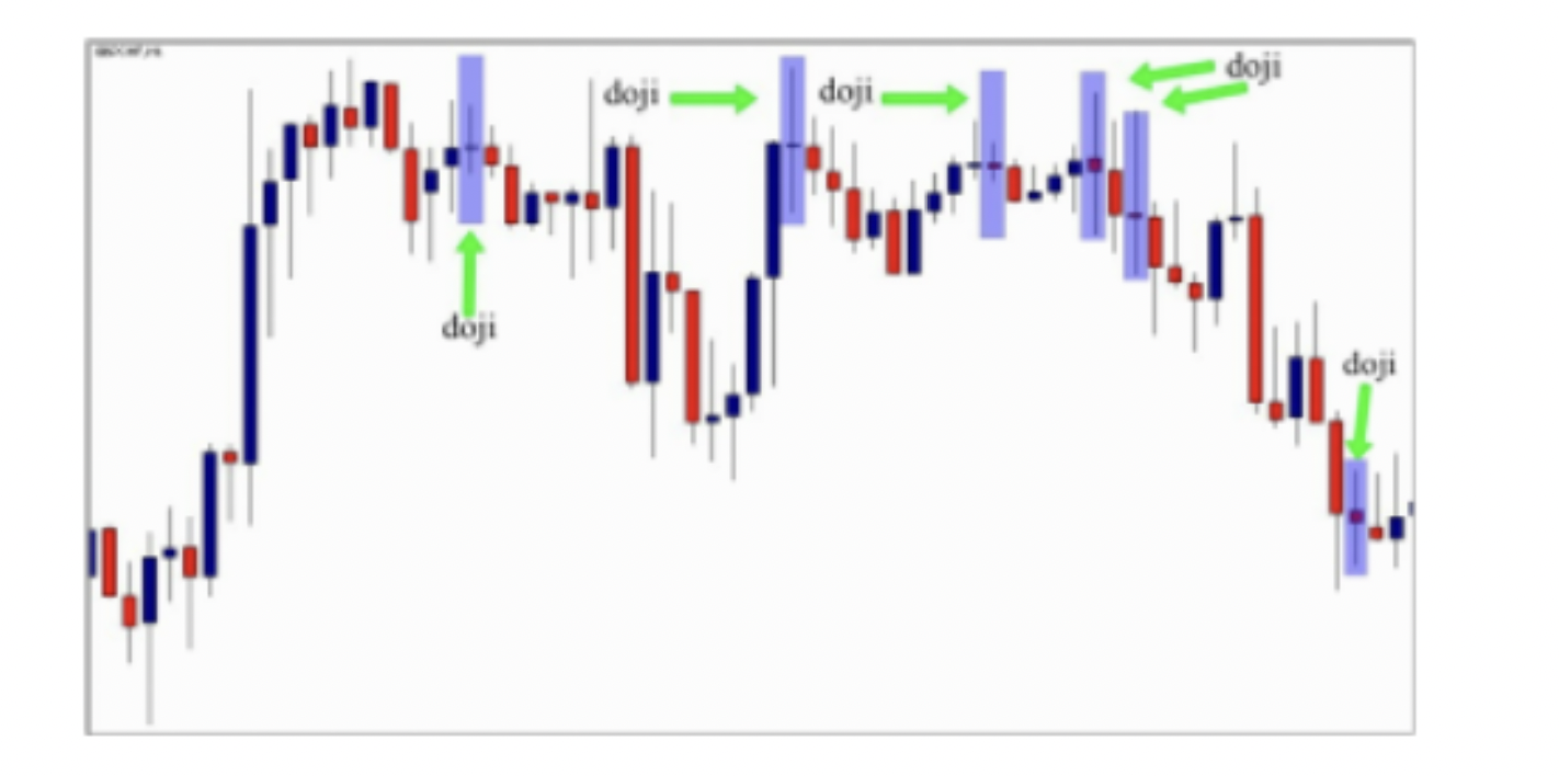
In the chart above, you can see different types of the Doji candlestick patterns.
This candlestick gives us a clear image about what happened in the market during the specific time period. In this hourly chart above, the formation of the Doji means that buyers and sellers are equal, no one is in control of the market during one hour, which is the time of the Doji candlestick formation.
You can’t use the Doji alone to make your trading decision, my goal in this first
lesson is to help you read charts by being able to identify and understand candlestick patterns formation, so when you see the Doji candlestick pattern for example, you know that during that period of time the market was in an indecision phase and sellers and buyers are equal.
This is the most important information that the Doji gives us when it forms in the market.
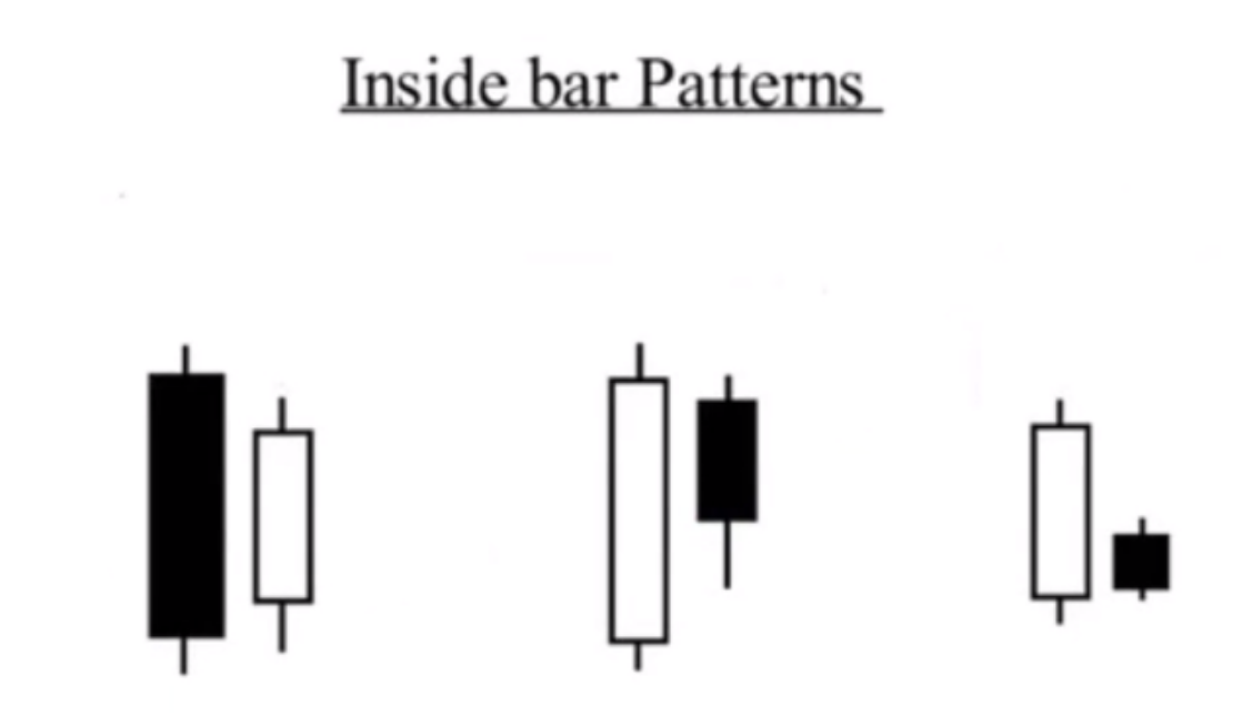
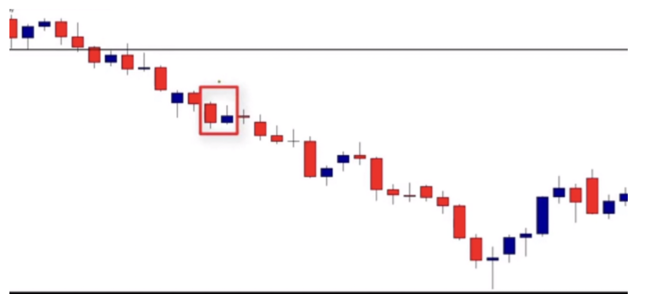
The inside bar (Harami pattern)
The inside bar is one of the most common candlestick patterns you will come across, so it is important to recognize it, to understand what it means, and to understand its limitations. An inside bar is a two-session reversal pattern; it is made up of two candlesticks, and implies that the price is in an indecision phase, and the breakout of this pattern means that the market went out of the range and will go in the direction of the breakout
As you can see the second small candle is inside the first one, the color of the small body is not important. We will talk about this pattern in detail in future lessons, and I’ll explain to you how to use it when trading supply and demand. See a chart with an inside bar
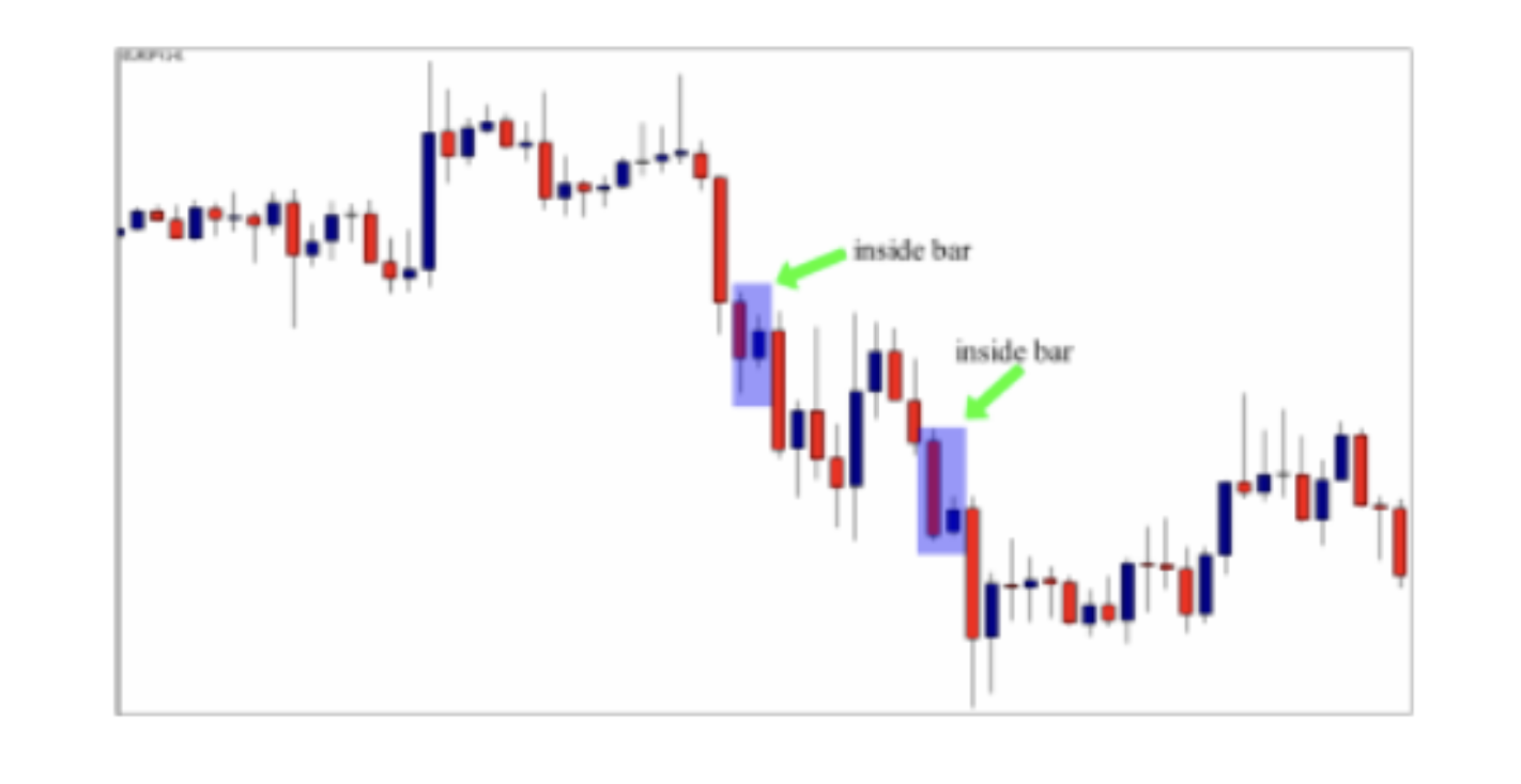
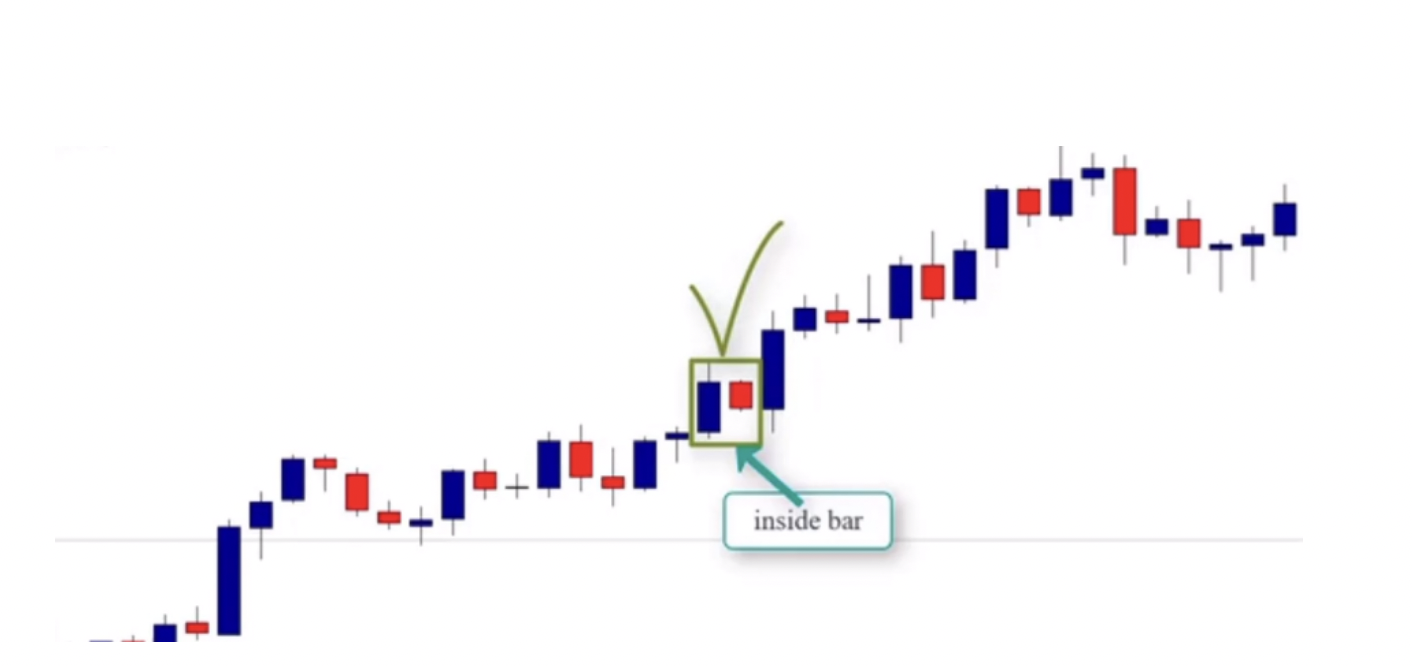
In this chart, as you can see, we have two inside bars that were formed during a downtrend. The inside bar pattern means that the market is in an indecision phase.
This pause gives us an opportunity to enter the market again with the trend. We will talk about this in detail in future lessons. What matters right now is to master the anatomy of the inside bar and understand the psychology behind its formation.
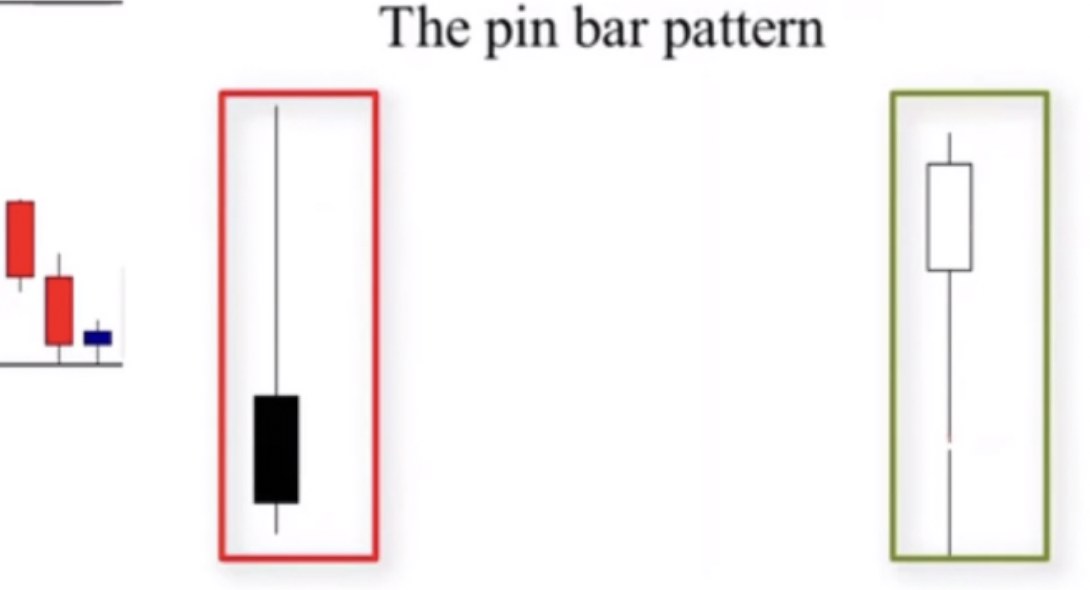
The pin bar
It is a candlestick pattern that consists of just one candle, it has a long lower wickand short body and little or no upper wick. Strictly speaking, the lower wick should be at least two times longer than the body, the longer, the better.

There are two types of pin bars; the bullish pin bar which is a reversal candle that occurs at the end of downtrend and reverses the trend. A bearish pin bar which is
also a reversal candle that happens at the end of an uptrend and reverses it — see the illustration below

As you can see in this daily chart above, the formation of the bearish pin bar indicates that buyers are rejected by sellers, and the market is likely to go down.
And the formation of the bullish pin bar means that sellers are rejected by buyers and the market is likely to go up.
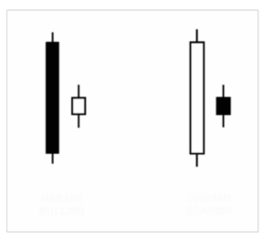
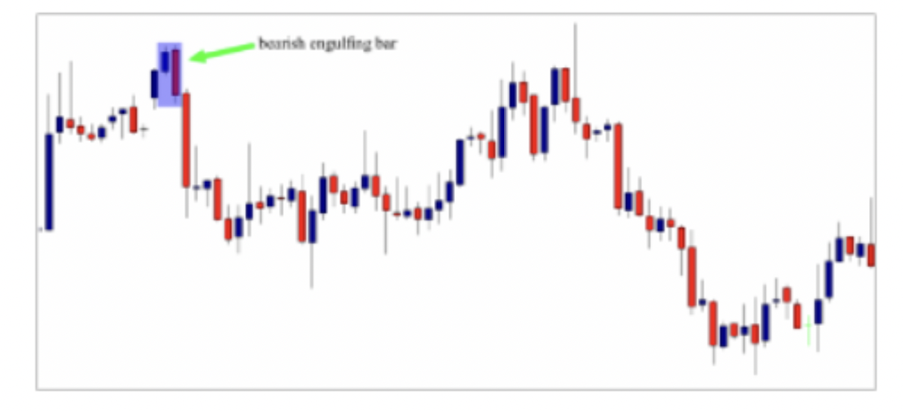
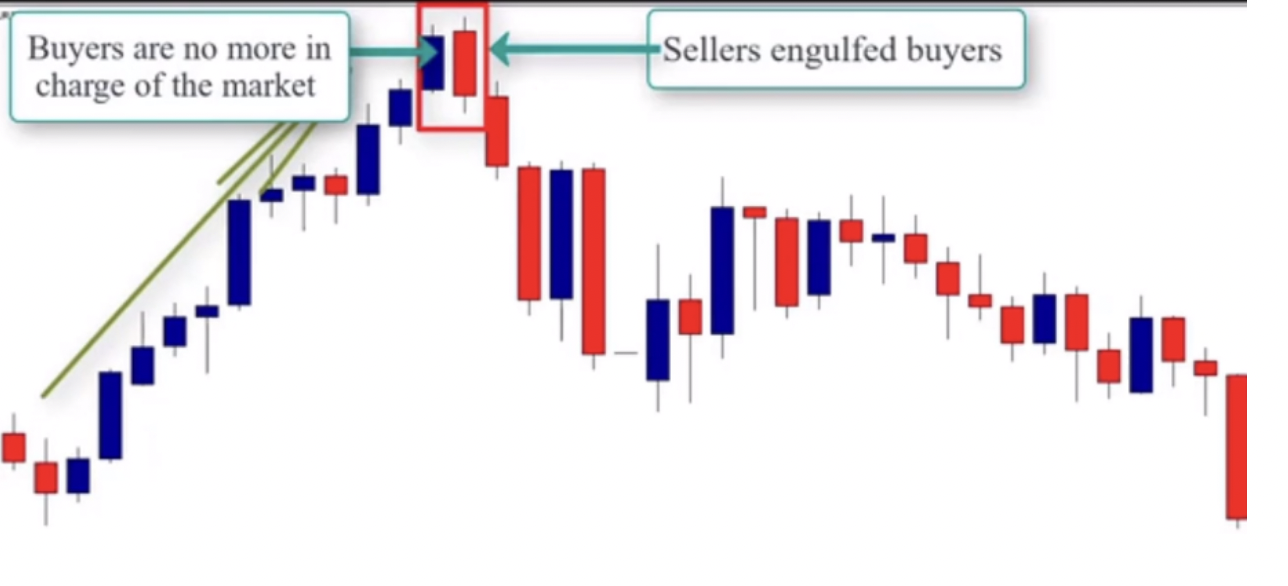
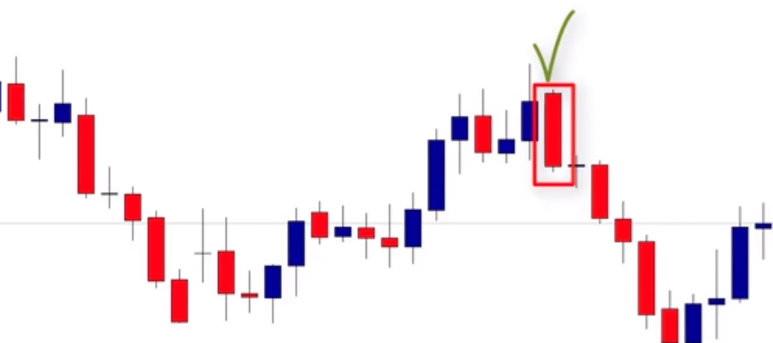
The engulfing bar
An engulfing pattern signals a reversal, and can be bullish or bearish. It comprises two candles, the body of the second one must engulf the body of the first one .
There are two type of engulfing bars:
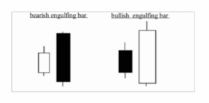
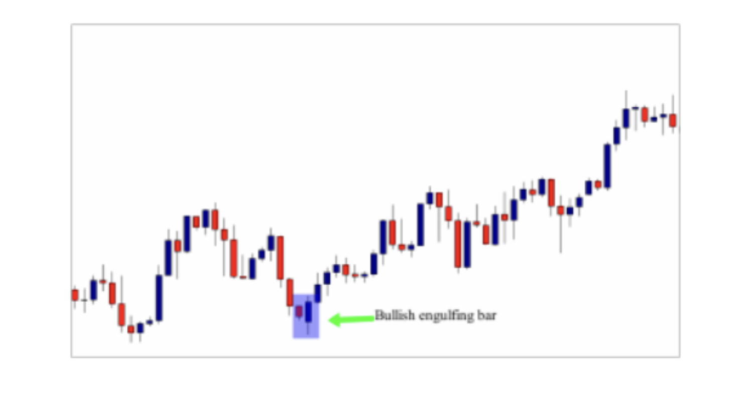
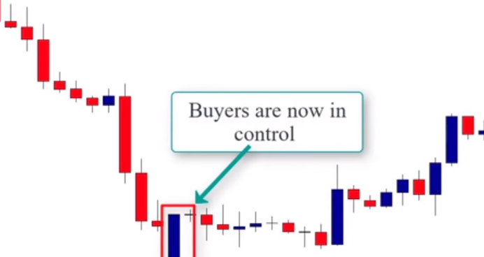
The bullish engulfing bar that consists of two candles – the body of the second candle is greater in size than the previous candle. This pattern is considered to be a reversal, because when it appears in a downtrend, it signals a reversal.
The bearish engulfing candle consists also of two candles, but it is the opposite version of the bullish engulfing bar. Because when it occurs at the end of an uptrend, it signals a future price reverse. See the illustration below:
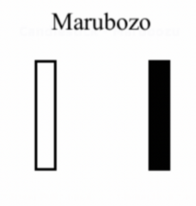
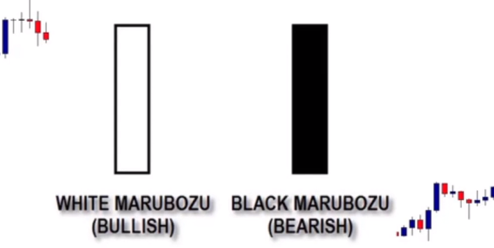
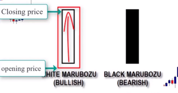
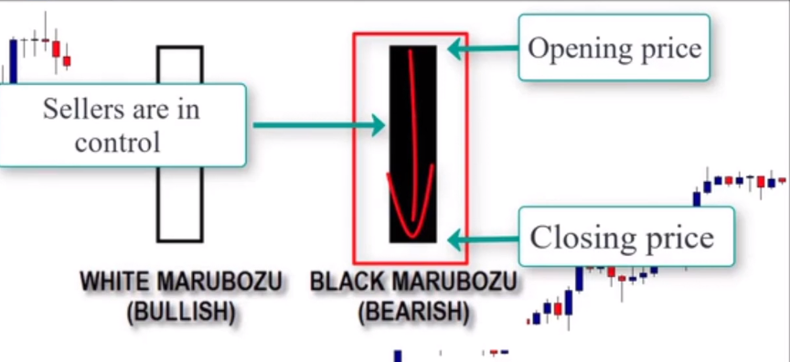
The Marubozo
The word Marubuzo means bald head or shaved head in Japanese, and this is reflected in the candlestick’s lack of wicks. When you see a Marubuzo candlestick, the fact that there are no wicks, tells you that the session opened at the high price of the day and closed at the low price of the day. See the illustration below
In a bullish Marubuzo, the buyers maintained control of the price throughout the day, from the opening bell to the close. see the illustration below:
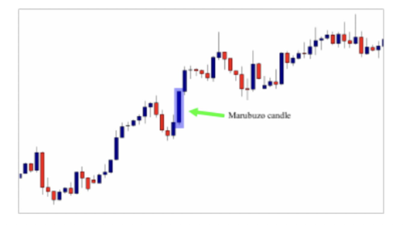
As you can see in the chart above, the market is trending up, and the formation of the Marubuzo gives us positive news about the strength of the trend in this period.
The formation of this bullish Marubuzo indicates that the market in this period is still strong.
In a bearish Marubuzo, the sellers controlled the price from the opening bell to the close, see the illustration below

As you can see in the chart, the market was trending down, and the formation of the Marubuzo gave us a good information about the trend in this period – meaning that it indicated that the bearish trend is still strong during this period, from the opening price of this candle till the close of it.
The morning star
A morning star is a three-candle pattern beginning with a candle that is strongly down. The second candle’s real body should be small and shouldn’t touch the prior candle’s real body. The third candle should be strongly up. see the illustration below
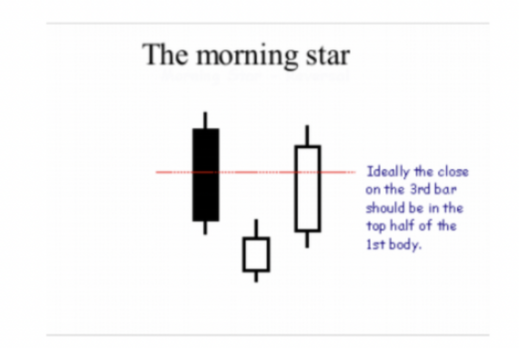
The morning star pattern is viewed as a bullish reversal pattern, usually occurring at the bottom of the downtrend, see the chart below.

As you can see in the chart above, the formation of this pattern indicated a trend reversal, because it signals that the control is changed from sellers to buyers.
We can’t trade this candlestick pattern alone, because we need more information and indications to make our trading decisions.
The evening Star:
The evening star pattern is opposite to the morning star and is a reversal signal at the end of an uptrend. The pattern is more bearish if the second candlestick is filled rather than hollow. See the illustration below
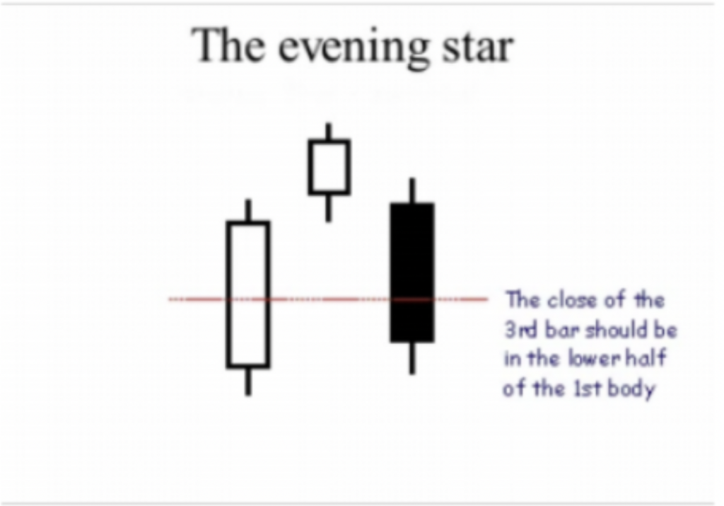
The evening star is a reversal pattern, and it usually occurs at the end of an uptrend, see the illustration below
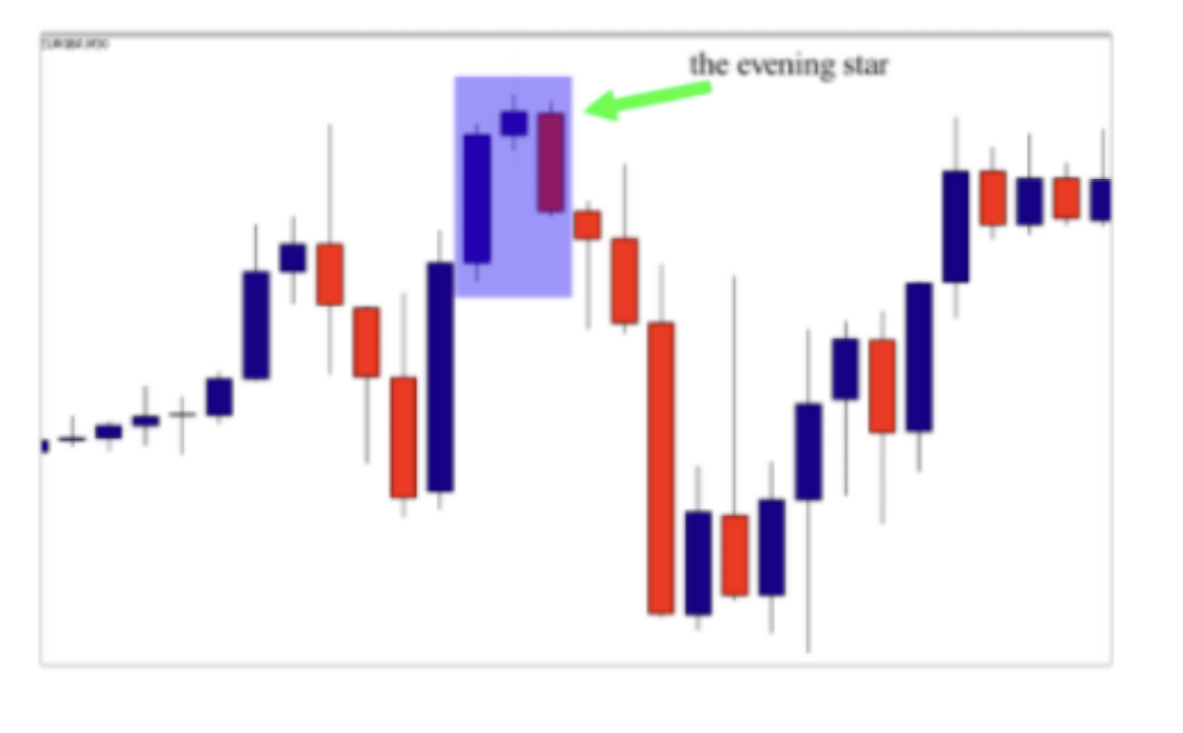
As you can see in the chart above, the formation of the evening star indicates that the market is likely to reverse from uptrend to downtrend, because the pattern signals a change in control from buyers to sellers.
Three white soldiers:
Three white soldiers is a bullish candlestick pattern that is used to predict the reversal of the current downtrend in a pricing chart. See the illustration below
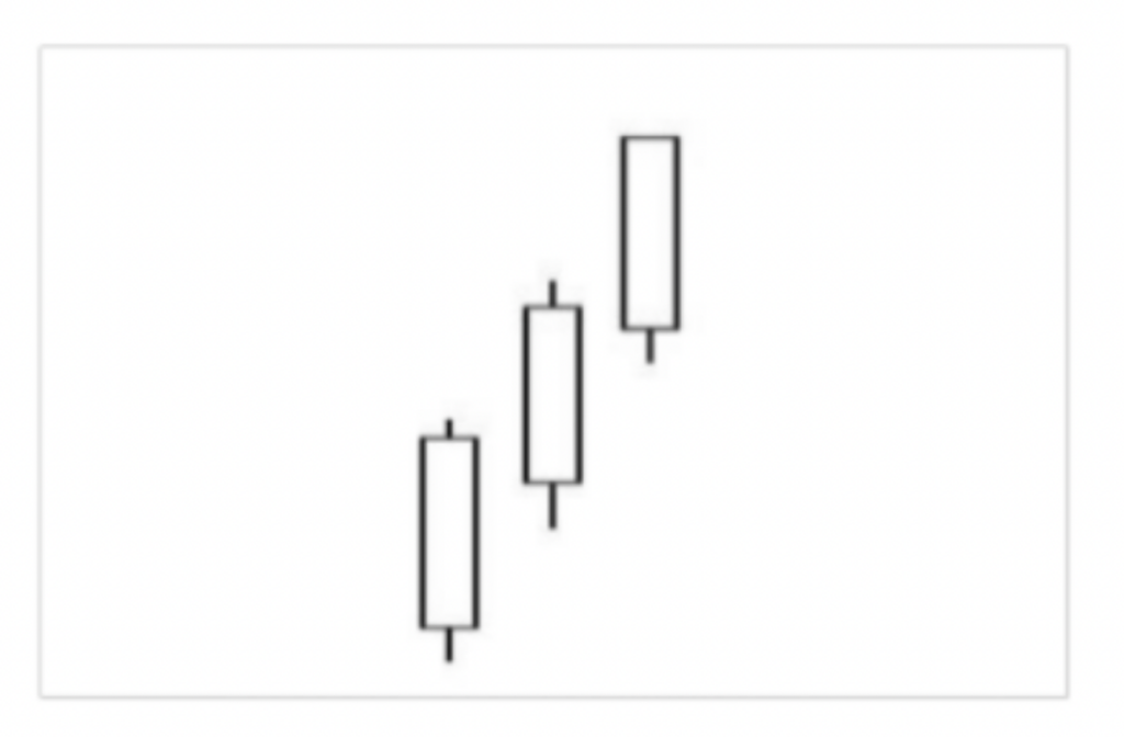
The pattern consists of three consecutive long bodied candlesticks that open within the previous candle’s real body and a close that exceeds the previous candles’ high.
These candles shouldn’t have very long shadows and ideally open within the real body of the preceding candle in the pattern. See the chart below:
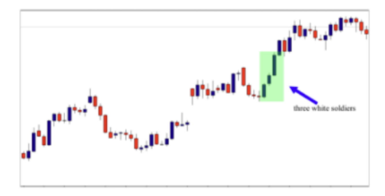
As you can see, the formation of the three white soldiers indicates that the trend is still strong, and buyers are still in control of the market. If they occurred at the end of a downtrend, it indicates a trend reversal. The candles can be blue or any other color that you prefer to use, the most important is that the candles should be bullish.
The three black crows:
Three black crows indicate a bearish candlestick pattern that predicts the reversal of an uptrend. This pattern consists of three consecutive long-bodies candlesticks that have opened within the real body of the previous candle. See the illustration below
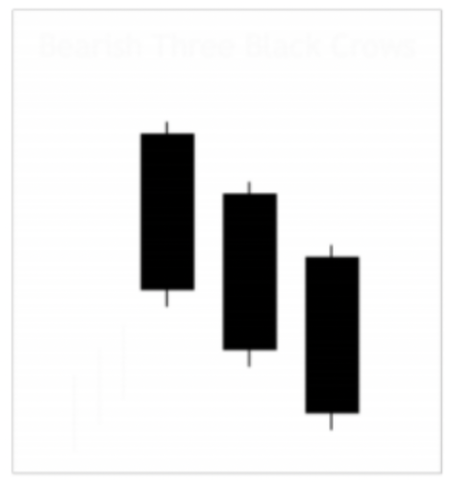
When this pattern happens at the end of an uptrend, it signals a trend reversal, and when it occurs at the downtrend, it gives us an idea about the strength of the trend – in other words it indicates that the downtrend is still strong. See the illustration below

As you can see in the chart above, the formation of the three black crows signals a trend change from an uptrend to downtrend, and the second three black crows’ pattern that occurred confirmed the downtrend.
I don’t always use these patterns in my trading but it helps with measuring the strength of the trend, so you can use it only as a tool to have an idea about the trend. Because using it as a signal alone will not give us the best risk to reward ratio.
The piercing pattern:
The piercing pattern is viewed as a bullish candlestick reversal pattern, similar to the bullish engulfing pattern. See how it looks below

The piercing pattern occurs when the second candle closes above the middle o the first bearish candle. It appears at the end of a downtrend, and is a complex pattern made of two candle lines. The first candle is bearish in nature and the second is bullish in nature. See the illustration below:

As you can see in the chart above, the market is in a downtrend. The price opens at almost the high of the day, and as usual, the sellers continue to sell. At the end of the session, the price closes almost at the bottom for the time period. In the next candle, the price opens below the low of the previous bearish candle, as sellers are making new short trades, and those who are already short in the market are also adding to their positions. But the smart money creeps in and starts accumulating shares from these ignorant sellers.
As the demand increases, the momentum decreases, and the prices start rising. As the price rises, the bears are happy to sell more at higher price, this facilitates bulls to accumulate more shares at lower price.
The demand continues to increase more than the supply, pushing the price up – the new sellers are now facing losses. They also start to buy back positions to minimize their losses. So the price rises further and at the end of the session the price closes above the opening. This results in the formation of a bullish white candle, which is the second candle of the piercing pattern.
The Dark Cloud Cover:
Dark Cloud Cover occurs in an uptrend, when a red candle opens above the previous candles’ closing price – but then the price retraces to below the midpoint of the previous candle

The Dark cloud cover is a two-candlestick pattern, and it is the opposite version of the piercing pattern. This price action setup is valid only when it occurs at the end of an uptrend. The first candlestick in this pattern must be a bullish candlestick with a large real body.
The second candlestick must be a bearish candlestick that opens above the high of the first candlestick, but closes well into the real body of the first candlestick. See the illustration below

As you can see in the chart above, the formation of the dark cloud pattern signaled a trend reversal because it was combined with a double top. This pattern is more reliable if the second candlestick closes below the middle of the first one.
The deeper the penetration of the second candlestick, the more significant it becomes.
As with most trend reversal patterns, the dark cloud cover becomes reliable depending on where it appears on the price chart in relation to other technical combinations such as trend lines, chart patterns, support and resistance.
Candlestick patterns are very important for you as a price action trader, because you will always use them as keys to read your charts properly and understand what happens in the market. But they shouldn’t be the first, or any factor in your trade decision making process
When analyzing your charts some things you need to consider are:
- Current market structure: you need to identify the market structure and know if the market is trending, ranging or is it a choppy market. You need to identify impulsive and corrective moves in relation to candlestick pattern setups in the market.
- Market major levels: you should identify the most important support and resistance levels in the market, because this will allow you to spot high points in the market and consider any price action setup that occurs in these points as a high probability setup.
- Higher time frame analysis: you will also need to analyze higher time frames to get an idea about the bigger picture and what is happening on higher time frames.
We will talk about all these points in detail in the course, so please pay attention to all information shared here, because the goal of this model is to give you solid
information that will allow you to read your charts correctly. This is the first and
most important skill that you should acquire before we move on to study how banks and financial institutions trade on the market
The market structure
When a market is moving in one general direction from left to right on the chart, either up or down, it is called a trend or a market bias. If a market is moving up, it
is said to have an uptrend, or a bullish trend, if it is moving down, it is said to have a downtrend or a bearish trend. These can also be called bullish bias or bearish bias.
The easiest and most effective way to identify a trend is by observing a market’s raw price action from left to right. As a market moves higher or lower, its previous turning points or swing points, become reference points that we can use to help us determine the trend of a market.
The easiest way to identify a trend is to check and see if a market is making a pattern of higher highs and higher lows for an uptrend, or lower highs and lower lows for a downtrend. See the diagram below:

As you see in this simple example above, the diagram shows us the basic idea of looking for higher highs and higher lows for uptrends and lower highs and lower lows for downtrends. To be honest with you, sometimes the market makes it difficult for us to identify a trend, it is not always clear like this, but with screen time and practice, you will be able to easily identify a trending market. Now let me give you a real chart example below:

As you can see in the chart above, the market is making a pattern of lower highs and lower lows. You don’t need to be Albert Einstein to decide whether the market is trending down or up. Only a general observation of swing points can help you identify the market trend. Now let me give you a real chart example of an uptrend below:
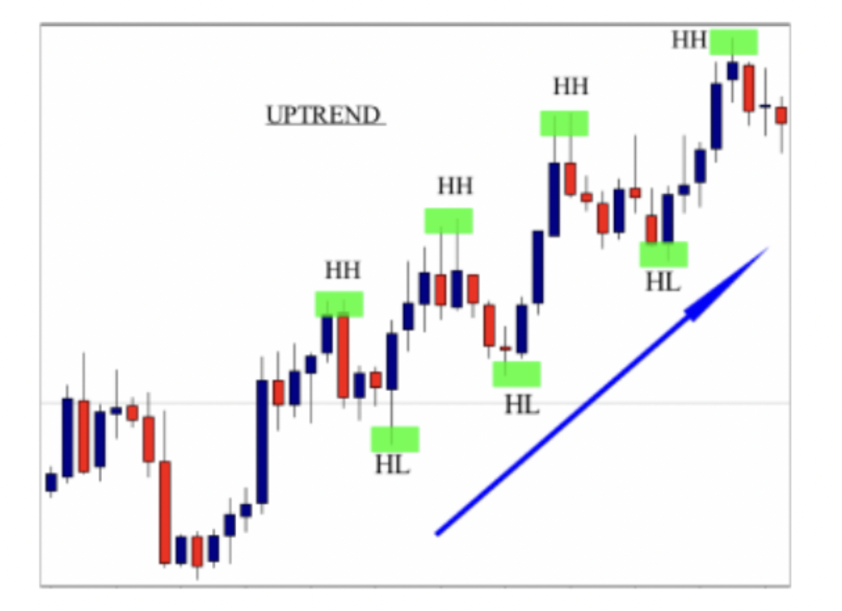
As you see in the chart above, the market is clearly making higher highs and high lows which indicates an uptrend market. You shouldn’t have to think too hard whether a market is trending or not. Most traders make the trend discovery way too difficult. If you take a common sense and patient approach, it is usually fairly obvious if a market is trending or not, just by looking at the raw price action of its chart from left to right. Make sure you make the swing points on your chart as it will draw your attention to them and help you see if there is a pattern of HH and HL or LH and LL as discussed above
The impulsive and the retracement move
Trending markets are characterized by two important moves, the impulsive move, and the retracement move. You should be able to identify these moves when you are analyzing a trending market, otherwise you will not be able to make the right trading decisions. So let’s start with the first move which is an impulsive move. An impulsive move is one where the market moves strongly or heavily into one direction, covering a great distance in a short period of time. They are generally more volatile, and they provide us with a good risk to reward ratio. See the illustration below

As you can see on the daily chart above, the market is trending down, the impulsive move starts from the beginning of the higher low swing points, because it is the area where sellers short the market until the lower low swing point where sellers took their profit. These moves are always within the trend. When the impulsive move ends, it’s always followed by a retracement move. See the same chart below
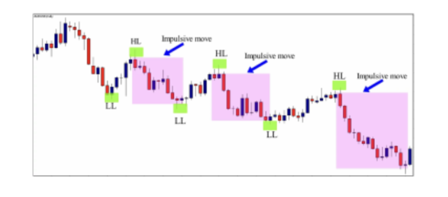
As you can see on the same daily chart above, when the impulsive move ends, the corrective move, or the retracement move begins. These small moves form against the trend and they shouldn’t be traded. The reason behind the corrective move formation in trending markets is the fact that sellers took their profits, so the market stop trending down and starts moving up little bit because some amateur traders try to trade against the trend while professional wait for the corrective move to end, and place their new orders with the beginning of the impulsive move. See another example below:

As you can see in the chart above, the market is trending up, and prices make impulsive moves, and corrective moves, when buyers buy the market prices go up and form an impulsive move, and when they take profit, a corrective move forms. During this time, buyers wait for the end of the corrective move and the beginning of the impulsive move to take another order.
This is how trending markets move, and if you want to make the best trading decisions, you need to know when the corrective moves ends, and when the impulsive move begins. This knowledge will help you catch the beginning of the impulsive move to make big profits and avoid trading the corrective moves. So how can we identify the end of the corrective move and the beginning of the
impulsive move?
To predict the end of a corrective move and the beginning of an impulsive move, we use support and resistance. So, what is support and resistance?
Support and resistance levels are horizontal price levels that typically connect price bar high to other price bar lows forming a horizontal level on a price chart.
In trending markets, support and resistance are created from swing points in a trend. As price trends, it retraces back on the trend, and this retracement leaves a swing point in the market, which in an uptrend looks like a peak and in a downtrend looks like a through. In an uptrend, the old peaks will tend to act as support after price breaks up past them, and then retraces back down to test them. See the illustration below:

As you can see in the illustration above, as price swings up and down creating this trend continuation pattern, it leaves support and resistance in its wake. When price swings down due to selling, then it leaves behind an area of resistance. When price swings up due to buying, then it leaves behind an area of support. When an area of resistance is broken, it must be watched from the other side in case it will act as support. See another example below

The illustration above shows you how support (swing point) leaves an area when it forms, and this area becomes resistance, when price retraces back to retest it . This is how support and resistance work in the markets, and to draw them in a trending market, all you have to do is to identify a previous swing point and draw a horizontal line on it. When the market breaks it and retraces back to retest it, you should pay attention because if the swing point was support it will become resistance, and if it was resistance it will become support. See a real chart example below

As you can see in the chart above, by identifying support and resistance in a trending market, we can easily predict the end of the retracement move, and the beginning of the impulsive move that most traders wait for to take their orders. Let me now give you another example of an uptrend market below
As you can see in the chart above, the market is trending up making higher highs and higher lows. The resistance level becomes a reference point after the breakout of it, and when price retraces back to test it, this level becomes support. By using resistance levels as reference points, we can identify future support levels that can be used to predict the end of retracement moves and the beginning of impulsive moves.
When drawing support and resistance in a trending market, you should connect the wicks and not the bodies, and you should focus on the most recent ones, because they are the most important levels
Drawing support and resistance in trending markets is a skill that you must learn, because these levels will help you plan your stop loss placement and your profit target, it will also help you predict with high accuracy the next impulsive move that you should ride from the beginning to make bigger profits and avoid being trapped in retracements.
In the first part of this lesson, you learned how to identify trending markets, and the most important moves in a trending market which are the impulsive and the retracement move, you learned also how to draw support and resistance so you can predict high probability entry points in the market. In the next part of this lesson you will learn about the second type of markets, which is the ranging market.
The Ranging Market
If you look at any market, or any time frame, you will see that when price moves strongly in one direction, it makes strong impulsive moves, followed by smaller corrective moves that are pointing against the direction of where the pair is clearly going.
This type of movement generates higher highs and higher lows in case of an uptrend and lower highs and lower lows in a case of a downtrend. A ranging market is one that is not behaving like this. A sideways market is characterized by the fact that price is not making new highs and lows anymore. Instead, it begins to make swing highs and swing lows horizontally. See the chart below:
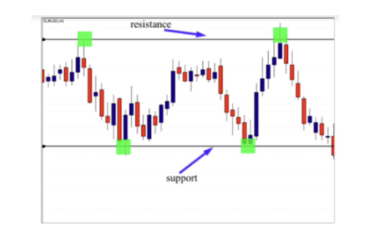
As you can see in the chart above, the market is trading horizontally between support and resistance levels. This type of market is called a ranging market, because in this period of time, buyers and sellers don’t know what to do so they keep selling from resistance and buying from support, and the market enters an indecision phase.
When a ranging market is formed, traders change their way of trading – so instead of following the trend and identifying the beginning of impulsive moves and retracement moves, they use three important strategies:
-False breakout strategies: this strategy consists of trading the false breakout of the support or resistance; the reasons behind this strategy is that buyers and sellers know that there are lot of traders who are ready to enter after the breakout, so they make false breakouts to trap breakout traders and then they go in the opposite direction. See the chart below:
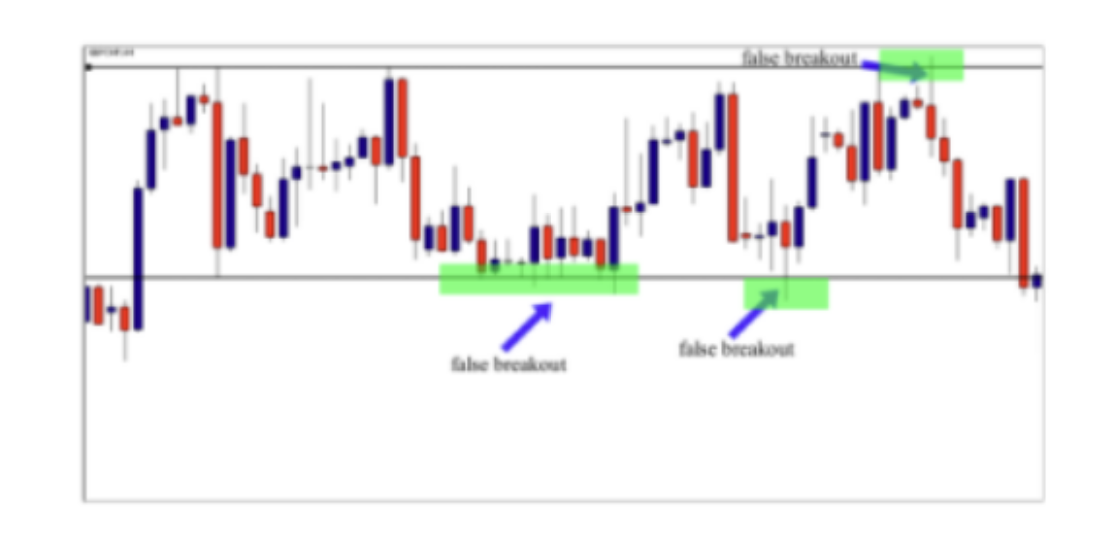
As you can see, after the false breakout – the market goes in the opposite direction to reach the next support or resistance levels.
-Breakout strategies: this strategy consists of placing an order in the direction of the breakout, because when the ranging market is broken, it is an indication that buyers or sellers are no longer in an indecision phase and they decided to drive the market up or down. See the illustration below:

As you can see, after the breakout of the support level, the market went strongly down, because sellers decided to go down after a long time of hesitation.
-Pullback strategies: the pullback strategy is used by conservative traders that wait for the market to retrace back after the breakout to give them a second chance to enter in the direction of the breakout. See the illustration below:
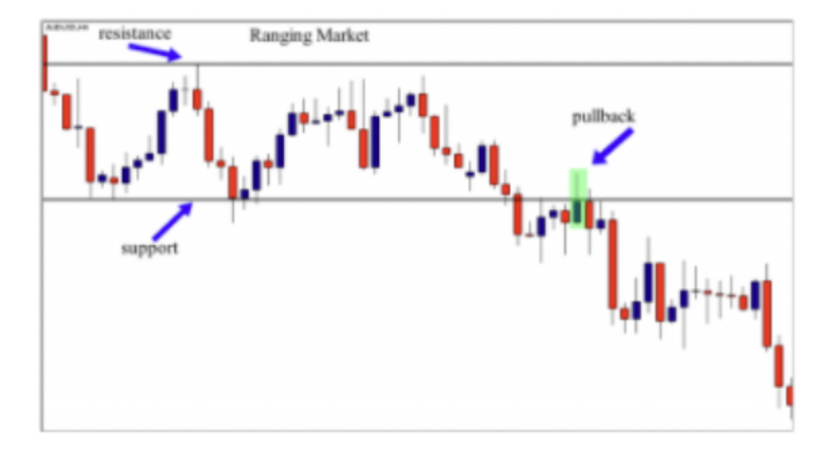
So, when you are in front of a ranging market you should know that prices will move horizontally between support and resistance. And after the breakout of the range, the market goes directly in the direction of the breakout or it pulls back to give another chance to other traders to ride the trend.
Choppy Markets
Choppy markets are those which have no clear direction such as sideways markets, but are a really churned up mess which makes traders lose sleep at night.
This is where previous gains can be quickly wiped out and it’s a deeply frustrating and demoralizing experience. These kinds of markets can turn your dreams into nightmares if you don’t know about them, and if you don’t ignore them.
A ranging market is a market condition that doesn’t exhibit any type of predictable pattern. It is simply gyrating around randomly without any clear direction up or down. It can be characterized by high volatility or low volatility, but the one defining characteristic is a lack of clear, long term direction up or down – see the chart example below:
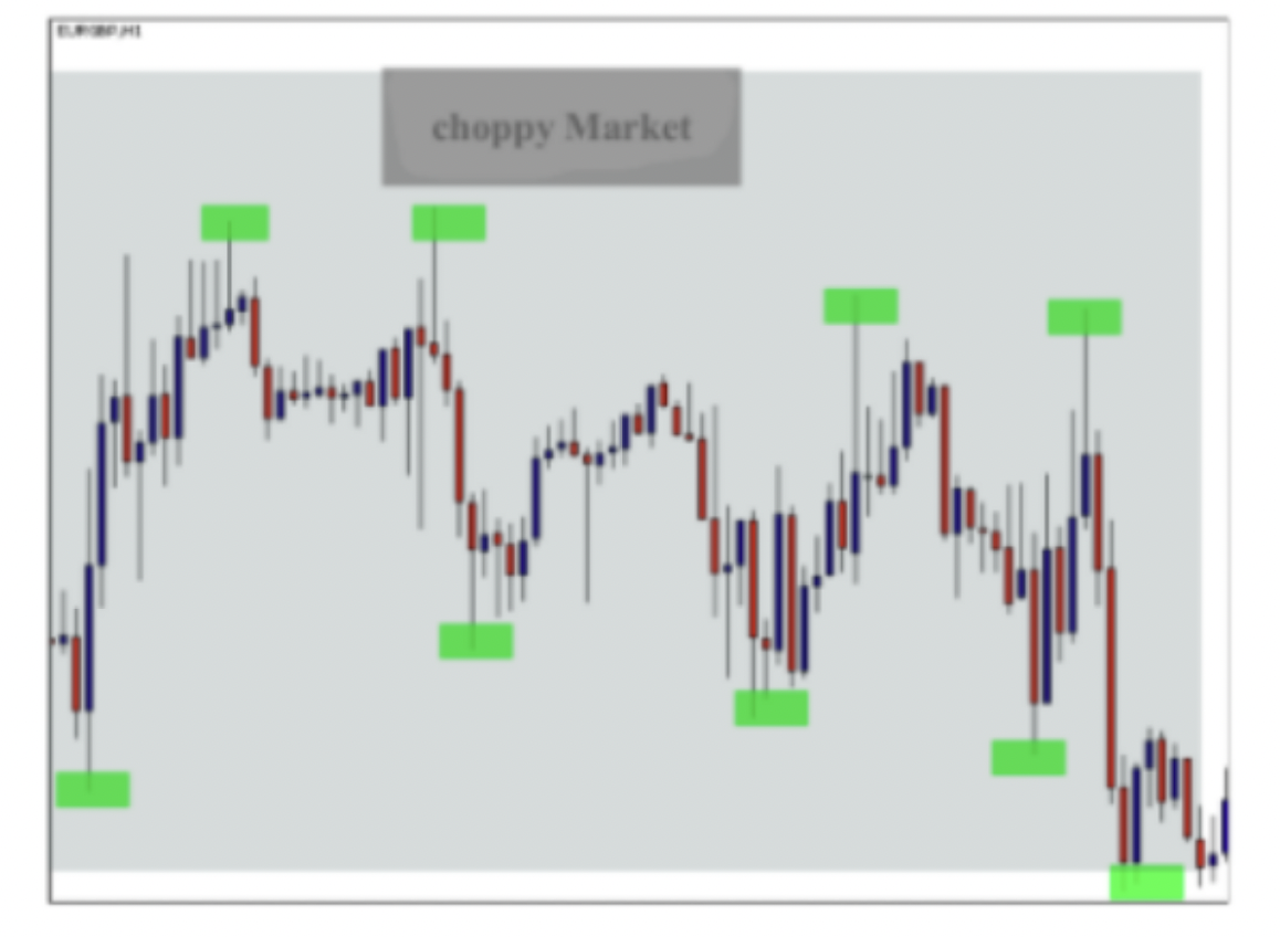
As you can see in the chart above, the market is indecisive, moving up and down creating a mess in the market; you can’t identify clear support and resistance levels in this chart, because nobody knows what the market is doing. In this case, the best trading decision to make is to stay away from this market. Let me give you another example below

As you can see in the chart above, it is difficult to trade in this market because support and resistance are not clear. If you try to trade in these conditions you can easily blow up your entire trading account.
Knowing when to trade and when not to trade is important for you if you want to become a consistently profitable trader. This is the reason why I started with the basics, especially with the market structure, because if you apply supply and demand strategies in the wrong market conditions you will not get the results that you want.
Before you move to study our supply and demand trading method, you should make sure that you can differentiate between trending markets, ranging markets and choppy markets. So please take your time to understand these structures, and then you can move on to study the main strategy
TECHNICAL ANALYSIS & JAPANESE CANDLESTICK PATTERNS
Hi traders and welcome to the first basic course. If you are an advanced trader and you have already learned about Japanese candlesticks, you can probably skip this course. But if you are a beginner trader, watching this video is highly recommended.
The first skill that you will need to acquire to become a successful trader is the ability to read your charts. This ability will allow us to analyze financial markets and predict future movement with high accuracy.
When it comes to charts, there are three most popular types. The line chart, the bar chart, and the candlestick chart.
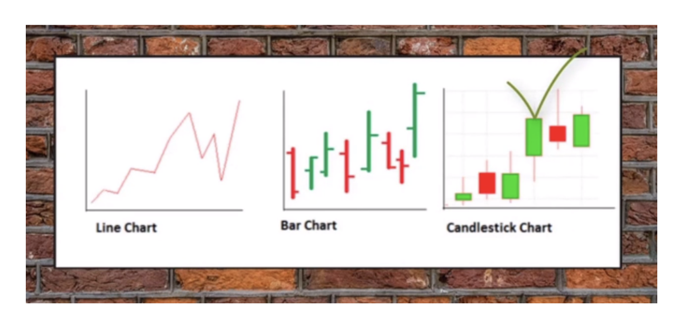
Japanese candlesticks represent the best type of charts. It surpasses the line chart significantly and is just more visually pleasurable than the bar chart. Japanese candlesticks are the language of the financial market. If you can master this language, you will communicate better with the market. And this is what makes a difference between successful traders and unsuccessful traders. Successful traders communicate better with the market.
Candlestick charts originated in Japan. This type of chart was created by Munahisa Homa, one of the best traders in history.

Munahisa Homa was born in 1724 into a very wealthy family.

The Homa family was considered so wealthy that there was a saying at the time, I will never become a Homa, but I would settle to be a local lord. When Munahisa Homa’s father died, Munahisa was placed in charge of managing the family’s assets. He then went on to Japan’s largest rice exchange, the Doihima Rice Exchange in Osaka, and began trading rice futures.

Homa kept records of yearly weather conditions in order to learn about the psychology of investors. He set up his own trading system called Japanese Candlesticks.
This trading method allowed him to dominate the rice market. He was called the God of Markets in his day and he made a huge fortune. It was said he made 101 trades in a row and made more than $10 billion in today’s dollars. Unfortunately we cannot use the same method because the current markets are not the same. But we can still use Japanese candlesticks in combination with other price action strategies to make our trading decision.
In fact, there are so many ways of using candlesticks, but in this video we will focus only on studying the anatomy of candlesticks and the psychology behind the formations.
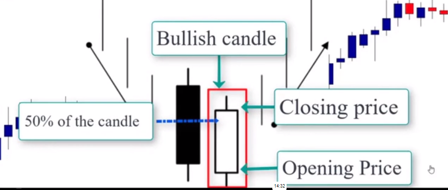
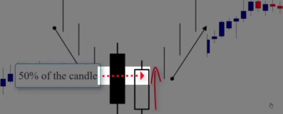
So before we can read the candlestick chart, you must understand the basic structure of a single candle. It’s very important. Each candlestick accounts for a specified time period. It could be one minute, 60 minutes, daily or weekly, and regardless of the time period, our candlestick gives us four important pieces of information. First is the opening price at the beginning of the time period, the closing price at the end of the time period, and the highest price during the time period, as well as the lowest price during the time period.
As you can see in this example, when you read a candle, depending on the opening and closing prices, it will provide you information on whether the decision ended bullish or bearish. When the closing price is higher than the opening price, as you can see here, it is called a bullish candlestick. By contrast, when the closing price is lower than the opening price, as you can see, it is known as a bearish candle. The upper and lower shadows of the candle represent the highest and lowest prices during the time period. Now, let’s go through the specific and distinct patterns we look for. First candlestick pattern we look for is the Doji Candle.
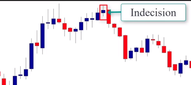
The Doji Candle is a unique candle that reveals indecision in the market. Neither buyers nor sellers are in control. The Doji Candle is characterized by its cross shape. This happens when the market opens and closes at the same level, leaving a small or non-existing body.

When this pattern happens in an uptrend, as you can see in this example, it can be viewed as an indecision that buying momentum is slowing down.

So traders may view this as a sign to exit an existing long trade. The same thing occurs when we’re in a down market, or the market is trending down. In this example, the formation of the doji candle indicates that the downtrend is no longer strong and could be viewed as a sign to exit our trade.

Remember, it is possible that the market was undecisive for just a brief period of time and continues to advance in the direction of the trend. Therefore, it is crucial to conduct thorough analysis before exiting a position.

Now let’s focus on the psychology behind the Doji formation. In the next few lessons, I’ll show you how you can use it as a basing candle and as an entry signal in combination with supply and demand strategies.
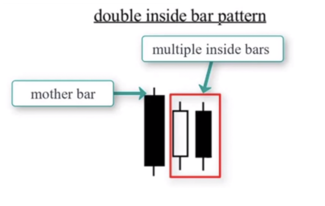
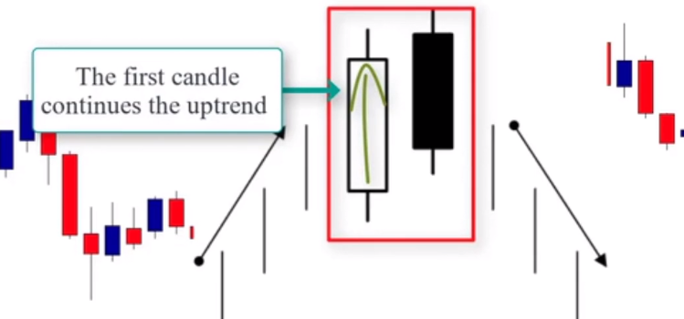
Let’s move to another Japanese candlestick pattern, which is the inside bar. What is an inside bar? An inside bar pattern is a multi-bar pattern that consists of a mother bar, which is the first bar in the pattern, followed by the inside bar.
As you can see in this example, inside bars can form exactly in the middle of the mother bar or close to either high or low.
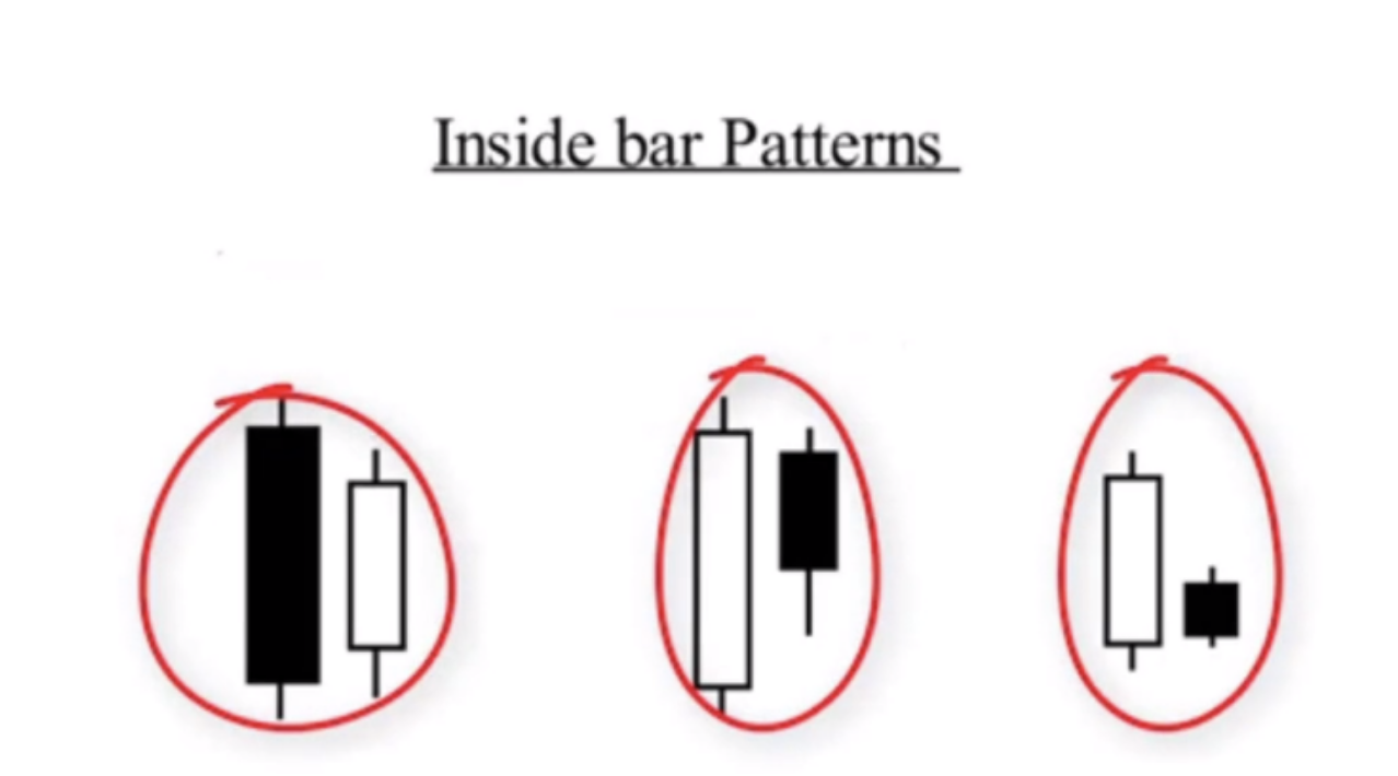
There is not an exact way they have to look, just as long as they are contained within a high or low to distance of the mother bar. In fact, an inside bar can have multiple inside bars within the mother bar and they are considered inside bar patterns as well. An inside bar pattern represents a pause or consolidation in the market.
It is considered a continuation signal in trending markets.

When this pattern occurs in an uptrend market, for example, it offers a good opportunity to join the trend. Let’s look at an example. You can see here in this example, we are in an uptrend. If you miss your entry here or here, the inside bar gives you another opportunity to join the trend after the breakout of the mother bar.
As we said, the inside bar represents a pause or consolidation. And the breakout of the mother bar means that the consolidation phase is possibly over and the market is likely to go higher again.
Now let’s look at another example in a downtrend market. As you can see here, we have an inside bar that was formed after the breakout of the support level that then becomes resistance.

If you miss that opportunity, the inside bar pattern gives us another opportunity to join the trend here and another opportunity right here.
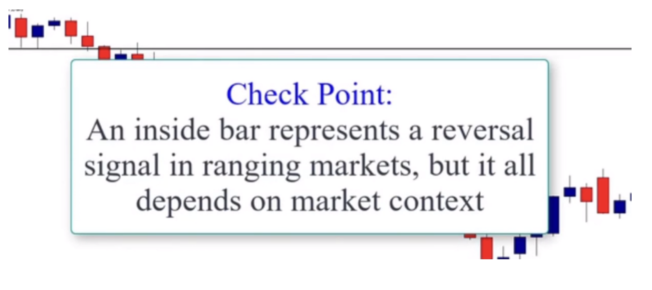
Inside bars can represent reversal signals in ranging markets. I’m not going to show you how you can trade it in different market conditions because what matters now is to know the anatomy of the inside bar and the psychology behind its formation.
The next candlestick is the engulfing bar. The engulfing bar is formed by two candles. This pattern is pretty easy to recognize.

Its structure consists of two candles. The first candle is totally engulfed by the next candle. In fact, there are two types of engulfing bars. The bullish engulfing bar, as you can see here, and the bearish engulfing bar, as you can see here.

A bullish engulfing bar typically forms after an extended move. It signals exhaustion in the market where sellers begin to book profits and buyers begin to take interest, pushing prices higher. As you can see in this illustration, the market was trending down.

The formation of the bullish engulfing bar represents a reversal signal. That means that buyers are overtaking sellers. In other words, buyers are taking control of sellers. Let’s look at another chart example.

As you can see in this chart, the market was trending down. That means sellers are in control of the market. The formation of the bullish engulfing bar indicates that sellers lost control of the market and buyers are stronger so the market is likely going to go higher.
So what about the bearish engulfing bar? A bearish engulfing bar pattern typically forms after an extended move up.

It is a sign of exhaustion and a signal that the market may be in the early stages of reversing. Just as the name implies, an engulfing candle is one that completely engulfs the previous candle.

In other words, the previous candle is completely contained within the engulfing candles branch. As you can see in this illustration, the engulfing candles branch high to low completely engulfs the previous candle. Now let’s look at another chart example. As you can see in this chart, the market is trending up.
Formation of the bearish engulfing candle indicates that buyers lost control and sellers may reverse the market direction. The engulfing candle setup has a strong reversal correction ability. If the price is increasing and an engulfing bar is created on the way up, it means that it gives us a signal that a top might be forming. The opposite is enforced too. If the price is decreasing and an engulfing bar appears on the chart, it suggests that the price action may be forming a topping pattern.
The next candlestick pattern is the pin bar candlestick pattern.
The pin bar should probably be called the king pin because it can be thought of as the king of price action setups for its ability to provide high probability entry points in trending markets, range bound markets, and as key levels against the trend. Pin bar is a one bar formation. The pin bar is a price bar which has rejected higher or lower prices. Price will open and move in one direction and then reverse during the decision to close at or past the open. The pin bar should have a long upper body or lower tail. The tail is also sometimes called the wick or the shadow. In fact, they all mean the same things, but the longer the tail, the better.
The area between the open and close of the pin bar is called the body, or real body. At the end of the body is sometimes referred to as the nose. The area between the open and close of the pin bar is called the body, or real body. At the end of the opposite tail is sometimes referred to as the nose.

The pin bar is a common reversal signal, which typically needs to occur near a support or resistance area. Recent levels or dynamic moving averages can be used in conjunction with Fibonacci retracements as well. Let’s look at an example.
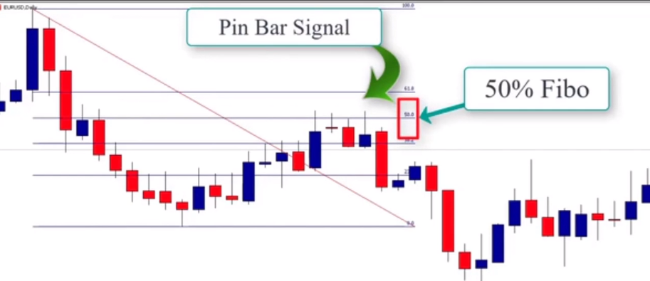
So you can see in this example the market is trending lower. After this retracement, prices formed a pin bar that was rejected from the 50% Fibonacci level. This Fibonacci level is very important. When combined with pin bars, we get a very high probability trading scenario.
Let’s look at another example. Here the market broke the support level. This support now becomes resistance. After we see the retracement, the market performed a pin bar that indicates rejection.
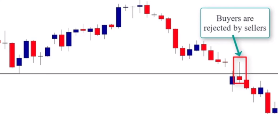
Here as we can see, sellers rejected buyers when the prices broke the support that now became resistance. So this is a good opportunity to place a sell order. Here’s another example.
This is a range bound market. In this type of market we’ll only trade from the boundaries. That means trading from support and resistance levels because buyers wait at the support level and sellers wait at the resistance level. Then as you can see, we get a pin bar at the support level which indicates that sellers are rejected by buyers. So it’s a strong signal to buy the market. When the market reaches the resistance level, it forms another pin bar which indicates that buyers are rejected by the sellers. This represents a good opportunity to short the market.
Now we’re not going to go into how pin bars trade in different market conditions because what matters for the moment is to get the ability to read the anatomy of pin bars and to understand the psychology behind its formation. In the next few lessons, we’ll learn how to trade pin bars in combination with supply and demand areas.
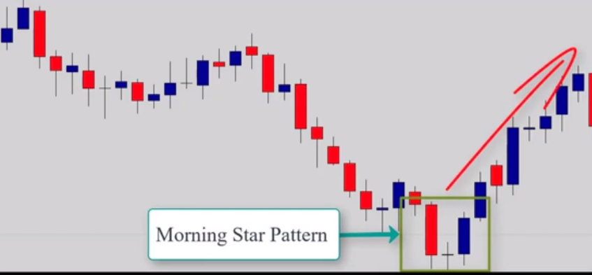
Now let’s talk about the Morningstar candlestick pattern. The Morningstar is a three candle reversal pattern occurring at market bottoms. So it is a bullish reversal pattern.
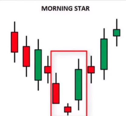
First candle is bearish continuing the trend in a downward direction. The second candle will have a smaller body. The color is not important. The third candle is a bullish candle and penetrates well into the body of the first candle. The further the penetration, the better.
So what does the Morningstar candlestick pattern tell us when it occurs in a downtrodden market? When the market is trending down, the formation of a long bearish candle confirms that the bears are continuing its downward momentum and the bears are in control. The second small bearish candle shows a possible loss of momentum. Then the third bullish candle indicates that bears are no longer in control of the market and the bulls will take control. When this happens in a downtrend, it indicates a bullish reversal signal.
Let’s look at another example. The market is trending down, showing that bears are clearly in control of the market.
The formation of the morning star pattern leads us to a reversal of the trend to the upwards direction. Remember, we don’t trade candlestick patterns alone, we trade candlestick patterns with other tools such as support and resistance, supply and demand levels, and so on. Here’s another example.

Here we can see that the market is trending down. Sellers are in charge of the market, and we see a formation of a morning star which leads to a possible trend reversal.
The evening star is the opposite version of the morning star. Morning Star. It is a three candle reversal pattern occurring at market tops. So it is a bearish reversal pattern.

The first candle is bullish which is a continuation of the trend in the upward direction. The second candle is a small candle that shows a loss of momentum followed by the third candle which is bearish. The first candle of the Evening Star shows us that everything is looking really bullish at this stage. The second candle shows us a loss of momentum and the third bearish candle shows us that sellers are now in control of the market.
Here is an example. As we can see here, the market is trending higher. Buyers are still in control. But we see a second candle that shows indecision or weakening of the market, followed by a third candle that shows us that sellers step in and take control.
The pattern indicates a bearish reversal signal. The evening and morning star candle patterns are reversal patterns that can be used only at the end of an uptrend or downtrend. They don’t necessarily work in range, rebound, or choppy markets.
Now let’s move to another price action pattern, the piercing pattern. Piercing pattern is a two-candle pattern occurring in market bottoms. So it’s a bullish reversal pattern.

The price action leading up to a piercing pattern must be in a down trend. We want to ignore the pattern in a sideways trend or uptrend. Price must be trending downwards. Now let’s talk about the anatomy of the candlestick. As you can see, the first candle is bearish, continuing the trend in a downward move. The second candle is bullish, opening below the first candle, or even better, below the low of the first candle, then closes above the midway point of the first candle, in other words above the 50% line.
Now let’s consider the psychology or sentiment of the piercing pattern. Who is control of the market? Buyers or sellers? As you can see the first candle continues the downtrend. Everything is looking quite bearish. The second candle opens below the low of the first one so the bearish trend appears to be continuing again and sellers are no longer willing to sell the market at these lower prices.

However, buyers find these low prices attractive and enter the market in more force. So the balance of supply and demand have been tipped now slightly in favor of the buyers and prices go higher. The key to this pattern is the movement of price above the 50% level.
This is considered the balance point for bullish and bearish sentiment. Buyers are able to push the price back up above the central balance point and close price in the upper area. This will shake the confidence of a number of sellers leaving them to exit their positions if the pattern is confirmed as price trades above the height of the second candle. It will strengthen the confidence of the number of buyers that will then enter and drive the bullish move higher.
Let’s look at another example. Here the market is going lower.

Right now, sellers are in control of the market. Here we see the first candle that confirms the selling pressure, but the formation of the second candle below the first one and the fact that it closed above the 50% level of the prior candle indicates that buyers are stronger and they are going to likely take control of the market. And as we see here, after the formation of the piercing pattern, the market goes higher.
This pattern works when used with other technical analysis, but we want to use it with supply and demand strategies as it increases the signal as a basing candle. So the most important thing right now is to focus on the anatomy of the pattern, and in future lessons we’ll learn how to trade it successfully.
Now let’s talk about the opposite version of the piercing pattern, which is called the dark cloud cover. The dark cloud cover is a two-candle pattern occurring at market tops. So it’s a bearish reversal pattern.

The price action leading up to the dark cloud cover must be in an uptrend. The pattern doesn’t necessarily work in a sideways trend or downtrend market. Price must be trending upwards. The first candle has a bullish real body continuing the trend in the upwards direction. The second candle is a bearish candle open above the real body of the first candle. So price in the bullish candle here closes here and then open at a higher price here. Better if open gaps up above the high point or above the tip of the shadow here of the first bullish candle. The second candle closes down below the midway of the bearish candle.

As you can see here, the 50% line marks the midpoint between the open and close of the bearish candle. The second candle must close below that point. Let’s consider the psychology of the dark cloud cover. Who is in control of the market? Buyers or sellers? The name of the pattern gives a good hint. What comes from those clouds? Rain, right? And what does rain do? It falls. This is why it is considered a bearish reversal pattern. Anyway, let’s consider the psychology or the sentiment. The first candle continues the uptrend.
Right now, everything is looking bullish as you can see here. The second candle opens above the high of the first bullish candle and as a result, buyers are no longer willing to enter the market because prices are still higher.

So some of them may be taking profits and exiting their positions. However, sellers find these prices attractive and enter the market in more force. The balance of supply and demand have been tipped slightly more in favor of the sellers and the price falls.
The key to this pattern is the extension of the down move below the 50% line of the first candle.

This is considered the balance point for buyers and sellers. Sellers were able to push the price back down below the central balance point and close the price in the lower area. This will shake the confidence of a number of buyers waiting to exit their positions if the pattern is confirmed, and it will strengthen the confidence for a number of sellers who will enter to push the price back down. Let’s look at another example. As you can see in this chart, the market is trending higher. Buyers are in control of the market. But when the market is at this level, everything is completely changed and sellers push the market back down. If we know about the dark cloud cover pattern, you will understand what happened. We can see here, buyers are still in control of the market. But when prices opened above the first bullish candle, buyers are not willing to buy the market from this area because prices are higher, but sellers find it a good opportunity to enter the market.

So they push prices back down below the 50% line of the first candle and close below. This indicates it’s more stronger than buyers and a bearish trend is likely to happen.
Now let’s move to another pattern which is the Marubozu. The Marubozu pattern is the opposite version of the Doji candle. If the Doji candle pattern indicates indecision in the market, the Marubozu indicates buyers or sellers domination.
What does the word Marubozu mean? The word Marubozu means bald head or shaved head in Japanese. This is reflected in the candlestick lack of wicks. So when you see a Marubozu candlestick, the fact that there are no wicks tells you that the decision opened at the high price of the day and closed at the low price of the day. The Marabouzu candlestick pattern is a one-candle, easy-to-spot signal with very clear meaning. There are two types of Marabouzu patterns. Bullish Marabouzu, that refers to bulls in control of the market. In this case, the opening price is below the closing price, which indicates that buyers are in control of the market during this trading session.
The bearish Marabouzu refers to bears in control of the market. In this case, the opening price is above the closing price, which indicates that sellers are in control of the market during this trade session.
Marabouzu is a continuation and a reversal pattern. Depending on where the marabouzu is located in a type of pattern, you can then make your predictions. A bullish marabouzu occurs at the end of a downtrend. Reversal is likely. Let’s look at an example. As you can see here, the chart was trending down in this market. Sellers were in control. The formation of the bullish marabouzu indicates that buyers are now in control of the market during this particular session.
So sellers are no more in control and a reversal is likely to happen. As you can see, the market trended higher. Let’s look at another example. If we have a bullish marabouzu that occurs at the end of an uptrend, the reversal is likely. Here we can see that the market was trending higher.
This means that buyers are now in control of the market. The formation of the Marabouzu indicated that sellers are now stepping in and want to control the market during this time.
So buyers are now no longer stronger than the bearish camp and a bearish reversal is likely to happen. And as you can see, after the formation of the bearish Marubozu, the market went lower.
When a bullish Marubozu occurs during an uptrend, it indicates a bullish trend continuation. And when a bearish Marubozu occurs during a downtrend, it indicates a bearish trend continuation. That’s all we can say for now about the Marubozu candle pattern.
So now you know all the patterns that I mentioned in this video lesson are important because we will use them either as basing candles to draw our supply and demand zones or as possible entry signals. But don’t worry in the next lessons we’re going to learn how to use them in combination with the supply and demand strategy.
Why should you study supply and demand trading method
To start any business, you should attempt to know everything about it; otherwise you will likely never succeed in it. The same thing applies when it comes to trading financial markets. If you
have no idea how the market works, you will never figure out a way to make a consistent profit.
The markets are composed of two players, the market makers and retail traders; the market makers are banks and financial institutions – these players are the biggest participants in the market. They trade millions of dollars every single day, they control and manipulate the market,and drive prices whenever they want.
These players have the best technical analysts , they know how retail traders analyze and trade the markets, they know where your stop loss and your profit targets are, and they can manipulate the market and take money from you
whenever they want. This is the truth that nobody will tell you about. Let me give an example to show you how market makers know how you trade the market and how they take money from you .

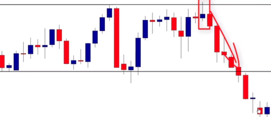
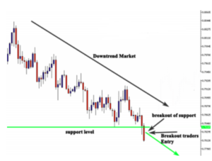
In this chart, as you can see the market approaches a high probability key resistance level with the formation of the pin bar, AND the false breakout of this level, giving us a high probability sell signal. As a retail trader, you will sell the market after the close of the pin bar and place a stop loss above the resistance level or a few ticks above it. You take your order and you feel excited about it, but look at what happened next:

As you can see the market hits your stop loss twice before it goes strongly to the profit target. When your stop loss got hit, you feel disappointed and you feel like someone is watching what you are doing in the market. This happens frequently in all financial markets, and if you are not aware of that, you will always be trapped by banks and financial institutions. Look at another example:
As you can see in the chart above, the market was trending down. After the breakout of the support level, the breakout traders will automatically enter the market to join the downtrend and make profit. If you are trading breakouts you will enter this trade and you feel very confident because the support level was strongly broken and you feel the trend will continue going down. But look at what happened next:
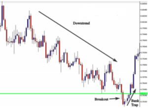
As you can see, after the breakout of this level, banks and financial institutions changed their tactics, because they know that there is a large amount of retail traders who entered the market to join the trend. They trapped traders by what we call: false breakout strategy. If you know about this trap, you will buy the market after this trap and make money because you know what happened.
Banks and financial institutions have certain zones where they buy and sell in the market and if you can identify them. You will take the same trades they take and make money with them instead of trading against them – let me give you an example:
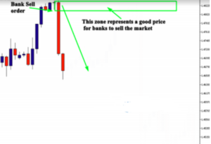
Look at the example of the chart above – you will see that the market dropped down strongly, as evidenced by the red candlesticks. This move was made by banks, because they think this price is a good level to sell against. When the market goes back to test this zone, the same bank will liquidate the rest of quantities, and other banks will sell from the same price, so we will see another strong move. Look at what happened next:
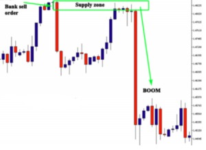
As you can see, the market went down strongly when price tested this zone. This is one of the strategies that banks and financial institutions use to trade the market. And if you know about it, you could make money easily on this trade.
These zones form frequently in the market if you know where to look. The examples I mentioned above are only some of many strategies that the market makers use to manipulate the market and take money from retail traders. And this is the reason why you have to study and learn how banks and financial institutions trade the market.
I want you to change the way you look at the market, and instead of looking at the market as sellers and buyers, you should look at it as market makers versus retail traders. Market makers know what you are doing, they are more
powerful than you, and they are in the market to trap you and take money from you.
In the next lessons, you are going to learn how banks trade the market, you will start looking at your charts as a market maker, and you will be able to identify big moves in the market before they even happen. If you can follow what I’m going to share with you in this course, your trading results can change dramatically.
Please take your time to read everything and don’t skip any part because everything I share is important if you want to join the 5% of successful traders.
How do banks use supply and demand method ?
The markets are ruled by the law of supply and demand in much the same way the law of gravity rules our planet. Prices go up and down because of the imbalance in supply and demand. If supply is higher than demand, the price goes down, and if demand is higher than supply, price goes up.
The markets are dominated by big investors such as central banks, hedge funds, market makers, and other financial institutions. These investors are also affected by some factors that influence their trading decisions such as daily news that affects the world’s economies, as well as economic data about some countries. And when they make their trading decisions, they move prices strongly and create an imbalance in supply and demand…the greater the imbalance the greater the move in price.
How many times have you seen a market retrace back to a level where a recent major move started from, only to respect that level almost exactly before making another strong directional move? It happens frequently in the market. Look at this example below to understand more fully:

As you can see in the chart above, the red big candle represents a big bank sell order (this selling decision was influenced by big economic news). We don’t care about news, we only care about big moves like this, because this is the footprint of banks and financial institutions. When the bank takes this sell order and drops the market down, it can’t liquidate all the quantities at once, so it leaves some quantities to sell from the same zone. The amount of quantities left in the zone depends on buyers. If the bank found a big number of buyers to sell, it can liquidate all quantities and nothing will be left in the zone. But in most cases, banks leave quantities as limit orders in the same zones they sell from.
The beginning of the big move becomes a very interesting price to sell from, because there are some limit orders left in that price, other banks and financial institutions will sell from the same zone when the market pulls back to test this zone. Because they know that there are other financial institutions that will sell from the same zone, and this is the easiest way to make money without being in a conflict. Look at another example to understand more:
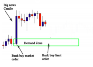
In the chart above, you can see a big blue candle that represents a bank buy order. This big buy order was influenced by economic news. Don’t bother yourself with trying to analyze economic news and how they will affect the market. You are not a bank trader – you are only a retail trader with a small trading account. What you have to do is to identify interesting prices where banks and financial institutions will buy or sell from.
As you can see the bank made the first buy order, and because of the lack of buyers, it can’t liquidate all its quantities, so it makes another limit order. Other banks and financial institutions will see this zone as an interesting price to buy from because they already know that there are banks who bought from it and they still have limit orders on it. Look at what happens when the market pulls back to test this zone.
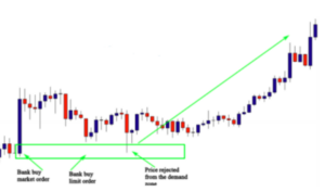
As you can see when the market pulls back to this zone, it gets rejected because there are some quantities left as limit orders in this zone, and other financial institutions will buy from the same zone because it is considered to be a very
interesting area to buy from.
When the market goes up from this zone, other retail traders will join the move, and if you are aware of how banks and financial institutions trade the market, you will join the move and make money by following the big participants in the market. This is how supply and demand strategy works, and in the next lessons you will learn everything you need to master this strategy and start using it in your trading.
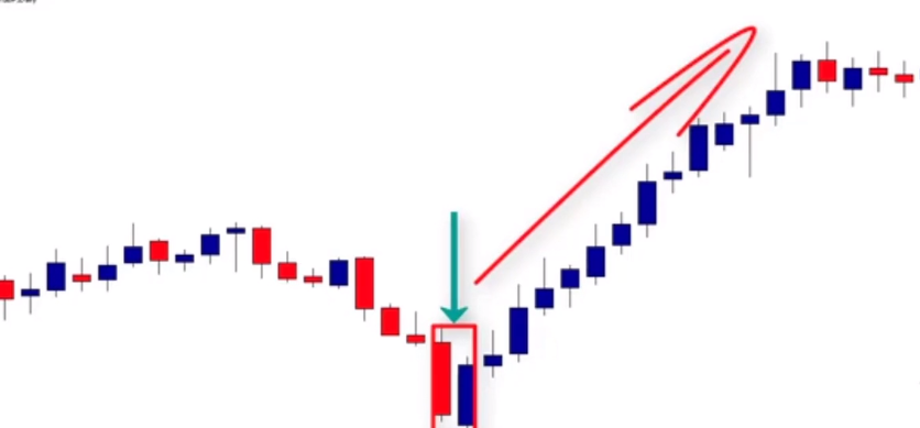
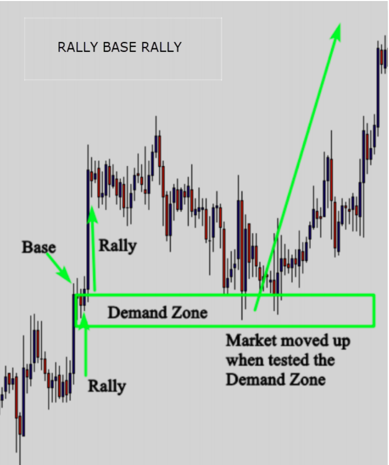
The Drop-Base-Rally pattern
Supply and demand zones form and come in differentshapes and this is the reason why you have to know the different types of supply and demand to be able to identify
them easily. In general, there are two types of supply and demand – the first type is Valley and Peaks and the second one is the continuation pattern.
Valley and Peaks are composed of these formations:
Drop-Base-Rally or Drop-Rally
Look at the example below :

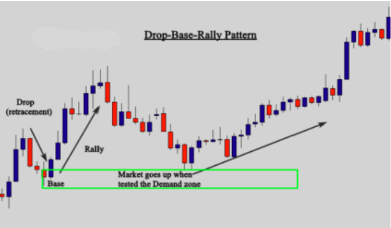
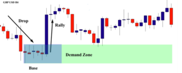
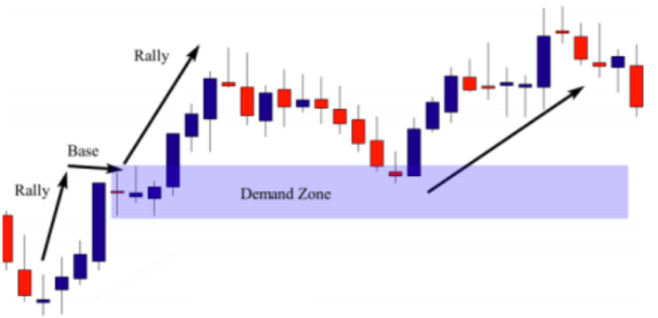
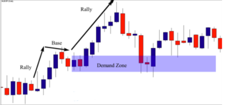
This is an example of a Drop-base-rally and means a move down followed by a pause and then a move up. The drop is a small move that indicates a weak momentum, and the base is where the market consolidates to accumulate enough quantities and then goes back up. When the market returns to the base, which is considered to be a demand zone, there is a high probability that the market will go up again.
Now let’s look at a real chart example to learn more about this pattern:
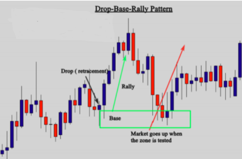
As you can see in the chart above, the market made a short retracement (Drop) before going strongly up, creating a Drop-Base-Rally pattern which is a high probability
Demand zone. In the same chart there is another Drop-Base Rally pattern that I didn’t mention because it is a weak pattern; I picked up only the most powerful one.
So, don’t get confused because the purpose of this part is to help you identify this pattern when you open your chart. It doesn’t matter if it is a high probability pattern or not, because in the next parts I will show you in detail how to differentiate between powerful zones and weak zones that you should ignore.
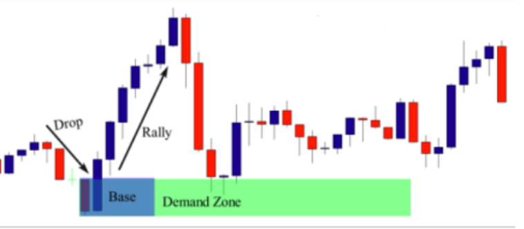
See another Example :
This is another example of a Drop-Base-Rally pattern. The psychology behind this pattern is that banks took the profit of the previous move, and the market moved down forming a retracement or a drop. Banks make another strong move up because of a news release, an economic data point or just because they think this is a good price to buy from.
Don’t bother yourself with fundamentals and trying to understand the reason behind this move; you should just focus on the pattern. Because when you identify the pattern, you know exactly that there is a bank that bought from this zone. You wait for the market to retrace and test this zone, then you take a buy order along with the banks and other financial institutions.
Look at another example below:
This is another example of the Drop-Base Rally Demand zone pattern. In this illustration prices drop and then form a base while in consolidation and then make a significant up move. The base forms our main interest, when price returns to this base, we may expect some buying reaction. As you can see when the market dropped back down to the base which is considered as a demand zone, prices moved up again because there are still significant unfilled orders in this zone. Look at another example below :
The chart above shows a clear Drop Base-Rally demand pattern. This pattern happens frequently in all financial markets, and all time frames – because when financial institutions buy in the market, they leave this pattern as a footprint. If you can identify it, you will be able to predict where banks are going to buy again. Look at this chart again, as you can see, the market drops, and then forms a base, and then makes a strong move up. Sometimes, you will not find a lot of candles that form the base.
One candle is quite enough to form the base, and this candle can be used as a basing candle to draw the zone. We will talk about how to draw the zones in the next lessons. Now look at what happened when the market returned to test the demand zone – as you can see prices were rejected forming a nice Doji candlestick pattern. And this rejection indicates that there are significant unfilled orders in the zone, so as a supply and demand trader, you can use this candlestick pattern as an entry signal to buy the market.
We will learn about entry and exit tactics in the next lessons. Take a look at another example below :

This is another example of the Drop-Base Rally demand zone. As you can see the base is formed only by one candle. When the market returned to test the demand zone, we got a nice inside bar pattern as a signal to enter the market. But as I always say, don’t think of how to enter the market or how to know if it is really a bank order or not – this is not important for the moment because I will explain to you how to enter the market and how to make sure this is a bank order. Now, I want you to please focus on the Drop-Base Rally pattern.
Open your charts and try to look for these patterns in the market. You should master them, otherwise you will have a difficult time trying to understand the whole strategy.
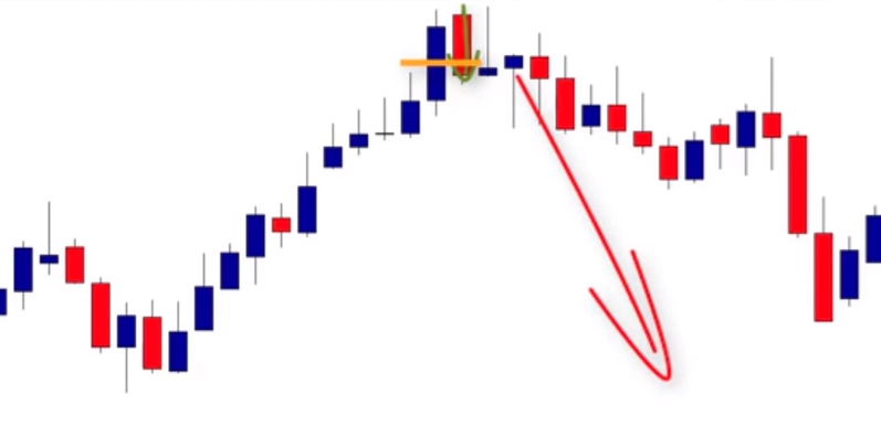
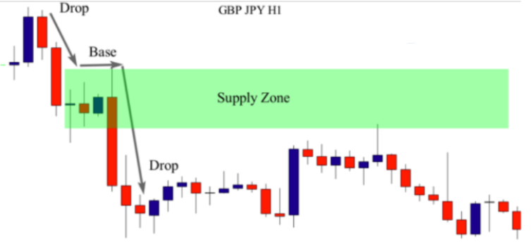
The Rally-Base-Drop pattern
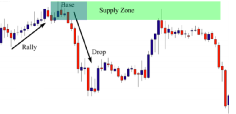
In this lesson, you are going to learn about the Rally-Base- Drop pattern which is the opposite version of the Drop-Base-Rally – look at the illustration below :

The example above shows a Rally-Base-Drop pattern which means a short move up followed by a short accumulation phase and then a move down. The base area is considered to be the supply zone, because the bank that sold the market, still has inventory in the same zone, and this price is very attractive for other banks and financial institutions.
When the market returns to test this zone, there is a high probability that the market goes down. Look at a real a chart example below:

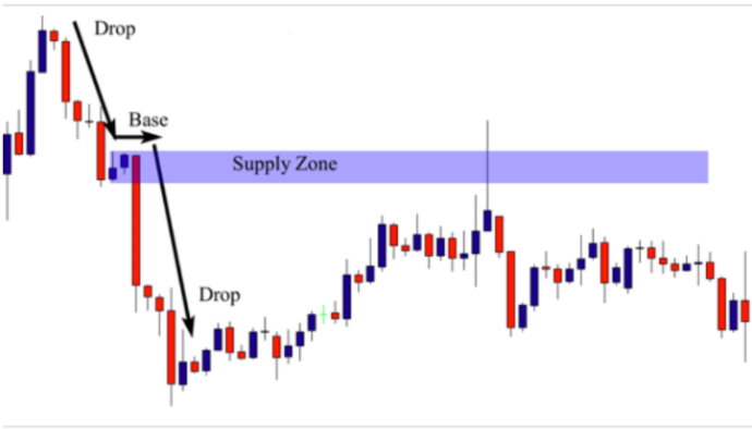
On this chart, you can see the market made a Rally which is a retracement after the previous down move. This Rally or retracement was created after that banks took their profit. The second move down was made after a short accumulation period (look at the Doji candle which represents a consolidation period) followed by a strong move down, after a bank decided to sell the market. This is how a Rally-Base-Drop pattern is created. When the market retraces to test this zone, price will be rejected as you can see in the chart. Long candle tails represent rejection from this level, because the bank that bought from this zone still has quantities as limit orders. Look another example below :

The same thing happened on the chart above. The market was trending down, after the previous move down, and then the market made a short retracement (Rally), and then formed a Doji candle which indicates a pause in the market
(Base).
Then the market moved strongly down to form a Rally-Base-Drop pattern. This pattern tells us that there is a bank that sold from this zone, and when the market retraces to test it, price will be rejected and the market will move down. And that’s exactly what happened. Look at another example below:

In this daily chart above, I’ve labeled an easy rally-base-drop supply zone where the market moved up for a few candles, sideways for a couple, followed by a sharp drop. This pattern is considered as a reversal pattern when it occurs at the end of a move up. Look at what happened when the market returned to test the zone, and, as you can see, the market stopped moving up forming a nice inside bar pattern, and as we know, inside bars means indecision or consolidation. So after the breakout of the inside bar, the market moved down strongly.
If you are used to trading this pattern in combination with price action signals, you will certainly take this trade after the breakout of the inside bar. We will talk about this in the trading tactic lessons. Look at another example below:
The previous example was on the daily chart, and this illustration is on the hourly chart. I will try to give you different examples from different time frames, because these patterns occur in all time frames, and all financial
markets.
Now, back to the chart above – the market was trending up, forming a rally which indicates a move up. It was followed by a small consolidation or a base, and then a very strong move down which is the drop. This Rally-Base-Drop supply zone represents a footprint of a financial institution that sold the market from that level. So what you have to do is simple – follow the footprint and do what the big boys are doing. When the market returned to test the supply zone, prices were rejected, and the market went down strongly. With screen time and practice, you will notice that when the market tests the zone, there are two possibilities:
Either price goes strongly down, because the quantities left in the zone are quite enough to drop the market down.
Or, the market will still need time to accumulate enough quantities – so we can see few candles that form an accumulation phase before the strong move down. Look at another example:

As you can see in the daily chart above, this is another Rally-Base-Drop Supply zone that was formed in this market. Sometimes the base or the consolidation is not necessarily formed by multiple candles, and as you can see in this example, the market moved up (rally) and then moved down strongly (drop). So the base was formed only by one candle. This can happen frequently in the market.
So if you find patterns like these where the market rallies and drops surprisingly, these setups are still considered a rally-base-drop.
The Drop-Base-Drop pattern
2- Continuation Patterns
A continuation pattern is a pause in the market before price resumes in a current trend. In an uptrend it requires a rally
followed by a base followed by another rally.
A continuation pattern in a downtrend requires a drop followed by a base followed by another drop. A continuation pattern is composed of these formations:
Rally-Base-Rally
Drop-Base-Drop
In the continuation pattern, the market doesn’t retrace, but pauses and enters in an accumulation phase before moving strongly in the same direction. Look at an example below of a Drop-Base-Drop.
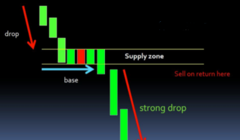
This pattern happens in a downtrend – the market goes strongly down, and because of the lack of quantity, it accumulates for a short period of time to get enough quantity before moving strongly down again. Let’s view a real chart example below:

The chart above shows a clear Drop-Base-Drop Continuation pattern – as you can see there is no retracement and the price pauses only for a short period of time before moving down strongly again. When the market retraced back to test the zone, the price was rejected from this area. Both pin bars rejecting from this zone represent a clear confirmation to enter the market. Look at another example below:
On the chart above, you can see the market was trending down forming this drop-base-drop continuation pattern, when the market returned to test the zone, prices were rejected forming a nice pin bar signal. If you are used to using pin bars as entry signals, you will understand that this price action pattern is a confirmation to short the market. Look at another example below:
This is another example of a drop-base-drop supply zone, a continuation pattern that occurs frequently during downtrend markets. Look at what happened when the market retraced back to test the supply zone. As you can see, the market was clearly rejected. The formation of the clear pin bar at the supply zone indicates that there are significant limit orders left in the zone.
So as a price action trader, you can enter immediately after the close of the pin bar – your stop loss is above the pin bar’s shadow and your profit target is the next support level. We will talk about this in the trading tactic lessons but for now I want you to focus on learning how to identify this pattern.
The Rally-Base-Rally pattern
The second continuation pattern that forms in an uptrend is called, Rally-Base-Rally. This means a move up followed by a short accumulation phase followed by a move up. See the example below:

As you can see in the chart above, the market moved up strongly, and paused for a short period of time before making another move up. When price retraces to test this zone, it will find strong rejection because
there are limit orders of other banks in this zone.
The rejection of price indicates that the zone is very powerful and it attracts other financial institutions to enter and buy the market. Look at the whole picture below to understand how powerful this zone is
The chart above is the same chart we discussed before. Let me explain to you what happened in the chart and how this Rally-Base-Rally demand zone was created. Before the first rally, we had bank traders placing long trades in
the consolidation. When the banks buy orders, the retail traders sell orders, the market rallies higher. Now that the bank traders are in profitable trades, the next thing they will want to do is secure some of their profits. When they decide to do this, they consume all of the buy orders coming into the market from retail traders who have begun entering long trades due to size of the
rally.
The consumption of buy orders means the market makes a small move lower, this creates the base, which the demand zones eventually forms off of. The move lower causes a large number of retail traders who went long on the rally higher to close their trades at a loss which puts a lot of sell orders into the market. In addition to this, there will be a small number of retail traders who think the move down is a trend reversal meaning they will place sell trades with the expectation that the market is going to move lower.
With two sets of retail traders putting the same type of orders in the market (sell orders), the bank begins buying again knowing they will make the market move higher, and in the process cause anybody who sold on the move lower to close their trades at a loss which ends up being the bank traders profits. But during the buying process, the bank will not find enough sellers and it can’t buy all of the supply, so it will leave significant limit orders in the same level which is a demand zone; and when the market returns to test it, prices will be rejected. And that’s what happened in the chart above. Look at another chart example :
On this daily chart you can see the market was trending up forming a Rally-Base-Rally Demand zone. The base was not a retracement – there was only a small pause before
another move up. When the market retraced to test the zone, we got a nice failed pin bar that can be used as an entry signal. Look at another example below:
On this chart, we see another Rally-Base-Rally Demand zone pattern. A rally is a move up followed by a small pause and then another move up. Don’t bother yourself with trying to understand how this pattern was created – what matters most is your ability to identify it on your chart, because this pattern occurs frequently in the market.
This may not all be clear yet but what I want you to understand in this lesson is that banks monopolize financial markets and when they enter the market, they leave their
footprints. To identify where banks are selling and buying you should master these patterns, because they buy or sell from either a Valley or a Peak pattern that are composed of a Drop-Base-Rally which is a move down followed by a retracement and a move up. Or A Rally-Base-Drop which is a move up followed by a retracement followed by a move down.
In a strong trending market, they form a continuation pattern that is composed of a Rally-Base-Rally in an uptrend which is a move up followed by a pause and then another move up. Or a Drop-Base-Drop which is a move down followed by a pause and then another move down. You do not need to try to know how to enter the market right now – focus only on the patterns because if you can identify the patterns, you have already done 50% of the work. Now you should do your homework – open your charts and try to identify these patterns. This exercise will help you train your eyes to find these patterns easily on your charts.
Hi everyone. In this lesson we’re going to learn how to identify supply and demand zones to be able to identify these key areas on our charts. You have to know that there are two types of supply and demand.
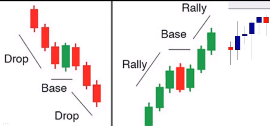
The first type of supply and demand zone that we’ll focus on is the drop-base- drop pattern. The second is the rally-base-rally pattern as you can see on the right. These patterns are considered continuation patterns. So let me break it down. If a supply or demand zone forms during a trend move, it’s either a drop-based drop in the case of a downtrend, or a rally-based rally in the case of an uptrend. So let’s first start with the continuation pattern, which is the rally-based rally. The rally-based rally is a type of demand zone which forms during an up move followed by a small consolidation, which is referred to as a base, and then followed by another rally, which creates the demand zone itself.

A rally-based rally always creates a demand zone. It will never create a supply zone. So now let’s look at a real chart example. This is a rally followed by a small consolidation followed by another rally.
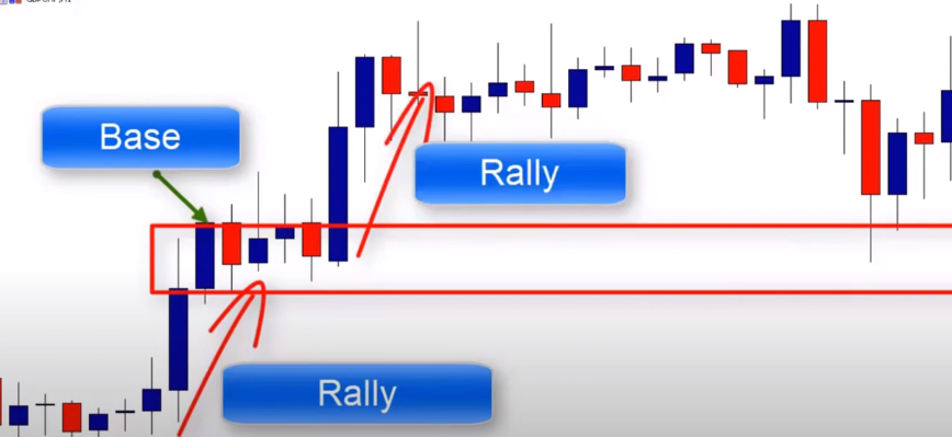
This is a rally-based rally demand zone formed in an uptrend market. Will the market return to test this zone? Well, there is a high probability that the market will go up again because this move is made by a financial institution, and other pending orders are still placed there. And as you can see, the market did return to test that zone, and prices were rejected. Let’s look at another example.
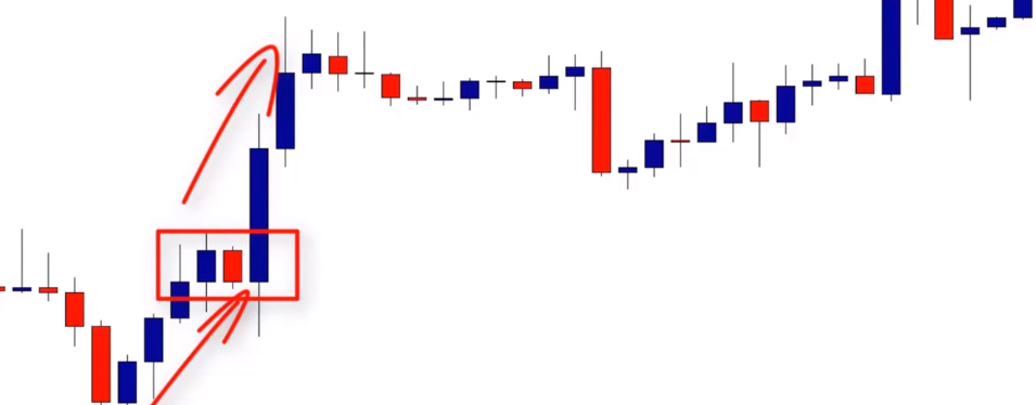
Again, we have another rally-based, rally-continuation pattern. Market moved strongly higher, paused a bit, and moved strongly higher again, forming a great demand zone. Will the market return to test this zone? Well, we can likely predict a huge move up at this area because we know a lot of pending orders are likely to still be filled. Here’s another example.

As we can see here, we have a rally followed by a consolidation and another rally that creates the demand zone. A rally-based rally is a continuation pattern that forms during an up move. The first rally is a move up followed by a small consolidation followed by another move higher that creates the demand zone.
Now let’s move to the next continuation pattern, which is the drop-based drop pattern. The drop-based drop is the exact opposite of the rally-based rally, the only similarity being that both form during trending markets. Where a rally-based rally structure will always form a demand zone and an uptrend, a drop-based drop will always form a supply zone during a downtrend. A drop down followed by consolidation is referred to the base, and another move down that creates a supply zone. If the market was to return to this zone, it should push the market lower. Let’s look at an example.

The market is trending lower, creates a drop base drop structure that indicates a supply zone. So as you can see, in this drop, which is a move down followed by a base and another drop down, when the market returns to test the supply zone, there’s a high probability that the market will go lower, and that’s exactly what happened.
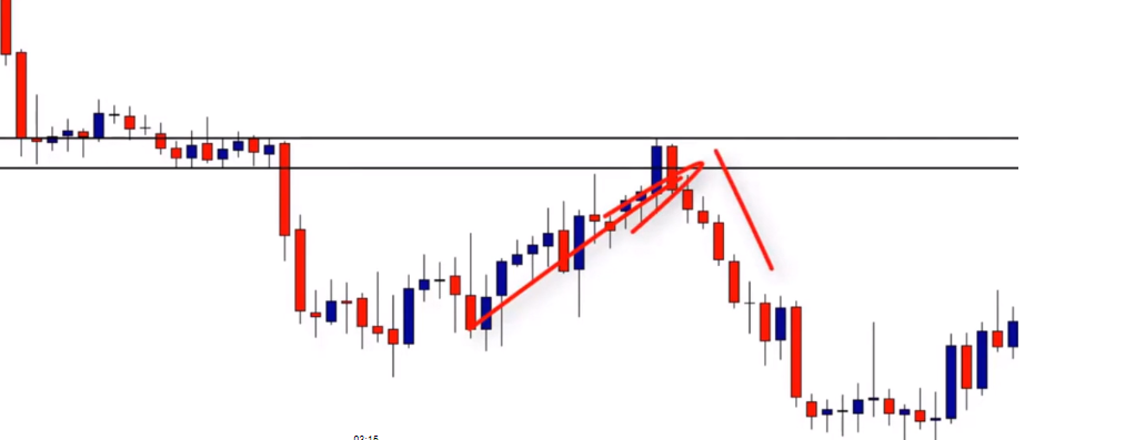
When the market reaches that supply zone, the market moves lower. This is another example of a drop followed by a base, followed by a drop. When the market returns to test this supply zone, prices should likely go lower. Let’s look at this example.
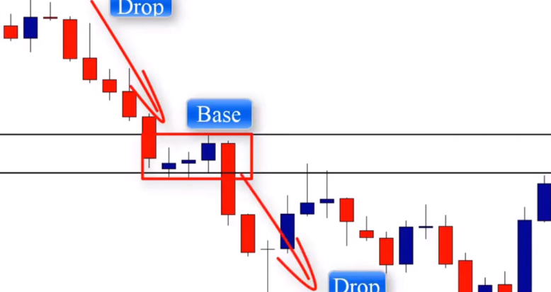
This is a daily chart that shows a clear drop, base drop, continuation pattern. So this is the first move down at the base, or consolidation, followed by another move down. This is the supply zone that the market will return to test, and it was rejected.
Now let’s talk about another different demand zone pattern, which is the drop base rally. The drop base rally is a structure which always forms a demand zone in the market.
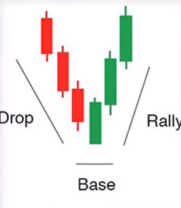
This pattern differs from what we just looked at, mainly because of the location in the market. So where both the rally-based rally and drop-based zones only form during trending markets, the drop-based rally zone will be found when the market changes from moving down to up. If the market was to return to the drop-based rally demand zone, it should push the market in the direction of the rally, which created the zone. Let’s look at this with another example.
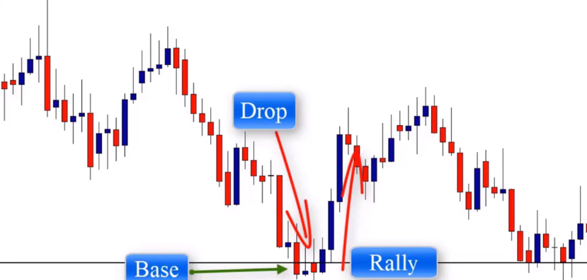
As you can see in this daily chart, we have a clear drop-based rally pattern that formed at the end of the downtrend. The drop is a move down followed by consolidation followed by a move up. And this move creates strong demand zones. When the market returns to test it, it will probably go higher so we can draw our demand zone here and enter at the resistance level located here.

As you can see, this trade opportunity provides us with more than 1, 2, or 3 risk to reward ratio. We’ll talk about trading strategies like this in future lessons. Now I just want you to focus on identifying the patterns. Here’s another example.

Here we have another drop-based rally demand zone. As you can see in the daily chart, we have a drop-based rally. You should know that sometimes we can find these when they do form the base, as in this example. So, after drawing the zone, we can wait for a price action setup to form at the zone. As you can see here, we have a nice doji pattern that formed a little bit far from the zone but the market went strongly higher.

In this example we see a drop base rally. This is a very strong move that indicates that a bank or financial institution placed an order here.

So will the market approach this demand zone? Will we see another strong move higher? As you can see that’s exactly what happened when the price reached the demand zone, the market rejected and went strongly higher.
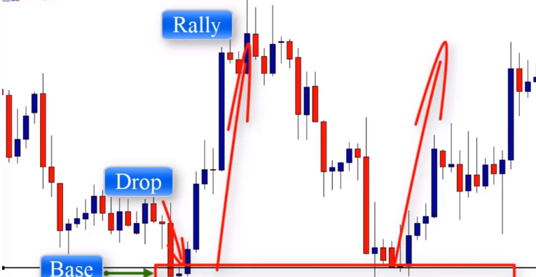
On the opposite side of the scale, we have the rally base drop zone. The zone forming the market reverses from moving higher to moving lower.
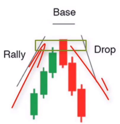
So we have a rally, which is a move up, followed by a consolidation, and then a move lower. A base is the small pause or consolidation. So you know, sometimes we can find a supply or demand pattern without a base, meaning without the small pause or consolidation. But as long as the market makes a move up, then forms a zone, it’s still considered a rally base drop. Now let me give you an example of a rally base drop supply zone. Here we have a daily chart.
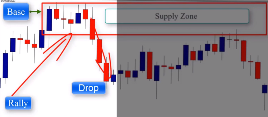
And this is a clear example of a rally base drop supply zone. This pattern occurs when the market reverses from moving higher to moving lower. So we have the move up followed by our base, followed by a move down, and when the market approaches the supply zone, we can predict another move lower and that’s what happened. This is a clear, doji, candle price action setup that formed at the supply zone and confirmed our entry

Let’s look at another example. On this daily chart, we have a clear demand zone at the bottom, a move up, form the base, and then the drop.

And we have a clear supply zone that formed at the end of the uptrend. And as you can see, when the market returned to test the supply zone, we get a nice pin bar that rejected from the zone. either tell of the bar will reject to indicate that another move down is going to likely take place. So if you check your charts you’ll find a lot of examples of rally based drop supply zones or drop based rally demand zones or rally based rally or drop based drop zones. I highly recommend going to your charts and try to find these patterns because this exercise will help train your eyes to this particular type of pattern and will help you find these more easily.
Introduction to drawing supply
and demand zones
In the last lesson you learned how to identify supply and demand patterns on your charts, and you should take your time to learn about them as much as you can. In this lesson you will learn how to draw these zones the right way.
The zone is called the base, and it is the beginning of the strong move made by banks or any other financial institution. This step is very important because if you can draw the zones correctly, you will be able to identify precisely the next biggest move and join big players at the right time. Banks and financial institutions take two types of orders; sometimes they take market orders because they need quantity to drive the market up or down. In this case, you will have an opportunity to enter with them by waiting for a candlestick confirmation pattern that forms in the zone, which we will talk about in the future lessons.
Sometimes banks take limit orders, and when the market tests the zone, prices move strongly up or down. Here, you can also take a limit order without waiting for a confirmation. However, if you don’t know how to draw the zone correctly, you will miss this opportunity to make money with big players. This is the reason why you should know how to draw supply and demand zones correctly. The zone of supply and demand can be identified by drawing
two features:
The Proximal Line : the price closest to current price
The Distal Line : the price furthest away from the current
price.
See the illustration below:
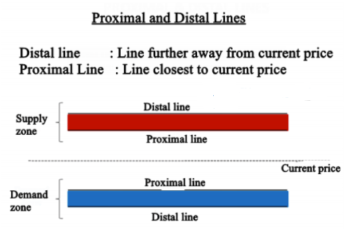
When drawing a supply zone, we draw a proximal line that covers the lower shadows of the basing candle, and the distal line at the upper shadow of the candle. If the candle has no upper shadow, we draw the distal line only at the lowest close of the candle. Look at the example below :

As you can see in the chart above this is a supply zone that was formed in the market – why is is a supply zone? …because it is composed of a Rally-Base Drop. The Rally is the short retracement (blue candles). And the base is the Doji candle (red candle) that represents a pause in the market. And the drop is the strong move down in the market.
The Doji candle is called the basing candle, and this is where we draw the zone. As you can see, the Distal line covers the upper shadow and the proximal line covers the lower shadow. This is how we draw a supply zone. Now let’s move to the demand zone – to draw the demand zone, we do the same thing but this time we draw a proximal line at the upper shadow of the basing candle, and a distal line at the lowest close of the candle. If the candle has a lower shadow, the distal line should cover it as well. Look at the example below :
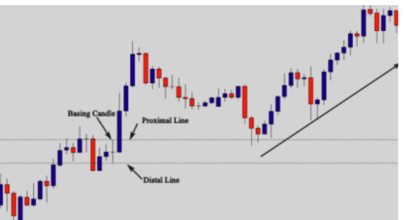
As you can see in the chart above, this is a clear demand zone that is composed by a Rally-Base-Rally. The basing candle is a Doji candle. Why didn’t we take the previous
candles as basing candles.? The answer is simple: the basing candle is the last candle before the strong move. In this example, the Doji candle was the last candle that pauses before the market made a strong move upward. So we draw the proximal line at the upper shadow and the distal line at the lower shadow to get the potential demand zone.
When drawing supply and demand zones, you will deal with different basing candles such as pin bars candles, inside bars, or engulfing bars. You should be able to draw your proximal and distal lines without confusion when you spot those basing candles – that’s what you will learn in the next lessons.
The pin bar as a basing candle
A pin bar consists of one price bar, typically a candlestick price bar, which represents a sharp reversal and rejection of price. The pin bar reversal, as it is sometimes called, is defined by a long tail and the tail is also referred to as a shadow or wick.
The area between the open and close of the pin bar is called the real body, and pin bars generally have small real bodies in comparison to the long tails. Look at the illustration below to see how it looks on your chart.
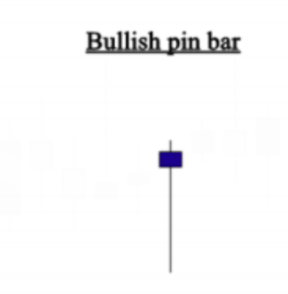
This is a bullish pin bar, when it forms as a basing candle in a demand zone, we simply draw the proximal line at the upper shadow, and the distal line at the lower shadow. Look at the example below:

As you can see by drawing a proximal line and a distal line we get a potential demand zone. But if the pin bar doesn’t have a nose, we can draw the proximal line at the close price of the candle.
Now let’s see a real chart example to show you how to draw a demand zone when dealing with a pin bar as a basing candle. Check out the chart below:
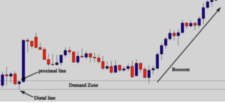
As you can see in the chart above, there is a very strong move made by a bank or another financial institution. Retail traders can’t move the market this way, so it is an order of a big player in the market.
We don’t bother ourselves with fundamentals to understand the reasons behind this move. Who cares? All what we know as price action traders is that this move was made by a financial institution, and that this zone becomes very attractive in the market. When price goes back to test the zone, the market is likely to go up. To draw this zone, we should look at the basing candle, and in this case, we have a bullish pin bar as a basing candle. So we draw the proximal line at the upper shadow and the distal line at the lower shadow to get a correct demand zone. And as you can see, when the market went back to test it, it was rejected and buyers drove the market up. Look at another example below:
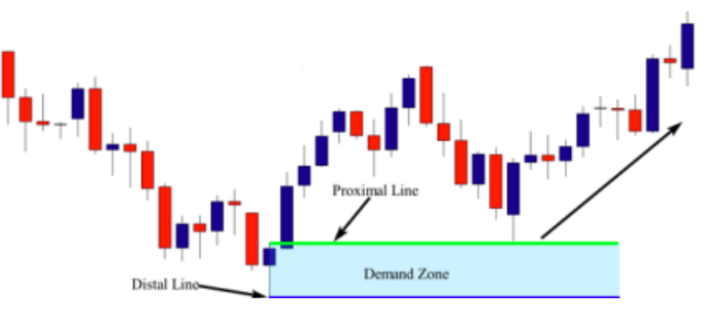
On this chart, which is a clear Drop-Base-Rally demand zone, the basing candle is the last candle that was formed before this strong move up. So when you identify the Demand zone and the Basing candle, you simply draw the proximal line at the upper shadow of the pin bar (nose). If there is no nose, you draw the proximal at the close of the candle, and the distal at the lower shadow. So, by drawing a proximal line and a distal line, we get a nice demand zone.
Look at another example below:

On this chart, which shows a clear demand zone, you don’t need to waste your time to decide whether it is a drop-base-rally demand zone, or a rally-base-rally. These patterns were used only to help you identify the zones. But
when you open your charts, and you spot a strong move up (big blue candles), you should have no doubt that there is a bank behind this move. So look at only the last candle that was formed before this strong move up. In this case, we have a nice pin bar as our basing candle. So to draw the demand zone, you draw the proximal line at the nose of the candle, and the distal at the lower shadow. When the market retraced back to test the demand zone, it moved up again as it was expected. Look at another example below:
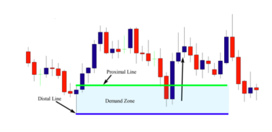
On this daily chart, and the demand zone that was formed is a drop-base rally pattern, the last candle that was formed before this move up is this nice pin bar candlestick pattern. So to draw the zone, you simply draw the proximal line at the nose, and the distal line at the lower shadow. As you can see, drawing demand zones using pin bars as basing candles is not complicated, let’s move now to the next part of this lesson to see how to draw supply zones using this price action pattern as a basing candle.
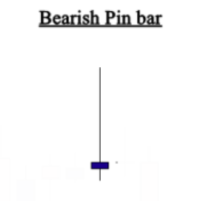
This is a bearish pin bar, when it forms as a basing candle in a supply zone. We simply draw the distal line at the upper shadow and a proximal line at the lower shadow. Look at the example below:

So as you can see, by drawing a distal line and a proximal line, we get the supply zone, when price tests this zone, the market goes strongly up. If the bearish pin bar has no nose, you can draw the proximal line at the close of the pin
bar. Now let me give you an example of how to draw a supply zone when a bearish pin bar forms as a basing candle. Look at the chart below:
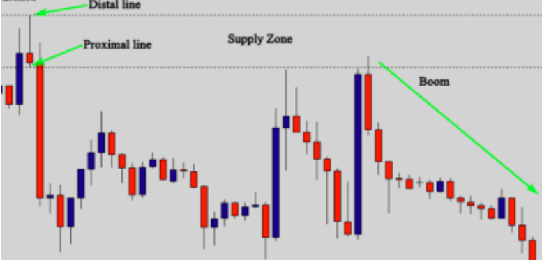
So as you can see, by drawing a distal line and a proximal line, we get the supply zone, when price tests this zone, the market goes strongly up. If the bearish pin bar has no nose, you can draw the proximal line at the close of the pin bar.
Now let me give you an example of how to draw a supply zone when a bearish pin bar forms as a basing candle. Look at the chart below: In the chart above, we identified a strong move that was made by a bank. The reason behind this explosion is likely from an economic news release. As price action traders, this is not important for us. We don’t try to analyze news and how they will affect the market. What matters for us is that this move was made by a big player. And when the market tests this zone, there is a high probability that the market will go down.
The bearish pin bar was the basing candle, and as I explained, when it comes to a bearish pin bar, we draw the distal line at the upper shadow and the proximal line at the lower shadow and then we get a correct supply zone.
As you can see in the chart, when the price tests the supply zone, the market goes down strongly, because there were quantities as limit orders placed in that zone.Look at another example below:
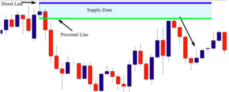
This is an example on a 1H chart; the market formed a nice supply zone, the last candle that was formed before this strong move down is a pin bar. So to draw the supply zone, you simply draw the proximal line at the lower shadow of the candle and the distal line at the upper shadow (nose). When the market retraced back to test the supply zone, prices moved down as it was expected. Look at another chart example below:
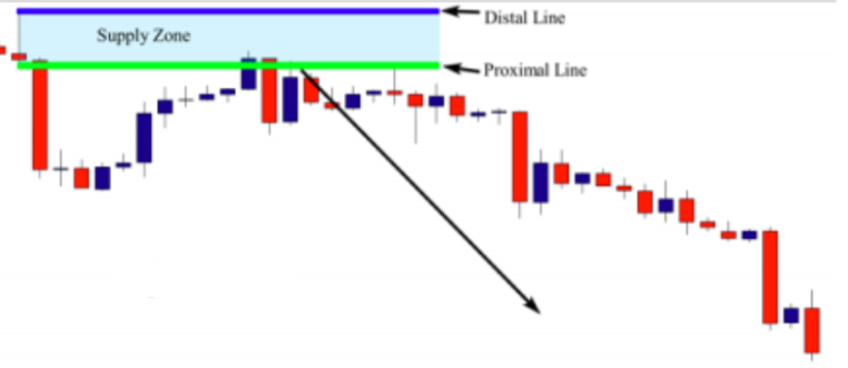
This is a 4H chart and another supply zone that was formed during a downtrend. When you identify the zone, look at the last candle that was formed before the strong move down. If it is a bearish pin bar pattern, you do the same thing we did previously, you draw the proximal line at the lower shadow and the distal at the upper shadow.look at the last example below :
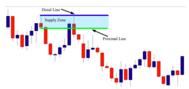
On this chart, the market formed a rally-base-drop supply zone. For chart pattern traders, they consider this pattern as a double top continuation pattern – the difference between you as a supply and demand trader, and a chart pattern trader, is the timing. You will not wait for the neck to be broken and for another pullback to enter this double top. You will be in the market before chart pattern traders, because you know that this is a supply zone, and all you have to do is to draw the zone by drawing a proximal line at the nose of the pin bar and a distal line at the upper shadow. And when prices returned to test the zone and form a nice price action setup, you will enter the market with confidence.
Now, you have to do your homework, open your charts, and try to find supply and demand zones with pin bars as basing candles. This exercise will help you better draw the zones easily when the basing candle is a pin bar.
The Engulfing bar as a basing candle
After a supply or a demand zone has been identified, we now move to drawing that zone. The zone is called the base, and it is the beginning of the strong move made by banks or any other financial institution. This step is very
important because if you can draw the zones correctly, you will be able to identify precisely the next biggest move and join big players at theright time.
Banks and financial institutions take two types of orders – one is market orders because they need quantities to drive the market up or down. And in this case, you will have an opportunity to enter with them by waiting for a candlestick confirmation pattern that forms in the zone, The other is limit orders – when the market tests the zone, prices move strongly up or down, and you need to take a limit order as well without waiting for a confirmation. But, if you don’t know how to draw the zone correctly, you can miss this opportunity to make money with the big players.
This is the reason why you should know how to draw supply and demand zones the correct way. The zone of supply and demand can be identified by drawing two features:
The Distal line: the price closest to current price.
The Proximal line: the price furthest away from the current price.
When drawing supply and demand zones, you will deal with different basing candles, such as pin bars candles, inside bars, engulfing bars, dojis…. .you should be able to draw your proximal and distal lines without confusion when you spot those basing candles. In this course, I have explained in detail how to draw the zone professionally using different candlestick patterns as basing candles, and in this course, I’ll show you how to use the engulfing bar as a basing candle to draw your supply and demand zones. The engulfing bar basing candle The engulfing bar formation consists of at least two candles, where the second candle completely engulfs the previous one. It provides a reversal signal when it is at the end of a downtrend or an uptrend, and a continuation signal when it forms with the trend. Look at an example of a bearish engulfing bar:
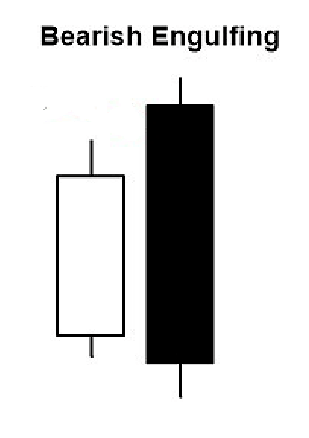
The bearish engulfing bar consists of two candles. The second candle needs to close above the first candle’s body; the shadows (tails and noses) don’t need to be engulfed, but provides a better opportunity. We need at least one candle in the base and sometimes we can find more than one candle. This is normal if the previous candle’s body is
completely engulfed. How to draw a supply and demand zone using bearish engulfing bars as a basing candle?

To draw a supply zone using engulfing bars, you only need to draw the Distal line at the upper shadow or the close of the second bar. And the proximal line at the close of the prior bar or the open of the prior bar if it is bullish. See the example below :

As you can see in this example above, the second candle covers only the real body of the prior candle, so the distal line should be drawn at the upper shadow of the prior candle, and the proximal line is normally drawn at the open of the
prior candle to get a supply zone. Now let me show you a real chart example to help you understand how to draw a supply zone using a bearish engulfing bar pattern as basing candles.

As you can see in the chart above, the basing candle was a bearish engulfing bar. The second candle engulfed the real body of the prior candle, and to draw the supply zone,we draw a distal line at the upper shadow of the prior candle, and a proximal line at the open.
As you can see, when the market tested the supply zone, the price went strongly down, because the area is very powerful. Look at another example :
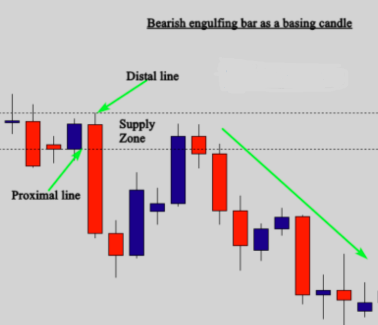
As you can see in daily chart above, we have identified a very strong downward move made by a bank creating an imbalance area, and this area is called a supply zone. To draw the supply zone correctly, we need to find the basing candle
which is an engulfing bar as mentioned in the
chart.
Here, in this case, the second candle covered totally the first one, so we draw the distal line at the upper shadow of the second candle, and the proximal line at the open price of the first candle. This is how we draw a supply zone using a bearish engulfing bar pattern as a basing candle. Look at another example below:
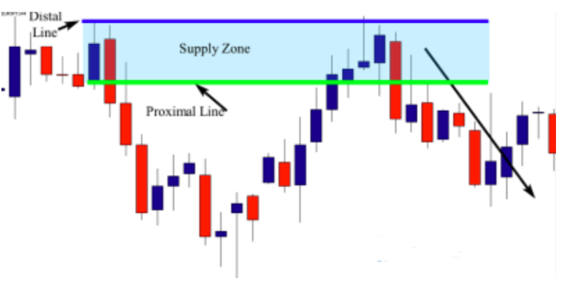
The chart above shows a clear supply zone. Look at the three red candles – they are big candles and very strong, and this move down indicates that the big boys are behind this move. When you identify the zone, things become easier. All that you need to do is to draw the zone and wait for a price action setup to form. This pattern is also considered as a double top reversal pattern, but the problem with trading patterns is that we can’t differentiate between strong and weak chart patterns. If you can ask any trader about the criteria he depends on to decide whether to trade a double top or ignore it, he will not give you a good answer. As a supply and demand trader, your perception of what is going on the market is completely different, because you know that there are banks and retail traders; and when banks enter the market, they leave their footprints. As it is shown in the example above, the strong move down is a bank or a financial institution order. So, you will simply look at the basing candle, which is an engulfing bar, and then, you draw the proximal at the close of the first bar, and the distal line at the upper shadow of the same candle. When prices retraced back to test the supply zone, the market formed a nice pin bar candlestick pattern that can be used as an entry signal to place a sell order. Look at another chart example below:

On this chart, we see that a clear rally-base-drop supply zone has been formed. To draw the zone, you draw the proximal line at the close of the first bar, and the distal line at the upper shadow of the second candle. When
the market returned to test the supply zone, we had a nice Doji candlestick pattern that was formed at the zone to confirm our entry. In the trading tactics section, you will learn how to enter and exit when trading supply and demand zones. Now let’s move to study how to draw a demand zone using a bullish engulfing bar pattern.
The bullish engulfing bar pattern is the opposite of the bearish engulfing bar, and it also consists of two candles, the second one totally engulfs
the first candle. When the bullish candle forms in a downtrend market, it could be considered as a reversal pattern, and when it forms in a trending market, it can be regarded as a continuation pattern. Look the illustration below to see how it looks like :
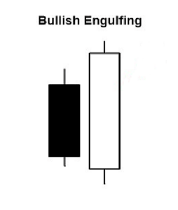
As you can see in the illustration above, the prior candle is entirely engulfed by the second one; sometimes the shadows and noses are not engulfed, but this is not a problem while the body is totally engulfed. When the bullish engulfing bar forms in a demand zone, it becomes a basing candle on which we draw the zones. If it happens on a higher time frame demand zone, it becomes more powerful.
To draw a demand zone using a bullish engulfing bar as a basing candle, you only need to draw a proximal line at the close of the first candle, and a distal line at the lower shadow of the second candle. Look at the illustration below :

In the illustration above, the first candle was totally engulfed, so the distal line was drawn at the lower shadow of the second candle, and the proximal line was drawn at the close of the first candle. See the real chart example below:

As you can see, we have a rally-drop rally pattern, and the second bar engulfed the first one, so we can draw the distal line at the lower shadow of the second candle and the proximal line at the close of the first candle to get a correct
demand zone. But if the second bar only engulfed the real body of the first candle, we can draw the distal line at the lower shadow of the first candle and the proximal line at the close of it. Look at the illustration below to understand more.
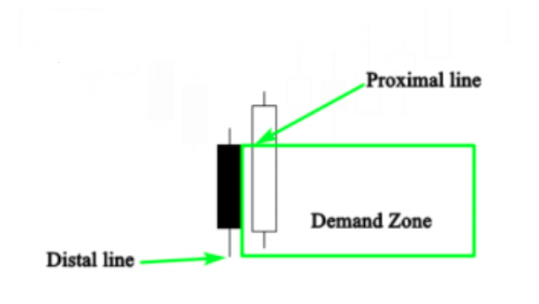
As you can see in the illustration above, the second bar covered only the real body of the first candle, so, here, in this case, we draw the distal line at the lower shadow of the first candle. See the real chart example below to understand
more :
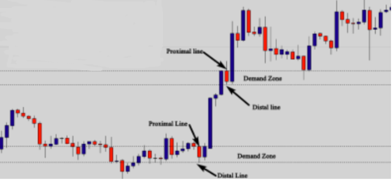
As shown in the illustration above, the distal line was drawn at the lower shadow of the first candle because it was not fully engulfed. As you can see, we got two powerful demand zones. When the market approached the second zone, the price was rejected, and it went strongly up. Look at another example below
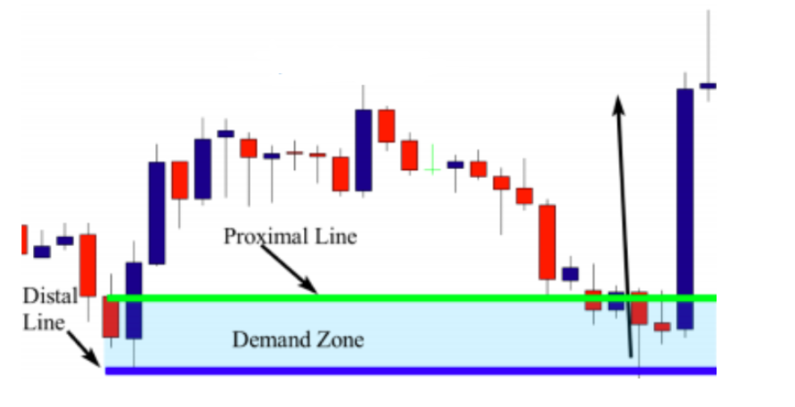
In this H4 chart, we have a drop-base-rally demand zone. The last bar that was formed before this move up is the engulfing bar.as you can see the first bar was totally engulfed. To draw
the demand zone, you draw the proximal line at the close of the first bar, and the distal line at the lower shadow of the mother bar. When the market returned to test the demand zone, prices were rejected, forming a nice pin bar pattern.
To enter this trade, you will only place a buy order at the close of the pin bar and a stop loss below the distal line – the profit target is going to be the next resistance level. This is not the
most important for the moment because I will explain to you in detail how to enter and exit your trade in the trading tactics section. I want you now to focus only on drawing the zones correctly, so look at another example below :

In this H1 chart, we have a drop-base-rally demand zone – look at the two blue candles – they are big and strong, and this indicates that there is a bank behind this move. Before this demand zone, look left and see the big red candle, it is also a big and strong candle, and it is considered as a robust supply zone. I ignored it because what I want to teach you here is only how to draw demand zones using engulfing bars as basing candles.
As you can see, when the market returned to test the demand zone, we got a nice pin bar that was strongly rejected confirming the zone. So to enter the market, you only need to place a buy order at the close of the pin bar, and the stop loss below the distal line and the profit target is the next supply zone.
The inside bar as a basing candle
An inside bar pattern are two bars in which the inside bar is smaller and within the high to low range of the prior bar. The high is lower than the previous bar high, and the low is higher than the previous bar’s low. Its relative position can be at the top, the middle or the bottom of the prior bar. The prior bar, the bar before the inside bar, is often referred to as the mother bar, and sometimes see an inside bar referred to as IB, and its mother bar referred to as a MB.
See the illustration below:
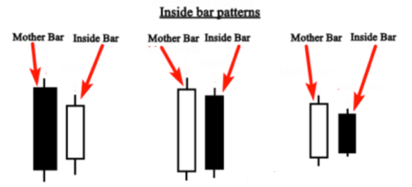
As you can see in the illustration above the mother bar is always followed by a small body called the inside bar – the pattern can be bullish or bearish, it all depends on the market context. What matters for us is how to use it as a basing candle to draw a supply or a demand zone, and when it happens at the beginning of a bank move in the market.
Bullish inside bar as a basing candle
The bullish inside bar occurs either with the trend, and it is considered as a continuation pattern or at the bottom of a downtrend, and considered a bullish pattern. When it happens at the beginning of a strong move (financial institution order), we need to know how to draw the demand zone correctly using this pattern because when the market approaches the zone, price will go strongly higher.
When we identify a strong move made by a bank, we look at the beginning of the move to draw the zone. If the beginning of this move started with a bullish inside bar, we simply draw the distal line at the lower shadow of the mother bar, and the proximal line at the close of the inside bar. See the illustration below:
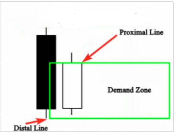
We identify the lower shadow of the mother bar and the close of the inside bar to get a correct demand zone. Now let me give you a real chart example to understand this better:

The chart example above shows a powerful demand zone, and you can see the beginning of this huge move was made by an inside bar. To draw your demand zone, you only need to draw the proximal line at the close of the inside bar and the distal line at the lower of the mother bar’s shadow. This zone is considered to be a very powerful demand zone, as evidenced by the large blue bullish candle – this is a clear bank order, because nobody can move the market this way. You would need millions of dollars to move the market strongly up.look at another example :

On the chart above, we had a strong move up forming a nice demand zone. The basing candle is obviously an inside bar. So to draw the zone, you simply draw theproximal at the close of the inside bar and the distal at
the lower shadow of the mother bar. As you can see, when the market returned to test the zone, we had two Dojis candlestick patterns. To enter this trade, you either place an entry order at the close of the first Doji or at the second one and your stoploss should be below the distal line. The profit target is going to be the next resistance level. This trade offers more than 4:1 reward to risk ratio. You will learn in detail how to enter and exit your trades in future lessons. Focus now on how to draw the zone, because drawing the zone correctly will help you better enter the market at the right time. Look at another example below :

On this 4H chart, as you can see the market made a huge move up forming a strong demand zone. Look at the big blue candle. When you see charts like these, don’t waste your time trying to know if it is a rally-base-rally or a
drop-base rally – you don’t have to care about that in cases like this, because what matters is the move, and here the move is clear and strong.
The basing candle can be considered either a small pin bar or an inside bar, but in this case, it is the same. If it is considered a pin bar, you draw the proximal line at the upper shadow of the candle, and the distal at the lower shadow. If you consider it an inside bar, you draw the proximal line at the close of the inside bar, and the distal line at the lower shadow of the mother bar. As you can see, we get approximately the same demand zone. When the market returned to test the zone, prices moved up strongly.
To enter this trade, you place your entry after the breakout of the inside bar that was formed (after the rejected tailed bar), and your stop loss should be placed below the distal line. The profit target is going to be placed at the next resistance level.
Bearish inside bar as a basing candle
The bearish inside bar occurs either with the trend and it is considered a continuation pattern but a reversal pattern if at the top of an uptrend. When it happens in the beginning of a strong move (Bank order), it becomes a basing candle, and it allows us to draw a supply zone. See the illustration below:
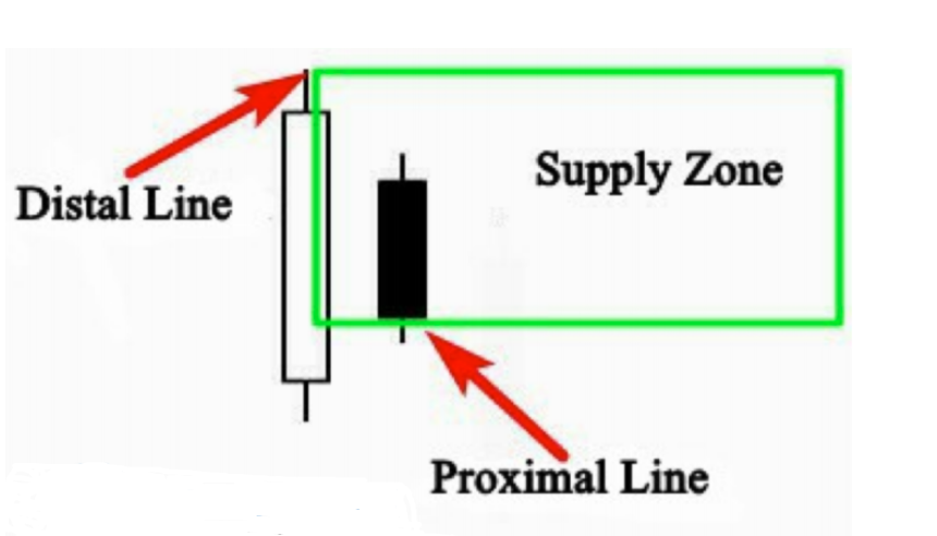
To draw a supply zone using a bearish inside bar as a basing candle, you just draw the proximal at the close of the inside bar and the distal line at the upper shadow of the mother bar. When the inside bar (baby) is bullish, you draw the proximal line at the open of the candle. Now let me give you a real chart example to show you how you can use bearish inside bars as basing candles to draw a correct supply zone.

As you can see in the chart above, we identified a good supply zone and the beginning of the move was made by a bearish inside bar. So to draw a correct supply zone, we draw the distal line at the upper shadow of the mother bar and the proximal line at the close of the inside bar. When the market tested this area, price was rejected, and the market went down strongly. Look at another example below:

On this chart, we have a clear drop-base-drop supply zone, with the basing candle is this bearish inside bar. So to draw the zone, you draw the proximal line at the close of the inside bar, and the distal line at the upper shadow of the
mother bar. When the market returned to test the supply zone, prices formed a nice inside bar that can be used as an entry
signal…and then moved down. When you draw the supply zone, and you get a signal after the retrace back to the zone, trading becomes easier, because you will only place an entry at the close of the inside bar, and a stop loss above the distal line — the profit target is going to be the next support level. By that I mean the black line that I mentioned in the chart. This trade opportunity offers more than 5:1 Reward to Risk ratio. Look at another example below:
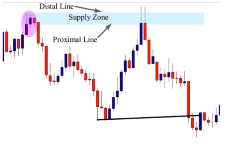
On this H4 chart above, the market formed a clear rally-base-drop supply zone and the basing candle is an inside bar pattern – a mother bar with multiple inside bars. To draw the supply zone in this case, you draw the proximal line at the lower close of one of the inside bars. When the market retraced back to the zone, prices were rejected twice to indicate that the market is likely to go
down again, and that is exactly what happened.
I think that drawing demand zones or supply zones using inside bars as basing candles has become more clear for you, so it is your job right now to open your charts, and start training yourself on drawing the zones using the inside bar pattern as a basing candle.
The piercing pattern as a basing candle
The piercing pattern is viewed as a bullish candlestick reversal pattern and there are two components of a piercing pattern formation. This pattern occurs when the bullish candle closes above the middle of the bearish candle. Look at the illustration below:

As you see in the illustration above, this is how the piercing pattern looks like in your chart. When it happens in a downtrend, it indicates a trend reversal. This pattern alone is not quite enough to decide whether the reversal is valid or not. But what matters for you now is to be able to identify this pattern when it occurs at the beginning of a strong move and use it as a basing candle to correctly draw the demand zone.
To draw a demand zone using a piercing pattern, you simply draw the proximal line at the close of the bullish candle, and the distal line at the open of the bullish candle or the lowest wick of both candles. See the illustration below

To draw a demand zone using a piercing pattern, you simply draw the proximal line at the close of the bullish candle, and the distal line at the open of the bullish candle or the lowest wick of both candles. See the illustration below :
When you identify a strong move, and you notice that it begins with piercing pattern, draw the demand zone by drawing the proximal line at the close of the bullish candle and the distal line at the lower wick of the candle. If the bearish candle wick was below the wick of the bullish candle, you draw the distal line there. Let me give you a real chart example below:

On this daily chart, you can see the piercing pattern that was formed at the beginning of this strong move. It is considered a basing candle, and to draw the demand zone, you draw the proximal line at the close of the blue candle, and the distal line at the lower shadow of it. When the market returned to test the zone, prices were rejected, and the market formed a nice pin bar pattern. So to enter this trade, you can place your entry at the close of the pin bar signal, and the stop loss below the lower shadow of it, and the profit target is going to be the next resistance level as mentioned in the chart. This trade offers more than 4:1 risk to reward ratio. Look at another chart example below:
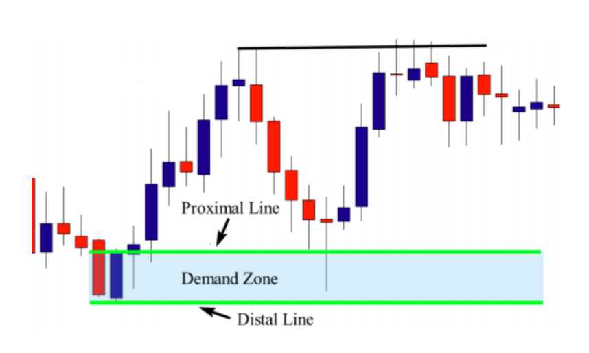
This is another daily chart – the zone is not that strong, but it is tradable, because the huge rejection that happened when the price returned to test the zone indicates that the big boys’ orders are there. We will talk about the criteria that we take into consideration to qualify a zone in the next lessons. My goal from this example is only to help you learn how to draw the demand zone using a piercing pattern as a basing candle. So to draw the zone, you only need to draw the proximal line at the close of the blue candle, and the distal line at the lower shadow or the close of it. Look at another example below :
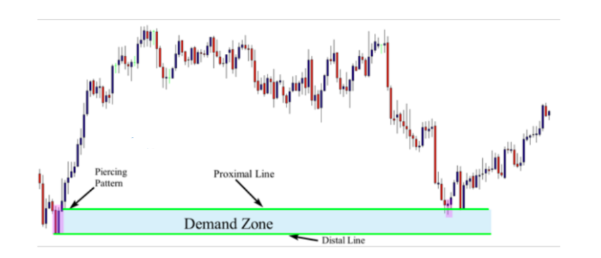
On this chart, the market makes a strong move up forming a nice demand zone. The piercing candle is the pattern that was formed at the beginning of this move. To draw the demand zone, you draw the proximal line at the close of the blue candle and the distal line at the lower shadow or the close of it. When the market retraced back to test the zone, prices were rejected forming a nice pin bar candlestick pattern. To enter this trade, you only need to place an order at the close of the pin bar, and a stop loss below the distal line. The profit target is going to be the next resistance or supply zone.
The dark cloud cover as a basing candle
The Dark cloud cover is a bearish candlestick reversal pattern. It is the bearish version of the piercing pattern and occurs at the top of an uptrend. When it happens at the beginning of an imbalance, it can be used as a basing
candle. There are two components of the dark cloud cover; the bullish candle and the bearish candle, the dark cloud cover occurs when the bearish candle closes below the middle of the bullish candle. See the illustration below:
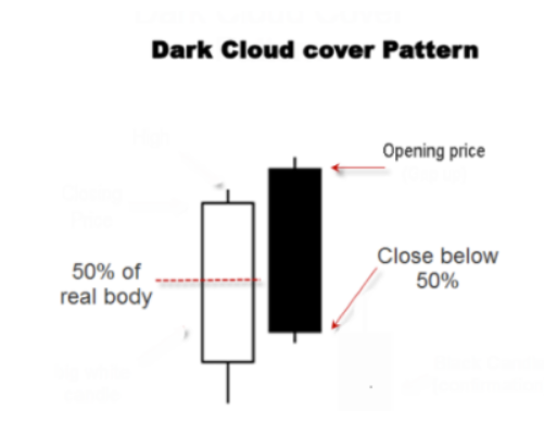
This is how the dark cloud cover pattern looks like on your charts and can be used as a basing candle when it occurs at the beginning of a strong move.
To draw the supply zone using the dark cloud cover pattern, you simply need to draw a proximal line at the close of the bearish candle and a distal line at the upper wick of it, or if the bullish candle has upper wick you can draw at that location. Let me give you an example below:

As you can see in the illustration above, we drew the distal line at the upper wick of the bearish candle and the proximal line at the closing price of it to get a correct supply zone. This is how we use the dark cloud cover to draw a correct supply zone. Now let me give you another example to show you how to draw it on a real time chart. See the illustration below:
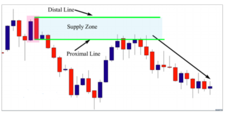
On this daily chart, you can see the dark cloud cover was the basing candle of the imbalance and we drew the distal line at the upper shadow of the bearish candle, because it is the upper shadow of both candles, and the proximal line at the close of the bearish candle. When the market comes back to test this supply zone, it was strongly rejected, because there were already quantities placed by banks in this area. Look at another example below:
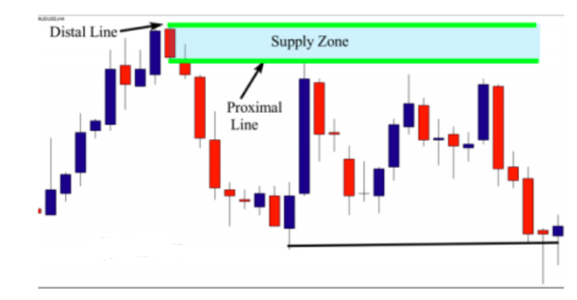
On this chart, the market formed a nice supply zone. As you can see, a dark cloud cover was formed at the beginning of this strong move down. So to draw the supply zone, you only draw the proximal line at the close of the bearish candle, and the distal line at the upper shadow of it. When the market approached this supply zone, it was rejected and went down.
Drawing the distal line and the proximal line correctly will help you see clearly where to place your entry and your stop loss. The profit target is always the next support or demand level. Look at another example below:
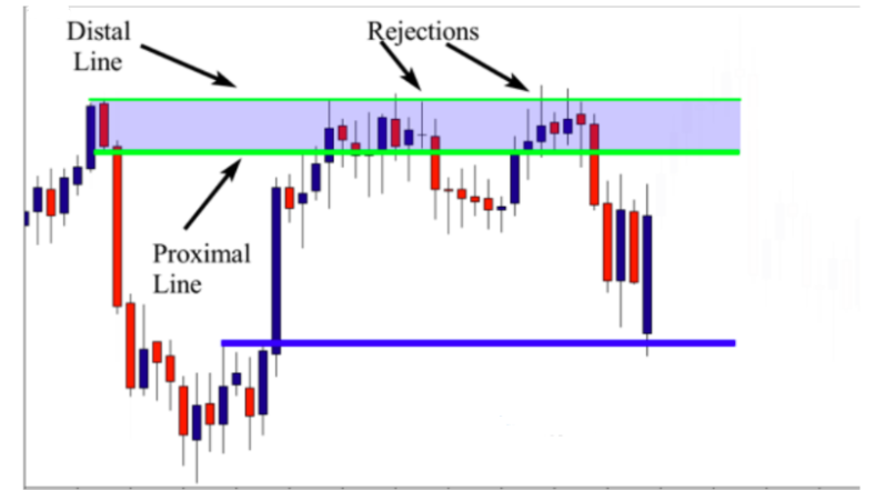
On this H4 chart, the market moved strongly down forming a clear supply zone. If you remember our supply zone patterns, this is a rally-base-drop supply zone. The dark cloud cover is the last pattern that was formed before this move down. So to draw the zone, you draw the proximal line at the close or the lower shadow of the bearish candle, and the distal line at the upper shadow of the same candle.
When the market approached the zone, prices were rejected forming multiple entry signals so you can place your entry either at the close of the Doji candlestick, or at the close of the pin bar. Your stop loss is going to be the next support or demand zone. I hope that the examples I shared with you could help you understand how to use the dark cloud cover as a basing candle.
If you want to master drawing supply zones using this candlestick pattern, I highly recommend you to open your charts and start looking for like these examples. This exercise will help you train your eyes on spotting these patterns easily
The Doji candlestick as a basing candle. The Doji candlestick pattern has a single candle, with the closing and opening price of the candle being equal. This candlestick pattern forms due to indecision between buyers and sellers in the market. In fact, there are four types of Doji candlestick patterns, just take a look at the illustration below:
1-Neutral Doji : It is a small candlestick pattern, with the open and close of price at the middle of the candle high and low; this pattern forms when buying and selling activity is at
equilibrium.
2-Long-Legged Doji : It is a long candlestick pattern, with the open and close price at the middle of the candle high and low; this pattern occurs also when buyers and sellers
are equal.
3-Gravestone Doji : In this pattern, the open and close of price is at the candle’s low; this pattern shows a highselling pressure in the market .
4-Dragonfly Doji : The Dragonfly Doji is the opposite version of the gravestone; in this pattern the open and close of price is at the candle’s high. This pattern shows a high buying pressure in the market

My goal from mentioning the Doji types is to help you know about all the variations of this candlestick pattern, and when one of these variations occurs in the market, you will not get confused because you already know that it is only one of the variations of the Doji candlestick. When drawing supply and demand zones, we can use a Doji candlestick pattern as a basing candle when it forms at the beginning of a strong move. To draw a supply zone using the Doji candlestick pattern, you only need to draw a proximal line at the lower shadow of the candle, and a distal line at the upper shadow no matter what Doji variation it is. Look at the illustration below:
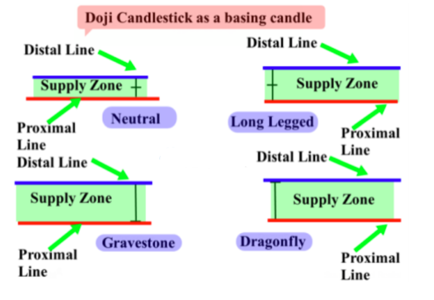
As you can see in the illustration above, we don’t care about the variation name when drawing the supply zone, we just draw the distal line at the upper shadow and the proximal line at the lower shadow. Let me give you a real chart example below

In this chart, we see a Doji candlestick pattern was formed at the beginning of the strong move, therefore we can use it as a basing candle to draw the zone. To draw the supply zone, you just draw the distal line at the upper shadow of the candle, and the proximal line at the lower shadow. As you can see when the market approached the zone, it formed a nice bearish engulfing bar signal. Look at another example below:

On this daily chart above, the market formed a clear supply zone. The move is very strong, and the last candle that was formed before this strong move down is the Doji candlestick pattern. So to draw the supply zone, you simply draw the distal line at the upper shadow and the proximal line at the lower shadow to get this potential supply zone. This trade offers a good risk to reward ratio. Look at another example below:

On this 4H chart, we see the Doji candlestick is the last candle that was formed before this move down, so it is considered as a basing candle. To draw the supply zone, you simply draw the proximal line at the lower shadow and the distal at the upper shadow. When the market returned to test the supply zone, prices were rejected forming a nice pin bar pattern. So to trade this setup, you place an order at the close of the pin bar, and a stop loss above the distal line, and your profit target is the next support level. To draw the demand zone, you only need to do the opposite of what you do when drawing the supply zone. You draw the distal line at the lower shadow and the proximal line at the upper shadow. Look at the illustration below:

This is the same chart as above, and as you see, there is a nice Doji candlestick pattern that was formed at the beginning of this strong move, therefore, we can use it as a basing candle. By drawing the proximal line at the upper shadow and the distal line at the lower shadow, we could get a nice demand zone. As you can see, when the market reached the zone, it formed a nice pin bar signal and prices pushed the market to go up again. Look at another example below:
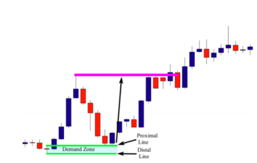
On this 4H chart, we identified the Doji candlestick as a basing candle, and can easily draw the demand zone. As you can see, we draw the proximal line at the upper shadow and the distal line at the lower shadow to get this potential demand zone. When the market returned to test the zone, we had a nice engulfing bar pattern as an entry signal. This trade opportunity provides us with more than 3:1 reward to risk ratio. Look at another example below:

On this 4H chart above we see another example that illustrates how you can use the Doji candlestick as a basing candle to draw the demand zone. As we did previously, you draw the proximal line at the upper shadow and the distal at the lower shadow, and when prices retraced back to test the demand zone, the market formed a nice inside bar pattern that can be used as an entry signal. Focus on learning how to draw the zone using the Doji as a basing candle. Please do your homework by opening your charts and train yourself to draw demand and supply zones using either the Doji as a basing candle or any other candlestick pattern that we have seen in previous lessons.
Drawing Supply & Demand Zones
Hey everyone, this is going to be an introduction to drawing supply and demand zones. You know when we identify a supply or demand zone, we need to know how to draw the zone correctly. If you make a mistake when drawing supply or demand zones, you could miss a lot of opportunities.
So the zone is called the base and it is the beginning of the strong move that is made by a bank, a fund, or any other financial institution. When drawing supplier demand zones, we want to focus on the last candle that formed before the strong move up or down. That candle is called the basing candle.
So in this example, we see that we have a classic supply zone. The last candle that was formed before the strong move down is this doji.
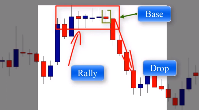
So that doji candle is called the basing candle, and in drawing the supply zone, we have a demand zone. As we can see here, in this demand zone, the basing candle is this one, the doji candle, because that is the last candle that was formed before the strong move higher.
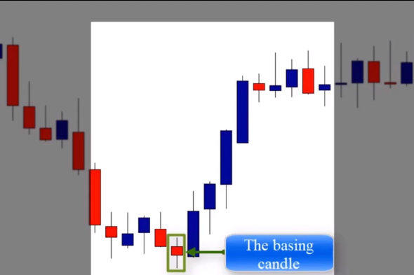
So when drawing the demand zone, we’ll take that candle into consideration. So in general, when drawing supply and demand zones, we take the basing candle into consideration, and the basing candle is the last candle that formed before the move, i.e. before the strong move higher or lower.
The zone of the supply and demand can be identified by drawing two features, the distal line and the proximal line. When drawing a supply zone, as we can see in this example, we draw a proximal line that covers the lower shadows of the basin candle and a distal line at the upper shadow of the candle, as you can see here.
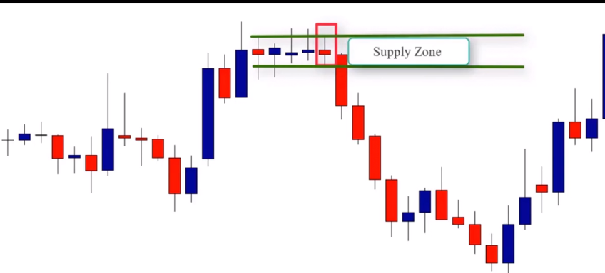
If the candle has no upper or lower shadow, we draw the lines at the lowest close and the highest close of that particular candle. So when it comes to demand zones or drawing a demand zone, we draw a distal line that covers the lower shadow of the candle and the proximal line at the upper shadow of the basin candle.
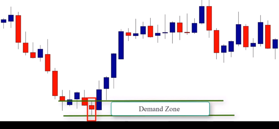
So here is an example. On this daily chart, we see a clear supply zone. This is a rally base drop supply.

The basin candle is this one. This is the last candle that was formed before the strong move lower. So we draw the proximal line that covers the lower shadow of the basin candle and the distal line at the upper shadow. So here we have a more clear picture of the supply zone.
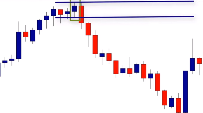
Will the market return to test this zone? We don’t know, but we wait for a price action signal to determine what happens. We’ll talk about how to trade those zones in future lessons. Let’s look at this example. Here we have a rally, base, drop, supply zone pattern.

The last candle before the strong moved down was a doji candle. So that doji candle is the basing candle. So to draw the supply zone, we do the same thing we did previously. We draw the proximal line that covers the lower shadow of the basing candle and the distal line at the upper shadow. So here we are, we have a nice supply zone. And as you can see, when the market returns to test this zone, the market rejected and went down strongly.
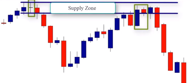
So, to trade this supply zone, the market provided us with a high probability setup, which is the inside bar candle pattern. But we’re not going to talk about how to trade these supply and demand zones quite yet. We’ll talk about trading strategies in the next lessons, but not right now. Let’s look at another example.
On this chart, we see a clear drop, base, rally, demand zone. And what we do is we want to find what the last candle was that formed before the strong moved higher. And what we can see here is a doji candle pattern. So that doji candle pattern is the basing candle to draw the demand zone, where we draw the distal line that covers the lower shadows of the candle and the proximal line at the upper shadow of the basing candle.
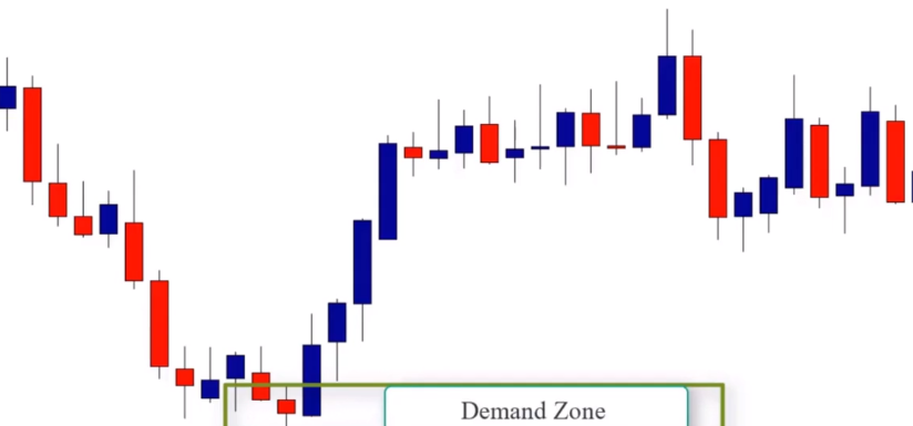
Alright, let’s look at another example. As we can see we have a rally base rally demand zone, followed by another rally base rally demand zone.

Let’s focus on the second demand zone because it is fresh and it is the first zone that the market is going to test. So the basing candle here is this one.

We draw the demand zone and as we see when the market returns to test this zone, the market was strongly rejected forming a nice pin bar candlestick pattern. We know that when drawing supply and demand zones, we’ll find different basing candles. Not only doji candles, sometimes it could be a pin bar with an engulfing bar or perhaps an inside bar. And that’s what we’re going to cover in the next lesson.
Hey everyone, in this lesson we’re going to learn how to deal with different basing candles when drawing supply and demand zones. And we’re going to start with the pin bar candlestick pattern as the basing candle.
So as we know, a pin bar forms with a long upper or lower tail and a small body. And the space between the open and the close of the pin bar is known as the body. And sometimes at the bottom or top of the pin we have what’s called a nose. In fact, there’s two types of pin bars, a bearish pin bar and a bullish pin bar. So let’s first start with the bullish pin bar.

Bullish pin bar forms when price closed at its high or it’s open with a long tail below the body. When this pattern forms as a basing candle in a demand zone, we simply draw the proximal line at the upper shadow and the distal line at the lower shadow. Look at this example of this bullish pin bar candle pattern.

As we can see, we draw the proximal line at the upper shadow and the distal line at the lower shadow to give us the potential demand zone. Only for pin bars that don’t have a nose, we can draw the proximal line at the close of the price candle.
Now let’s look at a real chart example.
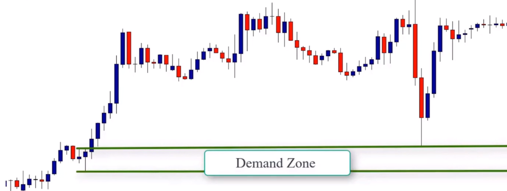
On this chart, we can see a rally based rally demand zone. The basing candle is this bullish pin bar. So to draw the zone, we just draw a proximal line at the upper shadow and a distal line at the lower shadow. Here’s another example.

On this chart, we see a drop based rally demand zone. The basing candle is this bullish pin bar. It’s the last candle before the strong move higher. So to draw the demand zone, we simply draw the proximal line at the upper shadow and the distal line at the lower shadow to get the demand zone. And as we can see, when the market returns to test this zone, price rejects and moves strongly higher. Here’s another example.

Here we have a rally, base, rally, demand pattern, which is a continuation pattern. The basing candle is this bullish pin bar. So we draw the proximal line at the upper shadow and the distal line at the lower shadow to get the demand zone. And as you can see when the market comes to retest the zone prices moved higher.
So now let’s move to the bearish pin bar. The bearish pin bar is the opposite version of the bullish pin bar. A bearish pin bar forms when price closes lower and is open with a long tail above the body.

When this pattern forms as a basing candle in a supply zone, we draw the distal line at the upper shadow and the proximal line at the lower shadow. Let’s look at some chart examples. Here we can see a rally base drop supply zone with a bearish pin bar as the basing candle.
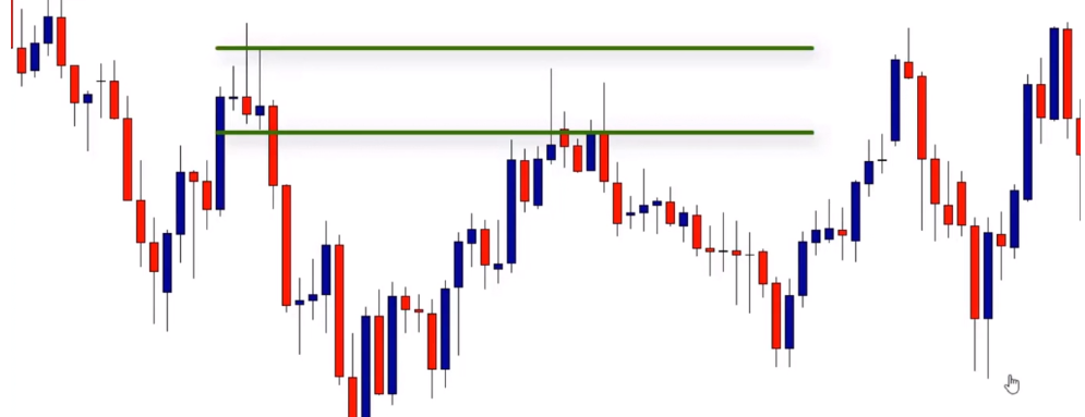
So we draw the proximal line at the lower shadow and the distal line at the upper shadow to get this clear supply zone. When the market returns to test the zone, prices were strongly rejected forming a nice bearish pin bar. Here’s another example.

As you can see here, we have a rally, base, drop, supply zone. This basic candle is a bearish pin bar. And so to draw the supply zone, we draw the proximal line at the lower shadow and the distal line at the upper shadow. When the market returns to test this zone, prices were rejected and the market moved lower. You know now that these patterns happen frequently in the market. So please do your homework, open some charts, and start looking for supply and demand zones with pin bars as basing candles and train yourself to draw these zones.
The Engulfing Bar as a Basing Candle
Hey everyone, in this lesson we’re going to learn how to use the engulfing bar candlestick pattern as a basing candle. Engulfing bar candle pattern is formed by two candles. This pattern is pretty easy to recognize. It consists of a candle which gets engulfed by the next candle and to get a valid engulfing pattern the first candle should completely fit inside the body of the next candle. In fact, there’s two types of engulfing patterns, a bullish engulfing bar and a bearish engulfing bar. Let’s start with the bullish engulfing bar.
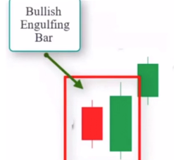
Bullish engulfing bar can be found during a period of strength and starts with a small candle and then that candle gets fully engulfed by the body of the next candle. As you can see, the prior candle is completely engulfed by the second one. Sometimes the shadows and noses are not involved and that’s not a problem while the body is still totally engulfed. When the bullish engulfing pattern forms in a demand zone, it can be used as a basing candle. Look at this example here. This is a bullish engulfing pattern. When it forms at the beginning of a demand zone, it can be considered as a basing candle. To draw the zone, we can draw the proximal line at the close of the first candle and the distal line at the low shadow of the second.
Let me give you an example. As we can see, we have a clear demand zone.

And we also have a bullish engulfing candle which forms or helps form the basing candle. So we draw the proximal line at the close of the first candle and the distal line at the lower candle. You see, sometimes the second candle engulfs only the real body of the first candle. In this case, we can draw the distal line at the lower shadow of the first candle and a proximal line at the close of the other candle. Let’s look at some other examples here.

On this chart, we can see a drop, base, rally, demand zone. The basing candle is a bullish engulfing pattern. To draw this zone, we draw the proximal line at the close of the first candle and the distal line at the lower shadow of the second candle. As we can see, we get a nice demand zone.

When the market returns to test this zone, price is rejected and went up higher. In this example, we have a drop, base, rally, demand zone.
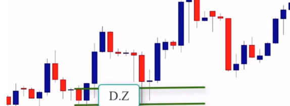
And a bullish engulfing candle serves as the basing candle. So to draw the demand zone, we draw the proximal line at the close of the first candle and the distal line at the lower shadow of the second candle. As we see, we get a nice demand zone drawn. When the market returns to test this level or this zone, it was strongly rejected.
Let’s move to the opposite version of the bearish, the bullish engulfing bar, which is the bearish engulfing pattern.

The bearish engulfing pattern can be found during body strength. It starts with a small candle. It gets fully engulfed by the body of the next candle. When the bearish engulfing pattern forms in a supply zone, it’s considered as a basing candle. In this example, we see a bearish engulfing bar that forms at the supply zone.
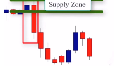
So to draw the supply zone, we draw the distal line on the upper shadow of the second candle and the proximal line on the open of the prior candle. We can then draw a distal line at the upper shadow of the prior candle. The second candle covered only the real bar. Here is another example.

On this chart we see a rally, base, drop, supply zone. This bearish engulfing bar is the basing candle. We draw the proximal line at the open of the prior candle and the distal line at the upper shadow of the second candle to get our potential supply zone. On this chart we see a rally base drop supply zone. The bearish engulfing bar is the basing candle. So to draw the supply zone we draw the distal line at the upper shadow of the prior candle because the body of the prior candle was fully engulfed.
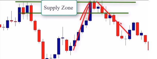
But we still have this upper shadow in the proximal line at the open of the same candle. As you can see when the market returned to test this zone, prices went down again. And finally, on this chart, we can see a drop, base, drop supply zone.

This bearish engulfing bar is the basing candle, so we draw the distal line on the upper shadow of the second candle and the proximal line at the close of the same candle to get the supply zone. When price returns to test this zone, the market was strongly rejected, forming a nice pin bar sell setup.
The Inside Bar as a Basing Candle
Hey everyone, in this lesson we’re going to learn about using inside bars as basing candles. So what is an inside bar? An inside bar candle is a candlestick in which the inside bar is smaller or within the high to low range of the prior bar.
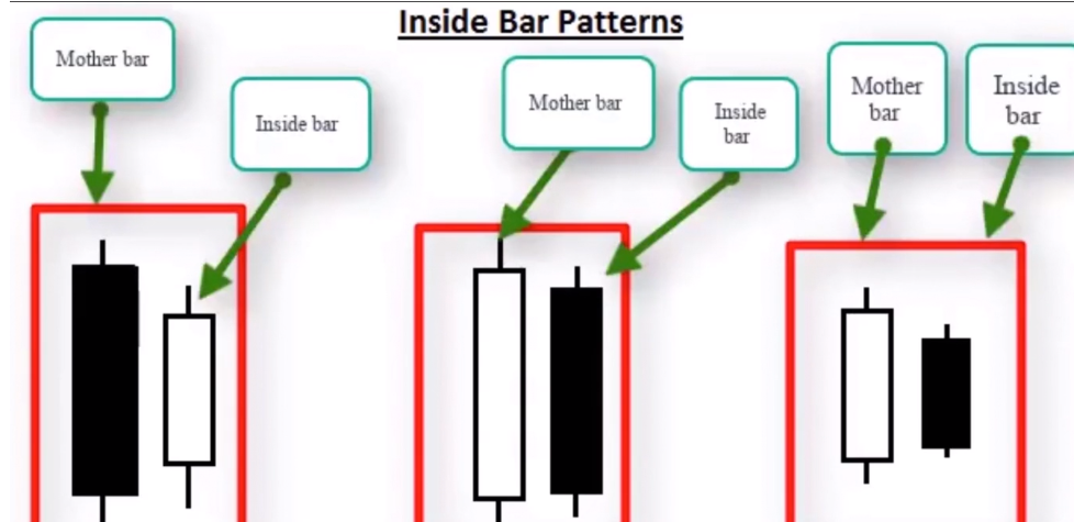
The prior bar is often referred to as the mother bar and the second smaller bar is referred to as the baby. In fact, there’s two types of inside bars, a bullish inside bar and a bearish inside bar. Let’s start with the bullish inside bar.
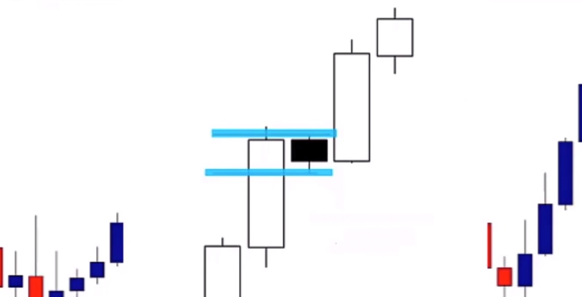
So the bullish inside bar happens during an uptrend, as you can see in this illustration, and it’s considered a continuation pattern. When it occurs at the beginning of a demand zone, it can be used as a basing candle to draw the zone. So let me show you. How can we use the inside bar as a basing candle. If this pattern happens at the beginning of a demand zone, we draw the distal line at the lower shadow of the mother bar and the proximal line at the close of the inside bar. Let’s look at a chart example.

Here, we can see a drop base rally demand zone. The basing candle is the inside bar and the distal line at the lower shadow of the mother bar. And as we can see, we get a nice demand zone drawn. Here’s another example.
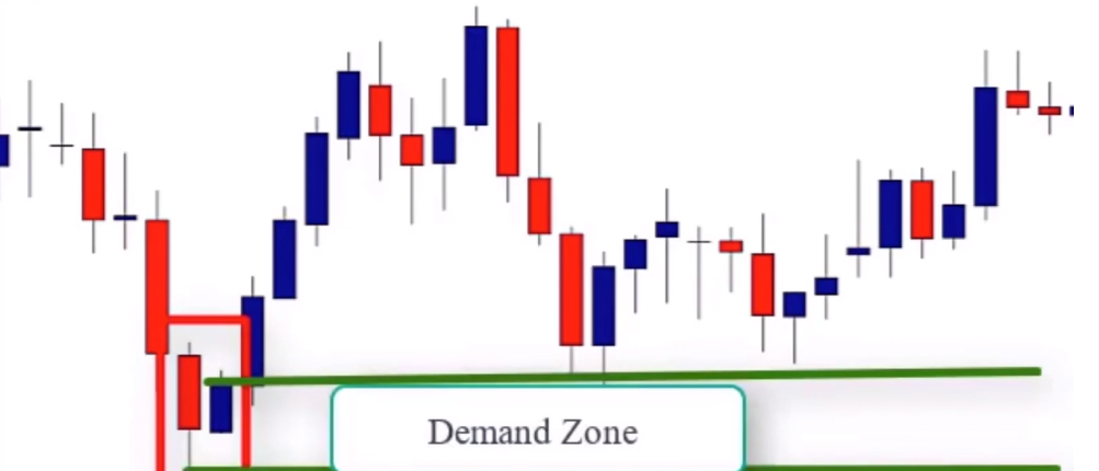
Here we have a drop-based rally demand zone. The inside bar is the basing candle. So as we did in the previous example, we draw the proximal line at the close of the inside bar and the distal line at the lower shadow of the mother bar. We look at another chart.

This is a rally base rally demand zone. We can see that we have an inside bar that formed as the basing candle, so we draw the proximal line at the close of the inside bar and the distal line at the lower shadow of the mother bar.
Okay, now let’s move to the opposite version of the bullish inside bar, which is the bearish inside bar. This version of the inside bar occurs either with a trend and is considered a continuation pattern, but at the top of an uptrend, it’s considered a reversal pattern. So when this happens at the beginning of a supply zone, it can serve as the basing candle. So to draw the supply zones using the bearish inside bar, we draw the proximal line at the close of the inside bar and the distal line at the upper shadow of the mother bar.
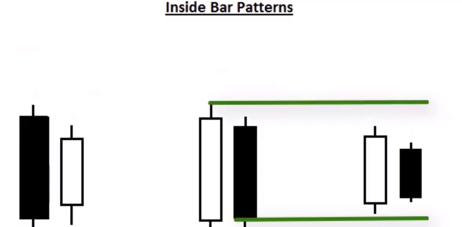
When the inside bar is bearish, we draw the proximal line at the open of the candle. Look at this example.
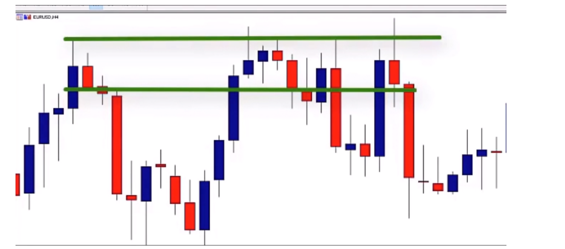
Here we have the market forming a nice rally base drop supply zone. The bearish inside bar is the basing candle. We draw the proximal line at the close of the inside bar and the distal line at the upper shadow of the mother bar. As we can see, when the market returned to test the supply zone, the market was strongly rejected by forming a nice pin bar pattern. In this example, we see a supply zone and we have a bearish inside bar that can be used as the basing candle.
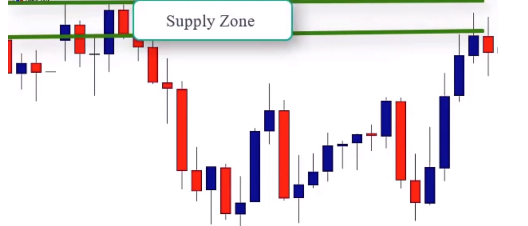
So to draw the supply zone, we draw the proximal line at the close of the inside bar and the distal line at the upper shadow of the mother bar. As you can see when the market comes to retest the zone we had rejection. So your job right now is to open some charts and try to find inside bars at the beginning of supply and demand zones and try to draw those zones correctly. We’ll see you in the next lesson.
The Piercing Bar as a Basing Candle
Hey everyone, in this lesson we’re going to learn how to use the piercing candle and dark cloud cover as basing candles. So let’s start with the piercing candle first.
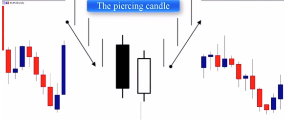
The piercing candle pattern is obviously a full body signal. It’s also a moderately strong reversal signal. Like most of the candlestick patterns out there, the context in which this pattern occurs is very important. A true bullish piercing pattern appears after a downward price. This pattern consists of a relatively large bearish candlestick, and as you can see, it is followed by a bullish candlestick that closes somewhere above the 50% line of the preceding candlestick in front of it.

This pattern forms at the beginning of a strong move up. It can be used as a basing candle to draw our demand zone. So to draw the demand zone using this pattern, we can simply draw the proximal line at the close of the bullish candle and the distal line at the open of the bullish candle or at the lowest wick of both candles.
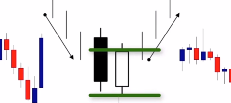
Let’s look at a chart example. Here we can see a drop base rally demand zone.
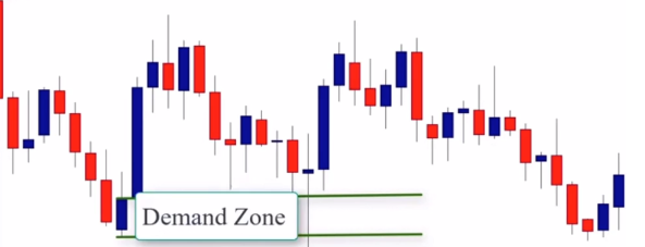
We have a piercing candlestick pattern that formed at the beginning of the strong move higher. So to draw the demand zone, we draw the proximal line at the close of the bullish candle and the distal line at the lower shadow. When the market returns to test this demand zone, prices were strongly rejected, forming a nice doji pattern as well as a nice pin bar pattern. Let’s look at another example.

Here we can see a drop-based rally demand zone pattern. We have a clear piercing pattern that formed at the beginning of the move higher. So to draw the demand zone, we draw the proximal line at the close of the bullish candle, as well as the proximal line and the distal line at the lower part of the shadow. In this example we see a drop base rally demand zone pattern.
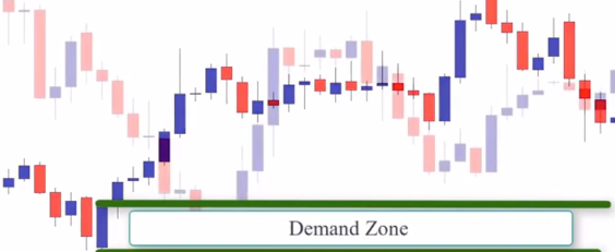
We have a piercing pattern as you can see here. To draw the demand zone we draw the proximal line at the close of the bullish candle and the distal line at the lower shadow.
Now let’s move to the bearish version of the piercing candlestick pattern which is the dark cloud cover.
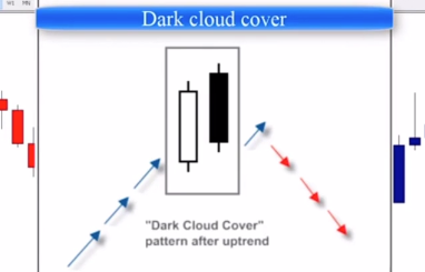
Dark cloud cover pattern is a bearish reversal pattern where the down candle opens up above the close of the prior up candle and then closes below the midpoint of the up candle. When this pattern forms at the beginning of a strong move down, it can be used as a basing candle. When drawing supply zones using the dark cloud cover as a basing candle, we draw the proximal line at the close of the bearish candle and the distal line at the upper shadow.

Let’s look at some chart examples.

Here, we can see a rally, base, drop supply zone. As we can see, we have a dark cloud cover candlestick pattern. To draw the supply zone, we draw the proximal line at the close of the bearish candle and a distal line at the upper shadow. As we can see, when the market returned to test the supply zone, it was rejected by both the doji pattern here and the golfie pattern here.
Let’s look at one more example.

Here we have a supply zone. We have a dark cloud cover that formed at the beginning of the supply zone. So to draw the supply zone, we draw the proximal line at the close of the bearish candle and the distal line at the upper shadow. Here we have a clear supply zone showing that the basing candle is a dark cloud cover.

So to draw the zone we draw the proximal line at the close of the bearish candle and the distal line at the upper shadow. So we can see when the market returns to test the zone prices were strongly rejected and the market moved down sharply. So that’s what we can say about the piercing candle pattern as well as a dark cloud cover. We’ll see you in the next lesson.
The Doji Candlestick as a Basing Candle
Hey everyone, in this lesson we’re going to learn about the doji candlestick pattern and how to use it as a basing candle. So what is a doji candlestick pattern?
A doji occurs when the market opens and closes at the same price level. It means that the market is undecided as neither buyers nor sellers are in control.
So there are four variations of doji.
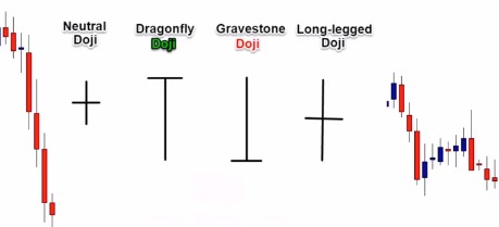
There’s the neutral doji, the long-legged doji, the gravestone doji, and the dragonfly doji. When one of them forms at the beginning of a demand zone or a supply zone, it can be considered or used as a basing candle. So let’s start with the doji that forms at supply zones. When a doji forms at the beginning of a supply zone, you draw the proximal line at the lower shadow of the candle and the distal line at the upper shadow. Here we’re looking at a one-hour chart of the euro. We have a clear supply zone.
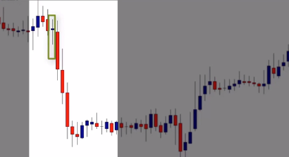
As we see, there’s a doji candle that was formed at the beginning of the strong move down, so we’ll use it as a basing candle. To draw the supply zone, we draw the proximal line at the lower shadow of the candle and the distal at the upper shadow. return to test the supply zone, the prices were rejected and the market moved lower.

Let’s look at another example.
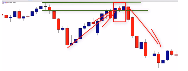
Here we have the Aussie U.S. and this is a rally base drop supply zone. Notice that the doji candlestick is the base in candle. So to draw the supply zone, we draw the proximal line at the lower shadow and the distal line at the upper shadow. When the market returned to test the supply zone, prices formed a nice inside bar signal and the market moved lower. Here is another example of the Aussie US on a daily chart and we have a rally base drop supply zone.

The doji candle is the last candlestick before the strong moved down, so it can be used as a basing candle. To draw the supply zone, we draw the proximal line at the lower shadow of the doji and the distal line at the upper shadow. And as we can see, when the market returned to test this zone, we got a nice pin bar that indicated price rejection and followed the market lower.
Now let’s move to the demand zone. When the doji candle forms at demand zones, we only do the opposite of what we did when drawing the supply zone. We draw the distal line at the lower shadow and the proximal line at the upper shadow. Let’s look at some chart examples.
Here is a 4-hour chart of the Aussie U.S.
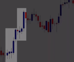
This is the first demand zone and this is the second demand zone. Let’s start with the second one.

As you see, the last candlestick that was formed before the strong move up is the doji candlestick. So, we draw the distal line at the lower shadow and the proximal line at the upper shadow to get the potential demand zone. When the market returned to test the zone, it was strongly rejected forming a nice pin bar. Now look at the first demand zone.

The last candle before this small bar is the doji candlestick. So to draw the zone, we draw the distal line at the lower shadow and the proximal line at the upper shadow to get the demand zone. When the market returned to test the zone, we saw clear rejection. Here is another example:
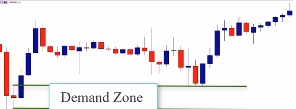
As you can see, we have a drop-based rally demand zone. The basing candle is the doji candlestick. So to draw the zone, we draw the distal line at the lower shadow and the proximal line at the upper shadow. All right, let’s look at one final example.

This is a daily chart of the Aussie Yen. We have a drop-based rally demand zone. A basing candle is the doji candlestick. To draw the demand zone, we simply draw the distal line at the lower shadow and the proximal line at the upper shadow to get our final demand zone. When the market returned to test the zone, it rejected forming a nice pin bar pattern. This covers the doji candlestick pattern as a basing candle. We’ll see you in the next lesson.
The strength of the move
Trading supply and demand zones is one of the most powerful trading methods because it allows you to take the same trades that banks and аinancial institutions make. However, you can’t open your charts and start trading all the supply and demand zones you find in your charts and sit back and wait for amazing results. This is not how it works – there’s more to it than that. When you identify a supply or a “demand zone”, there are some factors that you should take into consideration to decide whether you should take the trade, or you should stay away (the importance of focusing on high probability set-ups).
One of the most important elements to determine the power of the zone is the strength of the move. That means, when you identify a supply or a demand zone, the move should be strong and powerful. There are three factors that will help you determine the strength of the move:
-The time spent in the zone: you should always pay attention to the beginning of the move; if the move was quick and the market didn’t spend too much time in the zone, then this is a powerful sign that the order that was taken was by a bank or a financial institution. Because, when banks and financial institutions decide to take an order, they risk millions of dollars, which affects the market behavior. We can see a strong and quick move from a level without understating what happens. All that happens is that there is a big bank that takes orders in large quantities. So, when the beginning of the move is quick and strong, this is clear evidence that there is a bank or a financial institution behind this move. However, if the market spends too much time in the zone, this is a sign that the move is not that powerful.
-The Candles size of the zone: “Candles” give us an obvious representation of the quantities spent during the move, if the candles are big and have the same color, this is a sign that there is a big bank behind the move. But, if the candles are small and have different colors, this is not a good sign of a strong move. When a bank takes an order, it affects the market, and you can see bullish or bearish candles that go strongly in one direction; but, when you see a move composed by small candles with wicks, and different colors, this is not necessarily an order that was taken by a financial institution, so we prefer to always focus on the beginning of the move and see if it is quick and strong. Look at the illustration below to understand how we qualify the strength of the move:

As you can see in the illustration below , we have two different moves – the first and second moves are very strong because they are composed of three consecutive candles of the same color, or with a gap, the gap happens exceptionally in the market when there are high quantities of orders that was spent, so the price jump to the next level creating a gap. This gap is the representation of a bank order and should be taken as a high-quality zone. The last image on the left is the representation of a weak move and is not strong because we don’t see an impulsive force that drives the market strongly up or down, and zones like this should be ignored.
The stronger the movement the better – sometimes you can find only one big candle, and other times you can find three or four strong candles in a row of the same color. Don’t spend a long time deciding whether the move is strong or not – the chart doesn’t lie, and gives you the reality of the market. If it is a big move, it will be obvious on the chart, and if it is weak, you can know that just from the first sight. Look at the chart below to see how we evaluate the move:
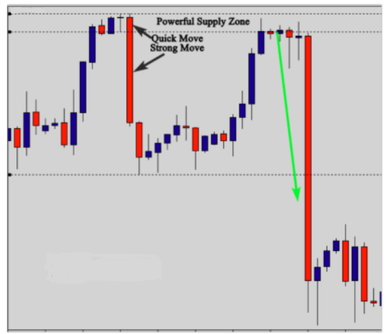
As you can see in the chart above, the beginning of the move was quick and strong; the market didn’t spend a long time deciding whether to go down or up; it went down strongly because there was a bank behind that move. The move was composed of only two big candles, and this is quite enough to qualify a supply or a demand zone. Sometimes, you can find only one big candle and other times you find multiple candles, it all depends on the quantities spent by the financial institution that was behind the move. Look at another example of a supply zone below:
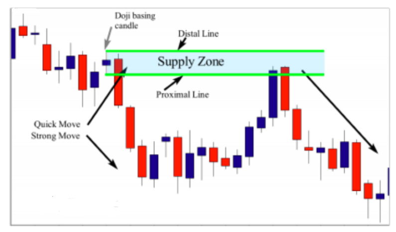
On this daily chart; this zone is considered a drop-base/drop-supply zone. The basing candle is the Doji candlestick. In order to draw the zone using this candlestick pattern, you draw the proximal line at the lower shadow, and the distal line at the upper shadow. This supply zone is very strong, because the move was quick; as you can see, the market didn’t spend at long time in the zone and the size of the candles are very big, the speed of the move and the bigger size of the candles indicates that this sell order was made by a big financial institution.
When the market returned to test this supply zone, prices were rejected,forming a nice dark cloud pattern that can be used as an entry signal. We will talk about entries and exits in the next lessons, but for now I want you to focus only on how to qualify the strength of the zone. Look at another example below:
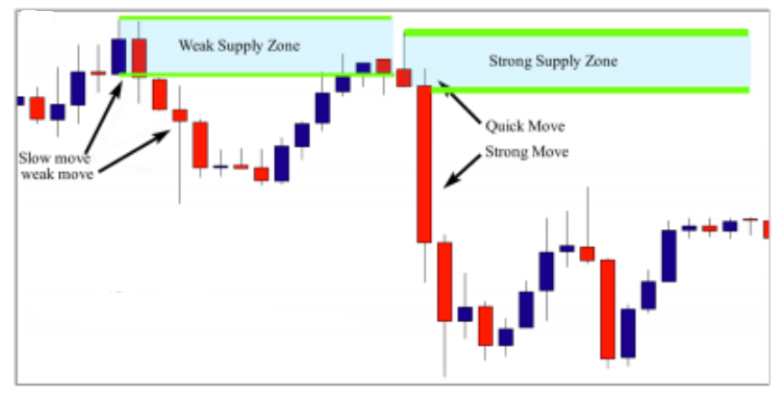
This is a 1H chart. Here, in this example we have two supply zones – the first one on the left is a weak supply zone, because the move was not fast, and the candle size is not that big.
This weak move down found a huge support as can be seen in the pin bar pattern that formed to stop this move down. If this supply zone was made by a bank or any other financial institution, we would see a very fast move down characterized by big bearish candles. Nothing can stop a bank from moving a market down.
This weak supply zone worked, even if it is not tradable, but this doesn’t mean that weak zones work every time. Now look at the second supply zone on the right. As you can see, it is a rally-base drop pattern. The basing candle is a pin bar candlestick. So, in order to draw the zone using this pattern, you draw the proximal line at the close of the candle, and the distal line at the upper shadow. This supply zone is very strong, because prices didn’t spend a long time in the zone, and the move was very fast and strong. This zone will provide us with a good risk-to reward ratio, which motivates us to trade it when the market returns to test the zone and form a high probability candlestick signal. Look at another example below:

Here, the market formed a weak supply zone, and as you can see in the illustration, the move was not fast and strong; the first pin bar that formed indicated seller’s resistance, and the Doji candlestick indicated pause or hesitation in
the market. This is a clear, weak supply zone, because if it was made by a bank, you would see big red candles that formed a significant move down. Look at what happened when the market returned to test the zone. As you can see, prices didn’t find any resistance and easily broke this weak supply zone. Please take this advice from me: whenever you spot a supply zone, look at the move and the size of the candles. If the move is fast, and the candles are big and strong, you can then evaluate the zone and look at it to see if it is worth trading or not. However, if the move is weak and the candles are small, just ignore it, and move on to another opportunity. Look at another example below:

On this chart; the market formed a nice Rally-Base-Drop supply zone. Look at the beginning of the move; it was fast, and strong, …look at the candle size — they are all big and bearish without any resistance. This is a sign of a strong and healthy supply zone. The last candle that formed before this strong move down, is the Doji candlestick. So, it is considered a “basing” candle. And to draw the supply zone, you draw the proximal line at the lower shadow of the candle, and the distal line at the upper shadow; as you can see, when the market returned to test this area, it was rejected and prices moved down strongly. Let me show you another chart example below

Here, the market formed a Rally-Base-Drop supply zone pattern. This zone is obviously very strong. Look at the first and second red candles. They are big and strong, without any resistance. This indicates that there is a financial institution behind this move down, and when the market retraces back to test the zone, prices are likely to move down again.
To draw this supply zone, you should identify the basing candle, and, in this example, the pin bar candlestick was the last candle that formed before this move down. Hence, to draw the zone, you can draw the proximal line at the nose of the candle and the distal line at the upper shadow. To qualify a demand zone and make sure it is strong, we take into consideration the same criteria that we used previously to qualify supply zones. Take a look at the chart below:
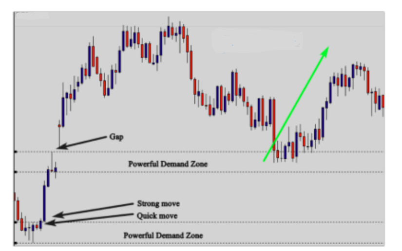
On this daily chart, we have two demand zones; the first demand zone was powerful because the beginning of the move was quick and strong, and the second demand zone was also a powerful
area because there was a gap. When prices jump strongly up or down creating a gap, this is clear evidence of a market maker order. As you can see, when the market retraces the test to the first demand zone, it went up again, because there were quantities left at the same price level. Look at another example below:
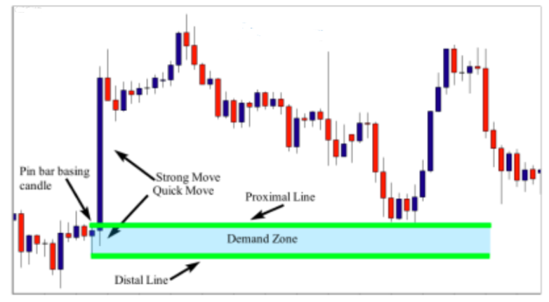
On this chart we look at this big blue candle – the size of the candlestick shows that there is a huge bank behind this move, because retail traders can’t move the market strongly upward in a very short period of time. This move is powerful, and the candlestick size is bigger, which indicates that this demand zone is strong.
We don’t care if this bank was motivated by economic news and this is not our job because we don’t use fundamentals. We use the supply and demand method to read how fundamentals affect banks and financial institutions. And based on the bank(s) behaviors, which we see in the form of patterns on charts, we make our trading decisions.
This chart above shows a huge move up made by a financial institution; this huge order was not taken by chance. If this bank doesn’t find enough sellers, it will leave limit orders in the same area, and when the market retraces back to test it, we can anticipate another move up.
To be able to identify the limit order area, we need to draw the demand zone, and in this example, we will use the pin bar candlestick as a basing candle, because it is the last candle that
was formed before this move up. So, to draw the zone, you draw the distal line at the lower shadow and the proximal line at the nose. And when the market retraces back to test the demand zone, you should wait for a price action signal to confirm your buying decision. Look at another example provided below:
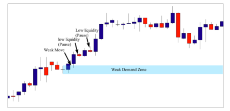
Here is another example – the market formed a Rally-Base Rally demand zone continuation pattern. This zone is not strong, because the move is weak; look at the both red candles, they are small and show lack of liquidity in the market.
So, it is very obvious that this is not a bank order, and this demand zone should be ignored. Look at another example below
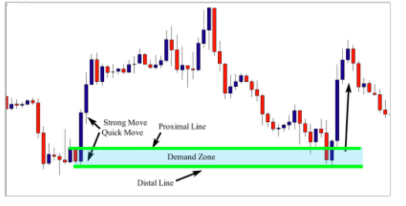
This chart reveals that we have a nice Drop-Base Rally demand zone. The move is fast and strong, and the candles are big. This is a clear demand zone that we should take into consideration. So, in order to draw the zone, you need to just identify the basing candle, and in this example, the engulfing bar is the last pattern that was formed before this move up. To draw the zone, you draw the proximal line at the close of the first candle, and the distal line at the lower shadow of the second one. When the market returned to test the zone, prices were rejected, and the market moved up again. Let me show the last example below:
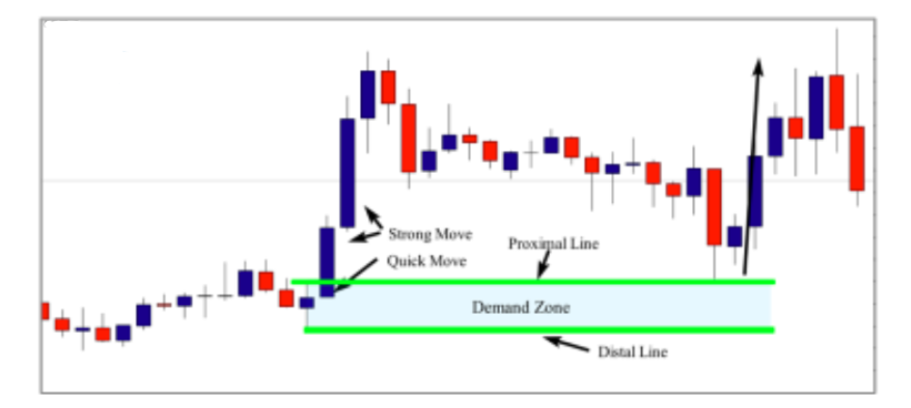
In this last example, we see that the market made a huge move up, as evidenced by the three blue candles; they are big and strong, which give us an idea about the strength of the move. This zone is clear. Most strong demand
zones are obvious on charts. If you find it difficult to decide whether the zone is strong or not, just ignore it, because strong zones will jump out at you immediately when you open
your charts.
The basing candle in this example is a bullish pin bar with a nose, so to draw the demand zone, you draw the proximal line at the nose, and the distal line at the lower shadow, and when the market retraces to test the zone, pay particular attention and wait for a high probability price action signal to confirm your entry. I will teach you how to enter and exit your trades in the upcoming lessons but for now, I want you to focus on how to qualify supply and demand zones based on the time spent in the zone, and the candle size of the zone.
The Freshness of the zone
One of the most crucial pieces of criteria that will make a difference in trading supply and demand zones, is the freshness of the zone. The more the level is tested, the
weaker it gets. When you identify a supply zone, you should pay attention to how many times the level was tested. This will help you determine whether the zone is worth trading or if you should ignore it. Look at the illustration below to understand how we determine whether the zone is fresh or not:

As you can see in the illustration above, the number of retracements is crucial to qualifying the power of the zone. The first zone is very strong, because it is fresh, and the first pullback represents a high probability setup to enter the market after the confirmation of a price action signal.
The second zone is strong as well, but not stronger than the first one, because it was tested twice. The second pullback represents a good opportunity as well. However, you will always need additional confirmation. That confirmation can be a pin bar, an inside bar, or an engulfing bar, but waiting for a confirmation is a must to enter the market if you are a beginner trader.
The third zone is a very weak demand zone, because it was tested for a third time. Hence, we can’t trust this zone anymore, because if buyers were so powerful, they will not need to test a zone more than once. So, if the level was tested more than two times, you should eliminate the zone, and focus only on the fresh ones.
Now, let me give you a real chart example of a fresh zone to help you better understand how to determine the freshness of supply and demand zones. Please view the chart below:
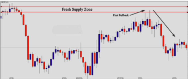
On this chart, we see the supply zone was fresh. The freshness of the zone represents the strength of it. So, when the market tests the zone for the first time, we can predict a strong move down, because prices will hit the unfilled limit orders that were left in the zone. As you can see, when the market retraced back for the first time to test the zone, prices were rejected, forming a pin bar candlestick pattern. Look at another chart example of a strong supply zone, but this time, the level was tested twice. Look at the chart below:
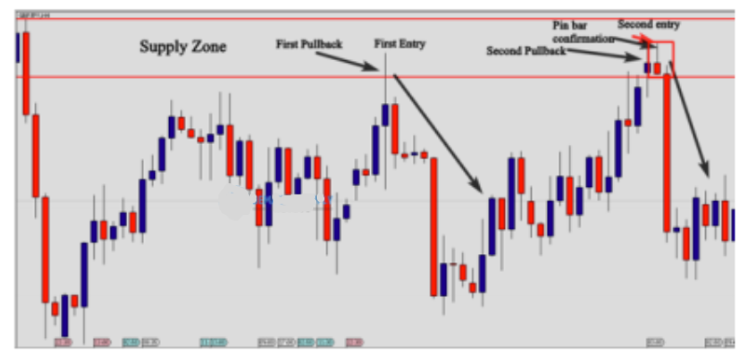
The supply zone was fresh; the first pullback represents a high probability entry point. As you can see, when the market retraced to test the zone, it was strongly
rejected. The second pullback is a good opportunity to short the market, because the zone is still valid and strong. When the market pulled back for the second time to test the zone, we had a nice pin bar candlestick pattern as a signal to short the market. Look at the reference example below:
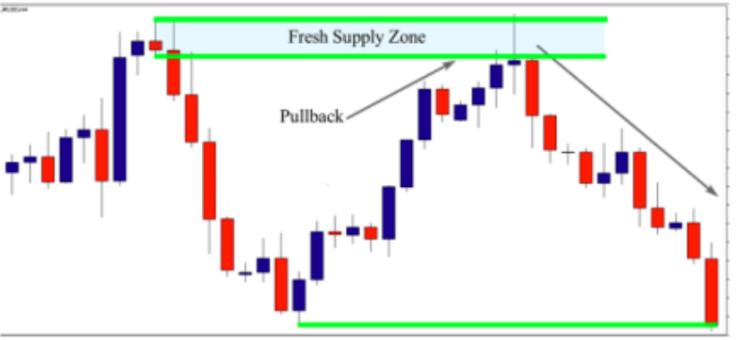
On this chart we see a nice Rally-Base-Drop supply zone. As you can see, the move is fast and strong; the candle’s size is big, which indicates that the order was made by a
bank or any other financial institution. The freshness of the zone gives more strength to this high probability setup, so the first pullback to test the zone should be taken into consideration. As you can see, when the market returned to the zone, prices hit unfilled limit orders and the market was rejected, forming a nice Doji candlestick. Look at another example below:
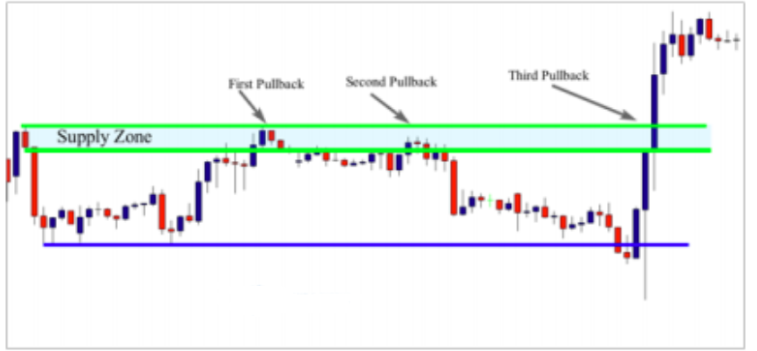
Here is another example that reveals the market formed a nice supply zone. The first pullback and the second one worked because the zone was still fresh, but the third pullback failed because the area was tested a couple of times. So please, take this as a rule: the first and second pullback can be traded if there is a clear price action signal. However, the third pullback to the supply zone should be ignored. Let’s move to the demand zone to see how to decide whether it is fresh and tradable or not; please see the example below:

On this chart we see a clear, fresh demand zone, because it was only tested for a first time. When the market goes back to test the area, it is obviously rejected. You can consider the zone still strong, even if it is tested for the second time. But you should always wait for confirmation to make your trading decision. Review the example below:

This example shows the market formed a Drop Base-Rally demand zone, and, as you can see, the move is quick and strong, and the candle’s size is big. This indicates that the order that caused this strong move up was made by a
financial institution. The basing candle is the engulfing bar pattern, and so to draw the zone, you draw the proximal line at the close of the first candle, and the distal line at the open of the second candle to get this strong demand zone.
The zone is fresh because it was not tested a couple of times; the first pullback did not give us a strong price action signal to buy the market; However, in the second pullback, the market was rejected and formed a nice tailed bar. This reveals that the zone is valid during the first and second pullback; if the market makes another pullback, this zone should be ignored. Look at another example below:

In this example, we have a clear demand zone; the move is quick and strong, and the candle’s size is big. The basing candle is the inside bar pattern, which you can consider it a Doji candle as well. So in this instance, to draw the zone you simply draw the proximal line at the upper shadow of the inside bar or (Doji), and the distal line at the lower shadow of the mother bar or the Doji; both ways of drawing are correct. This demand zone was fresh, and this gives it more strength, because when prices retrace back to test the zone for the first time, we will see a clear rejection and a strong move up. As you can see, that’s what happened after the first pullback; sellers were rejected, and prices moved up strongly again. Look at another example below:
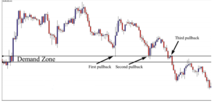
On this chart above, the market formed a clear demand zone. When the market retraced back to test the zone,prices were rejected at the first and second pullbacks. However, the third pullback failed because the zone is no
longer valid. So, no matter how strong supply and demand zones are, the zone should be fresh – this simply means price has not attempted to break that level before. Each time price comes back to a zone, the zone becomes weaker and will eventually break.
The breakout of previous support and resistance levels Another piece of criteria that you should take into consideration when qualifying a supply or a demand zone is
how the moves react to previous support or resistance levels.
This factor is important to qualify the power of the move, because a bank order doesn’t care about support or resistance levels; banks always trap retail traders and take their stop loss. So, when a financial institution takes a buy or a sell order, it drives the market to go crazy and catch other retail traders stops. This trap allows the bank to get more quantities and push the market strongly upward or downward. See the illustration below:
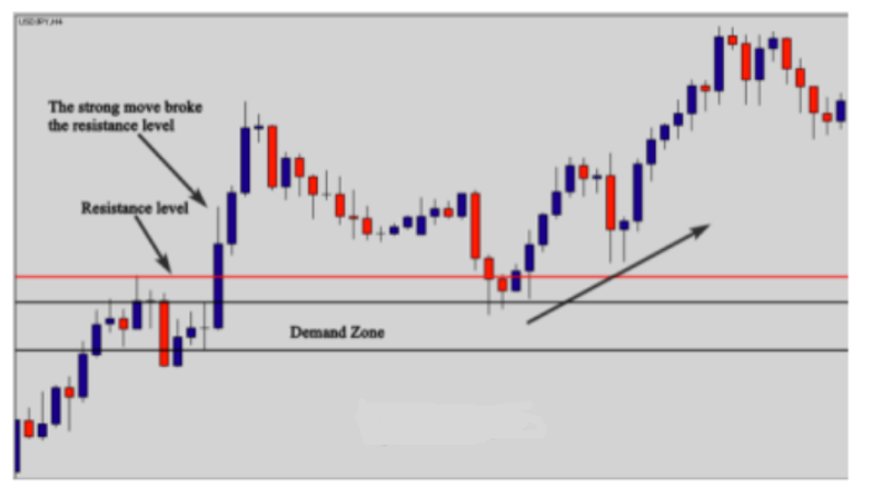
As you can see in the chart above, the strong move broke the resistance level and took the stop loss of sellers who shorted the market from this level. When you identify a demand or a supply zone, always look left to see if the move broke the previous resistance or the support level. See another illustration provided below:

As you can see, the market formed a nice Drop-Base-Rally demand zone. The move is quick and strong, and the candle size is big, which indicates that this order was placed by a financial institution. The breakout of the previous resistance level is another indication that helps us qualify the move as strong and tradable.
The zone is fresh, and it is going to be tested for the first time; this other criteria gives us more confidence in this area. So, to draw the zone, you just look left and identify the basing candle. In this example, the inside bar is the one that we use to draw the demand zone. So here, you simply draw the proximal line at the close of the inside bar and the distal line at the lower shadow of the mother bar. Please notice that when the market retraced back to test the zone, prices were rejected, forming a nice pin bar candlestick pattern that can be used as an entry signal.
Let me now give you another example of a supply zone below:
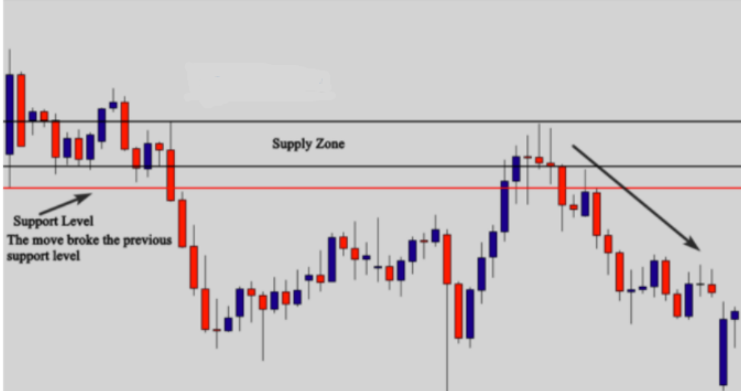
As you see, the strong move of the supply zone broke the previous support level; the breakout of this level indicates that the move is powerful, and there is a bank behind this move. After the breakout of the level, the stop loss orders of previous buyers will be caught and the market will go strongly down. This is one of the criteria that helps validate a supply or a demand zone. So again, always look left to see what happens to the previous support or resistance levels. Supply and demand zones that were rejected from a previous support or resistance level are not as powerful. Look at another example below:
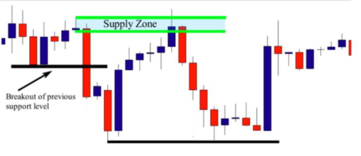
As we see here, the market formed a clear supply zone – the basing candle is the Doji candlestick, so in order to draw the zone, you simply draw the proximal line at the lower shadow and the distal line at the upper shadow of the candle. Now, let’s qualify the power of the zone: If you look at the move, you will clearly notice that it is quick and strong and the candle size is big (look at the big red candle). The breakout of the previous support level is further evidence that the move is very strong. The zone is fresh, and when the market retraced back to test it for the first time, prices were rejected, and the market went down.
The Minimum Risk to Reward Ratio
The next criteria that you should take into consideration is the risk to reward ratio. This is what makes a difference in your trading account. What do I mean by the risk/reward
ratio? The risk/reward ratio is the amount of money your risk in comparison to the amount of money that you are supposed to gain.
When you analyze the market and you find a high probability entry point, you should always calculate your risk to reward ratio. By that I mean that you should know how much you will risk, and how much you will win if the market goes in your direction. We will talk about this in detail in the money management section. To decide whether the supply or the demand zone is valid, we need at least a 2:1 reward to risk ratio; meaning that the amount of money you will win should be at least twice the amount of money you will risk. Let me give you an example – if the zone has less than 2:1 risk to reward ratio, you should ignore it , even if it is a powerful zone.
Because if you trade low risk to reward ratio probabilities, you will end up a loser in the long term.
Let’s say that you find a high probability supply or demand zone; you know that you will risk 100 dollars, and if the market reaches your profit target, you win 200 dollars. This is a 2:1 risk/reward ratio. If the amount of money that you will win is 300 dollars, this means that this is a 3:1 Reward to Risk ratio. I will explain to you how to calculate your risk to reward ratios in later sections.
Let me now give you an example of a supply and demand zone with a good risk/reward ratio; see the chart below:

This is a supply zone with at least a 4:1 reward to risk. In order to calculate the risk, you calculate how many points/ticks/pips between the distal and proximal line (the supply zone), and how many points/ticks/pips there are from the proximal line to the next support level or next demand zone. This supply zone has a good risk to reward ratio. Let me give you another example of a supply zone with a good risk to reward ratio:

Notice that the market formed a nice Drop-Base-Drop supply zone, and as you can see, the move is strong, the candle sizes are big, and the previous support level is broken. The zone is fresh because it will be tested for the first time and the risk to reward ratio is very attractive. As you can see, this trade offers a more than 4:1 reward to risk ratio. This is an especially important piece of criteria that should be taken into consideration. Look now another example of a demand zone below:

This is an example of a demand zone with a good risk to reward ratio. The risk to reward ratio is more than 3:1, which gives the trade good potential. If you take trades like these, you are not obligated to always be right to become a profitable trader. This demand zone is a high probability trade because the move is strong. Look at the first big candle. This candle gave us an idea about the move; the time spent in the zone is short. The breakout of the previous resistance level and the freshness of the zone are also important criteria that we should look for when qualifying this area as a valid demand zone. Look at this example below:

As you can see, the market formed a Drop-Base-Rally demand zone; the move is quick and strong; the breakout of the previous resistance level is another element that confirms the power of the move. The freshness of the zone gives it more credibility, and the risk to reward ratio is more than 4:1, which makes trading this demand zone very interesting. Now you know how to identify: supply and demand zones, how to draw the zones, and how to qualify valid zones by looking at the following criteria:
– The strength of the move
– The breakout of previous support and resistance levels
– The freshness of the zone
-The minimum risk to reward ratio.
The last, and most important element that you shouldn’t forget when qualifying supply and demand zones is the bigger picture. You should make your top down analysis to see if the zone is formed with the trend or not. This is what we are going to cover in the next lesson.
The Alignment of the Zonewith The Higher Time Frame Direction
Another critical step that you should take into consideration when qualifying supply and demand zones is the alignment of the zone with the bigger time frame direction. What I mean by that is: the zone that you want to trade, and the trading time frame should be in the same direction of the higher time frame. The alignment of the zone with the higher time frame is not a rigid rule; if the trading time frame and the zone are aligned with the higher time frame, this gives the zone more strength.
However, if the zone is not aligned with the higher time frame, this doesn’t mean that you should ignore it, because in the following lessons you will learn how to trade supply and demand zones, even against the trend. If you are a beginner trader, and you want to master this trading method, I want you to consider “The Alignment of the Zone with THE Higher Time Frame Direction ” as another criterion to qualify valid supply and demand zones. So, when you qualify a supply or a demand as a valid zone, you should make sure this zone is in line with the bigger picture by looking at more time frames.
No matter what type of trader you are, youshould always use multiple time frame analysis to get an idea about the bigger picture of the market. Most professional traders use two (or more) time frames, which is what I use personally when trading supply and demand. If you are a swing trader, and you want to trade daily charts, you should start with the monthly time frame, which is the bigger picture, and then move to the weekly /daily time frame (please view the diagram below). If the bigger time frame (monthly) is up, then you switch to the daily chart (which is your trading time frame), and the daily chart should be in an uptrend as well…you should then find a demand zone(s) that forms in line with the direction of the higher time frame.
If the bigger time frame is down and you switch to the daily time frame, which is your trading time frame, it should be a downtrend as well , and you should look for only supply zones, because they are aligned with the direction of the market (bigger time frame).You should also know the supply and demand zones that are formed on the bigger time frame.
Why should you know where the supply and demand are on the monthly charts? There are two reasons for that; if the monthly and daily charts have the same supply and demand zone in the same direction, this zone then becomes very powerful, and it will allow you know whether to take a limit order or a market order; it all depends on the other criteria. The second reason is that sometimes you will find supply or demand zones on the daily charts, but on the monthly chart, you find an opposing supply or a demand zone. This will help you know the potential of your trades on the daily charts.
Let me give you an example: if the monthly chart is going up, but faces a powerful supply zone, and then you switch to a daily, you know that the bigger picture is up; you should be looking for a demand zone. However, if you draw the monthly supply zone on your chart, and see on the daily chart there is an opposing monthly supply zone – this could effectively reverse the market. So, if you already took a trade, you know that when the market approaches the supply monthly zone, you should take your profit and get out. Look at this chart example below:

This is a monthly chart. The market was trending down, but it spent a long time ranging. The breakout of the trendline was a good signal that the market is going to go down. This is the first information we gathered from this monthly chart, and when we move to the daily chart, we will try to find supply zones that are aligned with the direction of the market. See the daily chart below
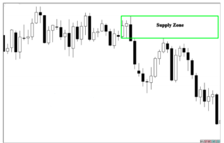
As you can see, the market on the daily was ranging, but the supply zone that was formed broke the range and dropped the market down. This is a powerful supply zone that should be taken into consideration because it is aligned with the monthly downtrend. Look at another supply zone that was formed after this one:

This is another supply zone that was formed after the one that was shown before; as you can see it is aligned with the monthly downtrend and this is one of the most powerful factors that determines
the strength of the zone. If you want to trade the 4h charts, you should start with analyzing the weekly or daily charts; the weekly chart is going to be your bigger time frame, and the 4h chart is your trading time frame. Look at the diagram below:
To trade the 4h time frame, you should look at the weekly chart to identify the trend of the market, see the example below: As you can see in the weekly chart above, the market is trending down. We identified the supply zones just to be cautious when we are trading the 4h time frame.
When we move to the 4h time frame, we will focus only on the supply zones, because we know that the market is trending down on the higher frame, so our zones should be aligned with the direction of the market. Look at the chart below:
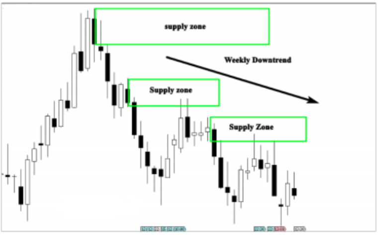
As you can see in the weekly chart above, the market is trending down and we identified the supply zones. Look at the chart below:
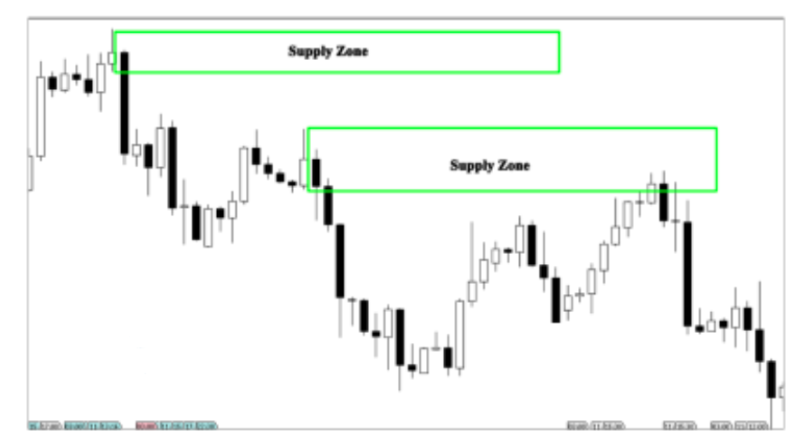
As you can see in the 4h chart above, we had two powerful supply zones. When the market tested these supply zones, the price was easily dropped down. Now, you should understand why we took only the supply zones, and we ignore the demand zones; it is because they are aligned with the direction of the higher time frame.
Remember that when you are trying to identify supply and demand zones on the weekly chart, which is the bigger time frame, you are not obligated to apply the principles we talked about to see if they are valid supply or demand zones; the purpose is only to identify supply or demand zones that can align with the trading time frame or being opposed to it .
If you are a day trader, and you want to trade 15 minutes charts, you should look at the 4h (or 1h) chart to see if they are aligned in the same direction; identify supply and demand zones on the 4h time frame, and then you move to the trading time frame which is the 15 minutes. Look at the following example below to see how we can trade smaller time frames using supply and demand zones:
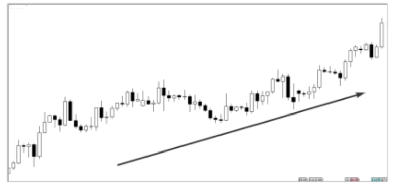
This is a 4H chart and in this illustration the market is trending up. You can see it is making higher highs and higher lows. So, the bigger picture is clear, we know that the direction of the market is up. Now we should move to the 15 minutes chart, and look for only demand zones that are aligned with the uptrend (bigger picture) look at the chart below:
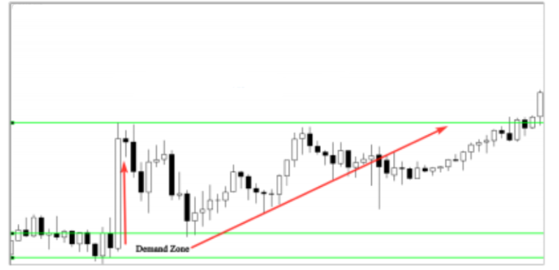
As you can see in the 15 minutes chart above, we have identified a very powerful move (look at the big white candle) which is certainly a financial institution order. So we draw the demand zone, and wait for the market to retest it again. This demand zone has a big potential because it is formed in line with the direction of the market. The top down analysis will help you know when to take a demand or a supply zone into consideration and when to ignore it. It is important to remember that on bigger time frames, we try to identify the direction of the market, and the most important supply and demand zones. We do this because when we switch to the smaller trading time frame, we should know if there is a supply or a demand zone that will oppose or be aligned with the supply and demand zones we looked for in the trading time frame.
Why do you have to see only the 4h chart and not the monthly when trading 15 minutes charts? It is because you are not going to stay for hours and hours in the market; you are only in intraday and therefore interested in the short-term time frame related to your trading time frame. When you are analyzing time frames, don’t overcomplicate your analysis. Simply look at the bigger time to identify the trend, and the supply and demand zones. If the trend is up on the bigger time frame, you know that you should focus on the demand zones on the trading time frame, and you take into consideration supply and demand zones of the bigger time frame, and vice versa. Let me give you some real chart examples below:

This is a daily chart; we want to trade the H1 time frame, so we should analyze the daily to get an idea about the bigger picture. As you can see, the market is trending down and this downtrend was confirmed by the breakout of the support level that becomes resistance. There is no supply zone and no demand zone (opposing zone) on this time frame. So, now we know that the trend is down on the bigger time, we then switch to the H1 time frame. We need to find a downtrend and a clear supply zone that is in line with the bigger time frame direction. See the illustration below:
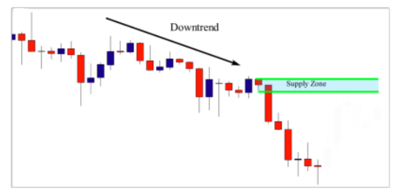
As you can see in the chart above, the H1 time frame is trending down and we had a nice supply zone that was formed in the market. This supply zone occurred in a downtrend and it is in line with the bigger time frame direction. So, this criterion gives this zone more strength. Now let’s try to qualify the power of the zone using the previous criteria we studied before: The time spent in the zone: The market spent little bit time before moving down, but this time is still accepted. The candle size of the zone: The candle size of the zone is not that big, but it is not small either, we can say that the candles are medium sized, which is also accepted.
The breakout of previous support level: As you can see, the zone broke strongly the previous support level; look left and see how this level was broken. The freshness of the zone: The zone is fresh and if the market retraced back to test it, and there is a high probability that the market will go down again. The risk to reward ratio: As you can see, this trade offers an attractive potential of more than 3:1 reward to risk ratio. In addition to our top down analysis that showed us that the zone in the H1 time frame is in line with the bigger time frame direction, the other criteria confirms the power of the zone and qualifies it as a valid zone. Look at what happened next:

This is what happened when the market retraced back to test this supply zone. As you can see, the market formed a nice Doji candlestick, which indicates indecision or a pause before this move down. Look at another example below:

This is a daily chart above; the market is in an uptrend forming a nice demand zone; so when we switch to the H1 chart, which is going to be your trading time frame, you should bear in mind that the direction of the bigger picture is up, and only take demand zones that are in line with the daily chart direction. See the H1 chart example below:
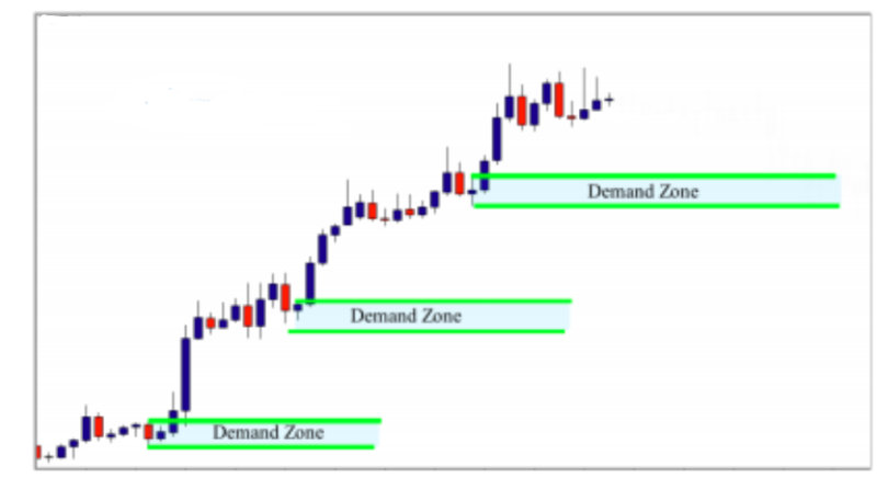
In the H1 chart above, the market is moving up as well, and there are three demand zones that formed in line with the direction of the higher time frame. So, the first element that validates these zones is its alignment with the uptrend direction to qualify the zone.
You should verify the power of the moves, the breakout of previous levels, the freshness of the zones, and the risk to reward ratio. These demand zones are considered strong zones and they are worth risking your money. Look at what happened when the market retraced back to test the first demand zone:
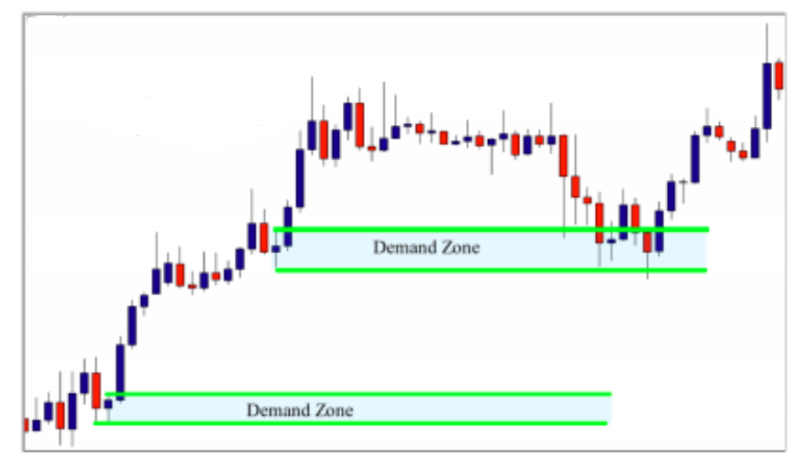
As you can see, when the market returned to test the first demand zone, prices formed a Doji candlestick which indicates a pause, and a pin bar which indicates rejection and all these candlestick patterns can be taken as entry
signals. Please don’t think of how to enter the market right now, because I will explain in detail how to use candlestick patterns as entry signals in the next lessons. I want you to focus only on how to find supply and demand zones that are in line with the higher time frame direction. Look at another example below:

This is a monthly chart; as you can see, the market is in an uptrend, so when we switch to the trading time frame (which is the daily), we should look for demand zones that are in line with the higher time frame direction. Look at the chart below:
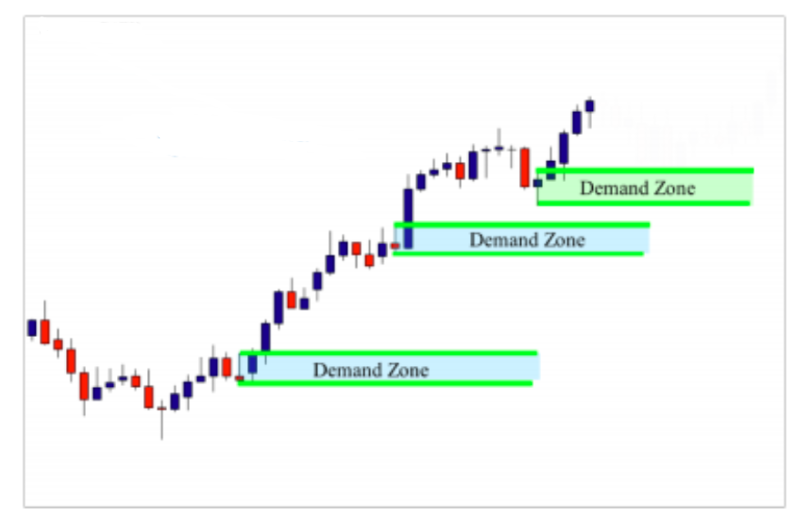
As you can see, when we switch to our trading timeframe (which is the daily), we find three important demand zones that formed in line with the higher time frame direction. I’m not going to tell you how I qualified these zones as valid demand zones, because I think that you are now used to the criteria that we use to qualify a zone (power of the move, speed of the move, breakout of previous levels, freshness of the zone , the risk to reward ratio). Let’s look at what happened when the market returned to test the first demand zone:

As you can see in the chart above, when the market retraced back to test the demand zone, prices formed a nice inside bar pattern that can be used as an entry signal. I think that you now have all elements in hand to qualify a supply or a demand zone and decide whether it is a strong zone or not.
But this is not quite enough to start trading, because whenever you spot a strong supply or demand zone, you will need some confirmations that support your trading decisions. And that’s what we will cover in the next lesson.
How to identify quality supply and demand zones
Hey everyone, in the previous lessons you learned how to identify supply and demand on your charts and learned how to draw these zones properly using different candlestick patterns as basing candles.
In this lesson you’ll learn how to differentiate between strong supply and demand zones that you should trade and the weak supply and demand zones that you should ignore because you’re not going to trade every single supply or demand zone out there that you find on your chart.
So to determine the quality of supply or demand zones I’ve developed a set of criteria by which supply and demand zones can be evaluated, such as the strength of the move, the freshness of the zone, the breakout of previous levels, the minimum risk to reward ratio, and the alignment of the zones with the higher time frames.
In this lesson, I’ll cover the first criteria, which is the strength of the zone or the strength of the move. To determine whether the zone is strong or not, you should take two factors into consideration, the time spent in the zone and the candle size of the move. Let’s look at an example.

In this chart, we have a clear rally base drop supply zone. When you identify the zone, you should pay attention to the beginning of the move. As you can see, the move was quick and strong and the candle size is big. These two elements showed us that there is a bank or a financial institution behind the strong move down because retail traders cannot move the market this way. But banks or hedge funds or financial institutions can. So in this example, we see that this move is strong because the market didn’t spend very much time in the zone and the candle was big.
Let’s look at another example.

We have a first demand zone and a second demand zone. Let’s start with the first demand zone. Look at the beginning of the move. It’s quick and strong. The candle size is big. This is a strong demand zone. The second demand zone has the same qualifications. The market did not spend too much time in the zone and the candles are big and strong. Look at what happened when the market came back to test this demand zone. As you can see, the market went up strongly. In this example, we have a supply zone, a rally-based drop supply zone.

The basing candle is that pin bar. Then we also have a second supply zone formed from a drop-based drop. Let’s start with the first supply zone. As you can see, the move was quick.

The market did not spend much time in the zone and the candle size is big So it’s a it’s what qualifies as a strong supply zone Look at the second supply zone the beginning of the move is strong and the candle size is big So this is also a strong supply zone when the market Came back and tested the supply zone the market paused forming a nice inside bar pattern and move down strongly. So this is how we weigh the strength of the move. Remember there are two elements that you should take into consideration, the time spent in the zone and the candle size of the move. We’ll see you in the next lesson.
The freshness of the zones
Hey everyone, in this lesson we’re going to cover the freshness of the zone, which is an important factor that you should take into account when evaluating the quality of your supply and demand zones. It’s very simple to evaluate the freshness of the zone.
Let’s look at an illustration.
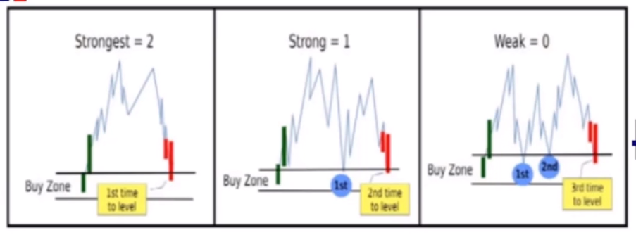
As you can see, we have three demand zones. The first zone is fresh because it has not yet been tested and this zone will offer the highest probability of a bounce. Second one is tested for the first time but still considered strong. So when the market traced back to test it again it was considered to be a strong zone but to trade it you should wait for a strong price action signal. The third zone is weak and should be ignored because it is tested more than two times and the greater the number of times the zone is fresh, you should see how many times the level is tested. If the zone was tested more than twice, you should probably ignore it. Let’s look at some chart examples.
So here we have a supply zone.
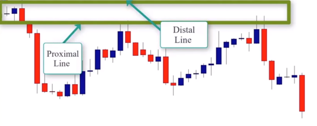
The basing candle is the pin bar. If we take both candles, we also get an engulfing candle as well. So to draw the zone we draw the proximal line at the lower shadow of the first candle and the distal line at the upper shadow of the second candle. Now let’s evaluate the strength of the move. As we can see the market didn’t spend much time before this move down. The size of the candles were big so the move is quick and strong. This is a fresh zone because it has not yet been tested. So it is considered a very strong zone. After this reassessment, the market did come back, tested the zone, and rejected, and price moved lower. So right now the zone is considered to be tested for the first time. After this second assessment, the market comes back and tests the zone for the second time, but it is still valid and tradable. After this test you should ignore this zone because it is no longer a fresh zone. Let’s look at another example.

On this move we see a clear supply zone. The move is quick and strong which confirms the strength of the move. We now want to evaluate the freshness of the zone. As you can see this was a fresh supply zone and we should pay attention to it when the market came back to test the supply area. So we have a first test as well as a second test. Right now the zone is valid and tradable, but after the second test we should ignore this zone. It’s no longer fresh after it’s been tested more than twice and the greater the number of times the zone is tested, the more likely it is to break. And that’s exactly what happened on that last attempt. The market attempt, the market broke and the market went higher. This final example, we see a demand zone.

In the basing candle is that pin bar. So to draw the zone, we draw the proximal line at the nose and the distal line at the lower shadow. The move is quick and strong, which indicates the strength of the move, and the zone is fresh because it has not yet been tested. This is the first test, and the zone worked well because it was tested for the first time. We can still trade the zone if there is another test but we should wait for a strong price action signal.
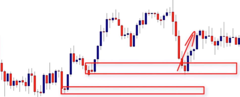
So this is how we evaluate the freshness of the zone. Remember a fresh zone offers the highest probability of the bounce but the greater the number of times the zone is tested the more likely it is to break. We’ll see in the next lesson.
The breakout of previous support and resistance levels
Hey everyone, in this lesson I want to cover the breakout of previous support and resistance as another criteria that you should take into account when qualifying supply and demand zones. So when you identify a supply or demand zone, we want to look to the left and see if the previous level has been broken. Let’s look at this example here.

We can see when we look to the left, previous resistance level. That level was broken strongly when the market moved higher. That breakout indicates that the strong move is made by a bank or a fund or some financial institution with big dollars. When banks or other institutions enter the market there are millions of dollars at stake. So the market tends to get a bit crazy and doesn’t care about support or resistance. Look at what happened when that level was broken. The market went strongly up because traders that sold the market here placed their stop loss just above that level. So when the market moved higher, the bank took those orders and pushed the mark higher, resulting in several retail trader stop levels. Let’s look at another example.

Here we have a clear supply zone and we can see that this support level was broken by a sharp move down by the market. This indicates that the move was made by a bank or a fund or a financial institution with several million dollars and confirms the strength of the move as well. In this example, we can see another clear supply zone, which we have previous support, which was also broken.
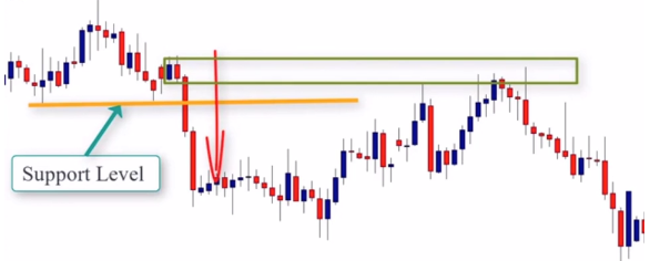
That was confirmed when the break of that support confirms the power of the zone. As you know the break out of a previous support or resistance level doesn’t necessarily mean that the zone is strong or is worth trading. So let me remind you of the other factors you should take into consideration when qualifying the quality of a supply or demand zone. First criteria is the strength of the move to qualify the quality of the zone. We look at two important things, time spent in the zone and the candle size of the move. As you can see, the market did not spend a long time in the zone and the candle size of the move was big.
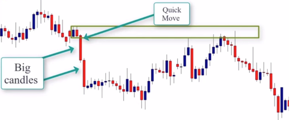
So we can see that this move is quick and strong. The second criteria is the freshness of the zone. This is a fresh zone because it has not yet been tested. So when the market traced back to it, we should prepare ourselves to short the market. The last criteria of the breakout is previous support or resistance. As we can see, the previous support was strongly broken and we should take that into account. So right now we can see that this supply zone is a high probability level that we should consider Shorting, but it’s not quite enough because we need to also make sure that these zones offer a good Risk to reward ratio and that’s what we’re going to cover in the next lesson. See you there
The minimum risk to reward ratio
Hey everyone, in the previous lessons we covered the most important factors that qualify a supply or demand zone, such as the strength of the move, the freshness of the zone, and the breakout of previous support or resistance.
In this lesson we want to cover the risk to reward ratio. This criteria is the most important one by far and you should take it into account before you decide whether to trade the supply and demand zone or not. So once you identify a supply or demand zone, you have to make sure that the zone offers at least a two to one reward to risk ratio. So what I mean by two to one reward to risk ratio, that means that the amount of money or ticks or points or pips that you trade or that the trade allows you to win should be at least twice the amount of money that you want to risk.
In other words, your profit should be at least twice that of your risk. Let’s look at an example here to help you understand what I’m talking about.
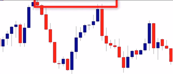
On this chart, we have a rally, base, drop, supply zone. The basing candle is the doji candle. So to draw the zone, we draw the proximal line at the lower shadow and the distal line at the upper shadow to get our potential supply zone. That zone is essentially our risk. That means that the ticks or points or pips between the distal line and the proximal line is your risk. Because when the market retraced back to test the zone, that’s where we get our entry signal. And that’s where we want to enter the market, and we want to place our stop loss above the distal line with a bit of a buffer. The reward is the distance between the proximal line and the profit targets. So in this example, our first profit target is the first support level.

We know, we’re not trying to calculate, we’re trying to compare between the risk and the reward that this zone offers. And as we can see, the supply zone offers a 5 to 1 reward to risk ratio. Here’s another example.
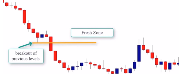
And here we have a drop base drop supply zone. As you can see, the move is quick and strong. The zone is fresh. And the previous support level is broken. So right now, everything’s about right. But what about the risk to reward ratio? So to evaluate the risk to reward ratio, we need to draw the zone. And as we can see, the pin bar is the basin candle. So to draw the zone, we draw the proximal line at the close of the candle and the disaligned at the upper shadow.

That is essentially our risk. What is the profit target? The profit target is the next support level. So again, the reward is the distance line between the proximal line and the profit target.

We can clearly compare our risk to reward ratio now. So it’s obvious that this one also has a good risk to reward ratio. Here is another example.
We have a drop base rally demand zone. But let’s evaluate the zone. As we can see, the move is quick and strong. The candles are big, the zone is fresh, and has not yet been tested. The previous resistance level is also broken.
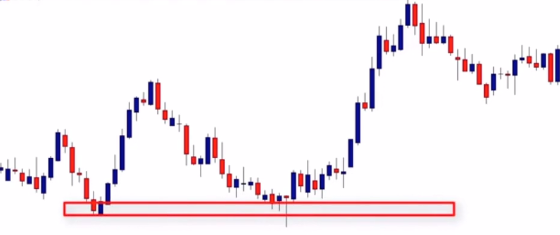
To evaluate the risk to reward, we draw our demand zone. The basing candle, as you can see, is that piercing pattern. To draw the zone, we draw the proximal line at the close of the second candle and a distal to lower shadow. So this is the demand zone and it equates to our risk. Our profit target is this next resistance level. So the distance between the distal line and the proximal line is our approximate risk. And the distance between the proximal line and the profit target is our approximate reward.

So this trade opportunity, as you can see, offers more than 6 to 1 reward to risk ratio. The R2R ratio is an important concept which is covered in detail in the Trade Tactics section. Now, I want you to open your charts, identify the supply and demand zones, evaluate the quality of those zones, and evaluate the history of the R2R ratio. We’ll see you in the next lesson.
The pin bar as an entry signal
In the last lessons, you learned how to qualify valid supply
and demand zones based on the following factors:
-The strength of the move: How the market leaves the zone determines the quality and the strength of it. Banks and financial institutions trade millions of dollars every single day, and when they place an order, the market responds strongly, and we can see this on our chart. To make sure the move is strong, you simply look at the time spent in the zone, and the candle size of the move.
-The breakout of previous support and resistance: The breakout of previous support or resistance level is a sign that the move is strong, and there is a financial institution behind it.
-The freshness of the zone: The zone should be fresh; either a virgin zone that is going to be tested for the first time, or a zone that is going to be tested for the second time.
-The alignment of the zone with the higher time frame :If the zone is in line with the higher time frame direction, it gives it more strength. We can still trade strong supply and demand zones even against the trend, and we’ll cover how to do it in the next lessons.
-The minimum reward to risk ratio: This factor should be taken into account when spotting a valid supply and demand zone; the risk to reward ratio is what will make you a successful trader or a losing trader. Supply and demand zones with less than 2:1 reward to risk ratio should be ignored.
When you qualify a valid supply and demand zone, youwill always need to see if the zone responds or not. If the zone responds, the market will give you a signal in form of a price action to confirm your entry. One of the most important price action patterns that can be used as a confirmation signal is the pin bar candlestick pattern.
The pin bar can include the following previously described candlestick patterns: lower shadow candles and long upper shadow candles, hammers and shooting stars, dragonfly and gravestone Dojis, etc… look at an example below:
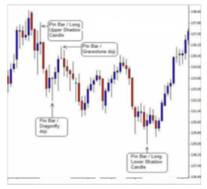
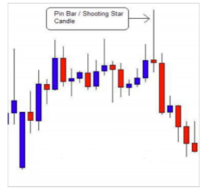
These different versions of pin bars happen frequently in supply and demand zones. When you draw your zone and you see that all the criteria are in place and a pin bar has formed, this gives us a clear signal to enter the market. Look at the chart example below:
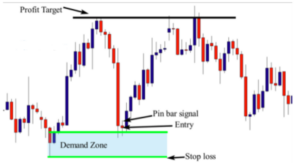
See the chart example above. The market formed a Drop-Base-Rally demand zone. The basing candle is an inside bar pattern and to draw the zone, you draw the proximal line at the close of the inside bar and the distal line at the lower shadow of the first candle. Let’s see if the zone is worth risking our money or not; look at the move, it is quick and strong, the candle size is big, and the previous resistance level is broken. The zone is fresh, and the risk to reward ratio is good, so we can say that the zone is valid but we need to wait for a clear price action setup to form.
When the market retraced back to test this zone, prices were rejected forming a nice pin bar candlestick pattern, so you can enter after the close of the pin bar; to do this , you simply place your stop loss below the distal line, and your profit target is the next support level. Look at another example below:
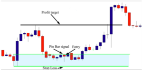
Here, the market formed a nice demand zone, the basing candle is a pin bar and to draw the zone, you draw the proximal line at the nose of the candle, and the distal line at the lower shadow. The move is quick and strong, as you can see the market didn’t spend a long time in the zone, and the candle that made the move is strong. The zone is fresh and the previous resistance level is broken. The risk to reward ratio is accepted, and as you can see, the trade offers approximately 2.5:1 reward to risk ratio meaning that right now, all these factors indicate that this level is a valid demand zone. However, we still need a confirmation signal to enter the market. The formation of the pin bar after this retracement back to the zone is a strong signal, so to enter the market, you can place a buy order at the close of the pin bar,a stop loss below the distal line; and the profit target is the next resistance level. Look at another example below:
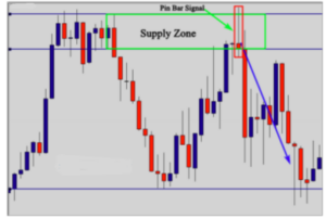
In this chart, the market formed a good supply zone: The move is not very strong, but it is accepted, as the previous support level is broken, the candle size is big, the zone is fresh, and the risk to reward ratio is very attractive. These criteria indicate that this supply zone is valid, but we still need a confirmation signal to enter the market. The formation of the pin bar candlestick pattern was a powerful signal to short the market. The formation of the pin bar in this zone means that buyers were strongly rejected by sellers, and this is clear evidence that the zone still works, because sellers are still willing to sell from this area. Therefore this price action trading setup validates the zone and confirms our entry. Look right now at how you can enter and exit the market using this price action pattern using the chart below
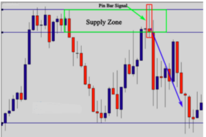
As you can see, after the formation of the pin bar, your entry should be after the close of, your stop loss should be above the upper shadow, and your profit target is the next support level. Notice that this trade provides us with a good risk to reward ratio. Look at another chart example below:

The chart above shows another supply zone. The move is not very strong, but it is accepted; the zone is fresh, and the previous support level is broken. The risk to reward ratio is very attractive because this trade offers at least 3:1 reward to risk ratio. The formation of the gravestone Doji (a pin bar) is a powerful confirmation to short the market. Look at the chart below to see how you can place your entry order and your profit target:
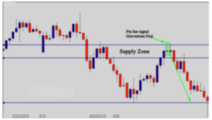
As you can see, after the formation of the pin bar, you place an entry order at the close of the pin bar, and the stop loss above the distal line or a few ticks above it, and your profit target is the next support level. Look at another example below:
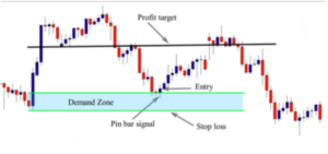
On this chart, the market formed a clear demand zone, and as you can see, the move is very strong, the zone is fresh, the previous resistance level is broken, and the risk to reward ratio is good. When the market retraced back to test this demand zone, prices paused forming an inside bar followed by a pin bar, so it is up to you to enter at the breakout of the inside bar or at the close of the pin bar.
In this example, we are learning how to use pin bars as confirmation signals, and l use the pin bar candlestick pattern as an entry signal. So, you can place your buy order at the close of the candle, your stop loss should be below the distal line and the profit target is the next support level. This is how you can use pin bar patterns as confirmation signals to enter the market when trading supply and demand zones. In the next lesson, you will learn how to use inside bar patterns as entry signals as well.
The inside bar as an entry signal
An inside bar pattern is a two bar pattern in which the inside bar is smaller and within the high to low range of the prior bar. The high is lower than the previous bar’s high, and the low is higher than the previous bar’s low. Its relative position can be at the top, the middle or the bottom of the prior bar. The prior bar, or the bar before the inside bar, is often referred to as the mother bar. Look at the illustrations below:
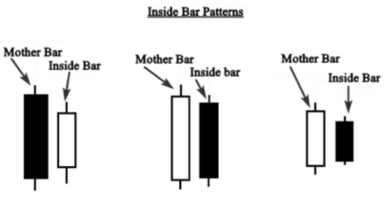
This is the traditional anatomy of inside bars. The formation of this pattern indicates indecision in the market; when this happens in a supply or a demand zone that requires a confirmation signal, we should use it to place our market entry. Let me give you an example below:
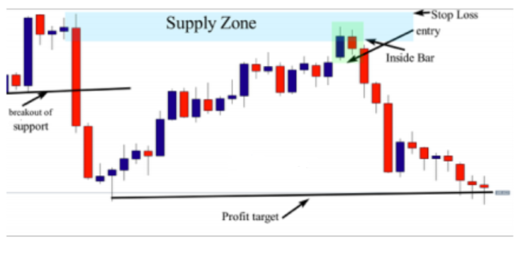
The market created a nice supply zone, and as you can see, the zone is very strong. The move is quick and strong, the candles are big, the previous support level is broken, the zone is fresh, and the risk to reward ratio is huge. These criteria allow us to qualify this level as a quality supply zone.
The formation of the inside bar patterns offers a great opportunity to enter the market after the breakout of the pattern. So,to trade this setup, you can enter either after the breakout of the second bar, or the breakout of the mother bar, and your stop loss should be placed above the distal line, and your profit target is the next support level. Look at another reference chart example below:
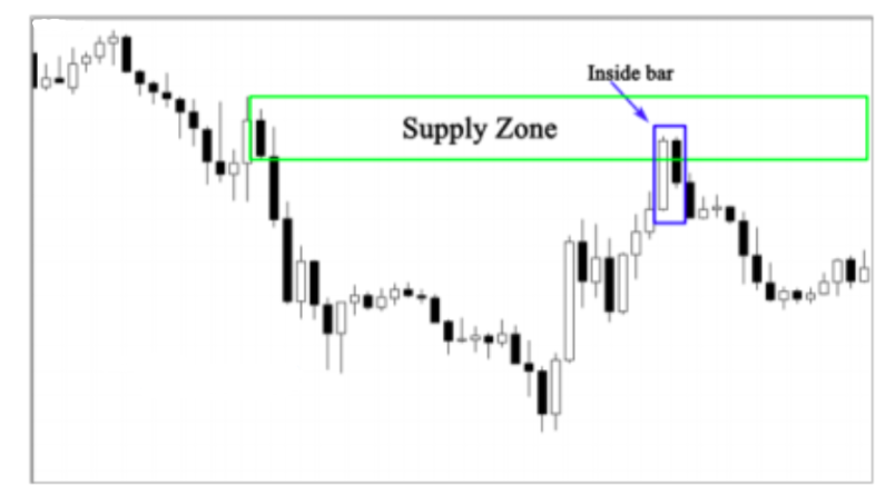
On the chart above; the market formed a nice supply zone – the move is quick and strong, the candles are big, the previous support level is broken, the zone is fresh, and the risk to reward ratio is good. The formation of the inside bar pattern when the market approached the zone indicates that the upward move is no longer powerful, and it faces a consolidation phase. The breakout of the inside bar pattern means that the market decided to respect this area.
Inside bars can technically encompass any candlestick pattern because they are simply a series of at least two candlesticks where the first candlestick completely engulfs the entire range of the subsequent candlestick, however, more often than not, inside bars end up being spinning tops or Dojis.
Note that the inside bar is different from the engulfing pattern, because it includes the entire range of the bar, from high to low, whereas the engulfing pattern only includes engulfment of the real body of the candle. Look at how inside bars look in your charts:

Inside bar spinning tops or inside bar dragonfly Dojis are different versions of the traditional inside bar pattern anatomy. However, they are also considered as inside bars, and they should be used normally as the traditional version of the inside bar pattern. Let me give you a chart example below:
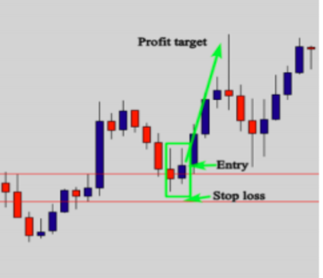
As you see in the chart above, the market formed a nice demand zone. The inside bar pattern was formed by a pin bar as a mother candle, and another pin bar as an inside bar. Don’t complicate things and waste a long time deciding whether the pattern is an inside bar or not. Look at the pattern and see if the second candle is entirely inside the first candle, that’s all. To enter the market, you only need to place an order after the close of the inside bar (second bar) and a stop loss below the demand zone, and your profit target is the next resistance level. Here in this trade you have at least a 2:1 reward to risk ratio. Look at another example (shown below) of how to enter and exit the market using supply and demand zones in combination with the inside bar pattern:
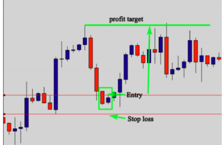
This is another example that shows how to enter the market using the inside bar pattern. This demand zone is strong, the move is quick and strong, and the candle is big which shows that this move is made by a bank or a
financial institution. Additionally, the previous resistance level is broken, the zone is fresh, and the risk to reward ratio is good.
After drawing the demand zone, the market went back to retest it and formed an inside bar pattern. The formation of this pattern means that the market is consolidating, or in an indecision phase. Why is it an indecision phase? Because
prices approached a demand zone, and buyers and sellers don’t really know what is going to happen. This is why no one could push the market up or down. The breakout of the inside bar (second candle) is a confirmation that buyers finally decided that the zone is worth trading.
So, your entry should be after the breakout of the inside bar, and your stop loss should be placed below the demand zone, and your profit target is the next resistance or (supply zone). This trade provided us with a 4:1 reward to risk ratio. Let me give you another example below:
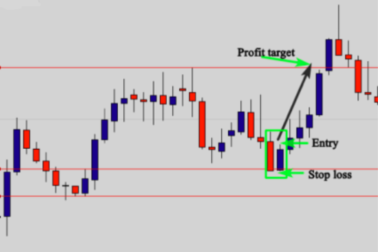
In this chart, as you can see in the previous example, we can use the supply and demand zone strategy in combination with the inside bar pattern in all time frames. It does not matter if you are a day trader or a swing trader. In the daily chart above, the market formed a nice demand zone, which is not as powerful, but it is not a weak zone either. We still wish to require a confirmation to make sure the zone is going to work.
When the market approached the demand zone, it formed an inside bar pattern to inform us that buyers and sellers hesitated to decide whether the market is going to go up or
down. As a supply and demand zone trader, we know the zone is strong, but still need confirmation, and the formation of the inside bar confirms our analysis. This prompts me to place a buy order immediately after the breakout of the inside bar (second bar), and a stop loss below the inside bar or below the demand zone – it all depends on your risk tolerance.
The profit target is the next resistance level. When I do this, my work is done; I should stay away and let the market do the work. If the market goes in my favor, I will win at least three times what I risked, but if the market didn’t go in my direction, I know that I’m wrong, and I will lose only the amount of money that I can afford to lose.
If you trade this way, you will always be a winner — because you will not be trading out of your emotions. And no matter what happens, you will win at the end.
The engulfing bar as an entry signal
The “engulfing” bar is one of the most important candlestick patterns that traders can use to benefit from when trading financial markets. The engulfing bar is one of my favorite signals when trading supply and demand zones. This pattern doesn’t happen often, but when it does, it is important to know how to take advantage of the profit potential. In this lesson, you will learn what this powerful pattern is, and how you can use it as a confirmation signal when it happens in the right place. As the name implies, an engulfing candle is one that completely engulfs the previous candle; in other words, the previous candle is completely contained within the engulfing candle’s range.
An engulfing bar consists of a smaller first candle known as the first candle, and a large second candle which has a higher high and lower low than the first candle.so that is seen to engulf the first candle. Look at the illustration below:

The illustration above shows bearish and bullish engulfing bars. The bullish engulfing bar happens frequently in a demand zone while the bearish engulfing pattern occurs in a supply zone. Let’s first talk about the bullish engulfing pattern. The bullish engulfing pattern formed after an extended move down, and indicates exhaustion in the market where sellers begin to take profits and buyers begin to take interest. Sellers and buyers are changing their role, and after the seller’s control of the market, buyers changed the game and take control of the market to reverse the direction of price. Look at the illustration below:
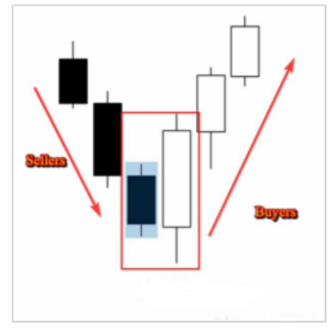
As you see here, the engulfing candle range engulfs the previous candle, and it is ok if the body of the engulfing candle doesn’t engulf the previous candle. The most important is that the range of the engulfing candle contains the previous one. See the illustration below:
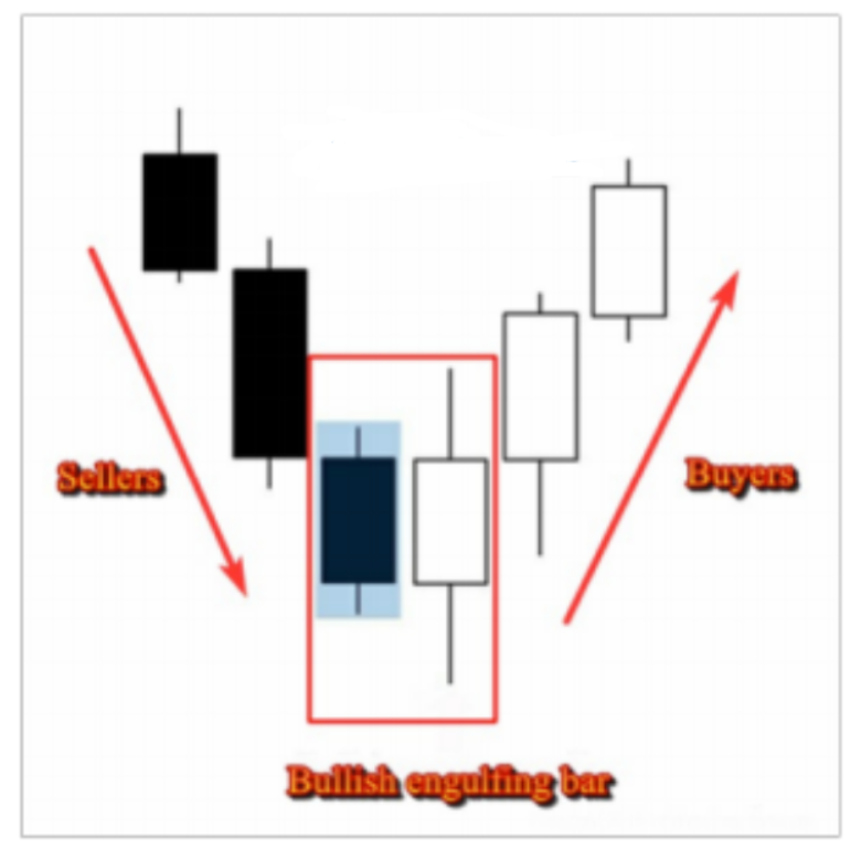
This is a bullish engulfing bar where the range engulfs the previous candle, but the body is in line with the preceding candle. This formation can be considered as an engulfing bar, because the range of the engulfing candle still completely cover the previous candle. The bearish engulfing bar is the opposite of the bullish one, and forms after an extended move up to signal an exhaustion in the market. This indicates that buyers are no longer in control of the market and sellers are likely to take control and reverse the direction of price. See the illustration below:
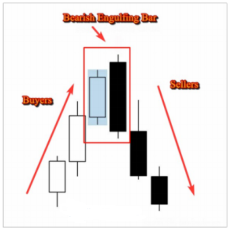
As you can see in the illustration above, the engulfing candle range completely engulfs the previous candle. Again, it is ok if the body of the engulfing doesn’t engulf the previous candle; we only need the range of the engulfing candle to engulf the previous candle to be considered a valid pattern. See the illustration below:
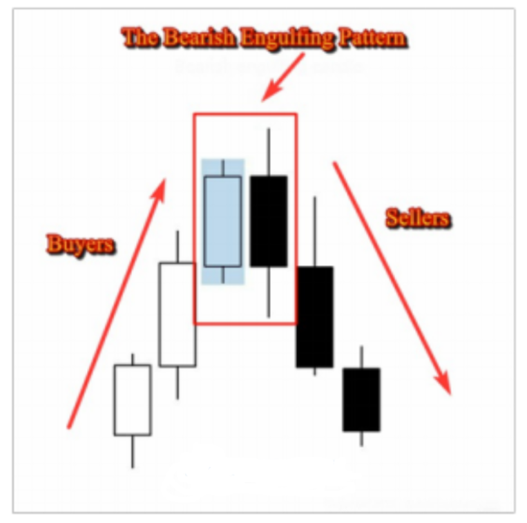
Notice how the engulfing candle range covers the previous candle, however the body doesn’t. This is still a valid bearish engulfing pattern
How to use Bearish and Bullish Engulfing Patterns as
Confirmation Signals:
Bearish and bullish engulfing bars are powerful candlestick patterns, and when combined with supply and demand zones, they give great results because you get all probabilities in your favor. When you identify a supply zone you know that this area is hot, and when price approaches it… it is likely to reverse. But you are not sure if the market will respond to this zone or not, because according to your analysis,
the zone is not strong enough. The formation of a bearish engulfing bar in that supply zone increases the probabilities of a move down and confirms your analysis. Because a bearish engulfing bar indicates that sellers are more powerful than buyers and when we see this in a supply zone, it gives more strength to the area. See the illustration below to understand more:
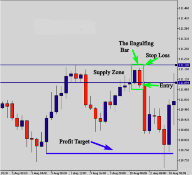
This example illustrates how the bearish engulfing bar pattern helped us confirm our entry. We had a good supply zone, but to enter this trade we still need some additional confirmations. The formation of the engulfing bar pattern was a powerful signal that confirmed our entry and allowed us to place a sell order after the close of this pattern. To enter the market, all we need to do is to wait till the bearish engulfing bar closes, and then you place a sell order after the close, and the stop loss goes above the supply zone. The profit target should be the next support level. See another example of a demand zone below:
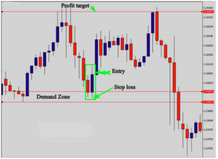
As you can see in the illustration above, the demand zone was not very strong, but is still tradable, so we were in need of a confirmation signal to place a buy order. The formation of the bullish engulfing bar pattern indicated that buyers are more powerful than sellers and that they are in control of the market when the price approached the demand zone. This is a clear signal that validates the power of the zone and encourages us to place a buy order after the close of the engulfing bar pattern and a stop loss below the wick of the candle or below the demand zone. Look at another example:

Here, the market formed a nice drop-base-drop supply zone – let’s try to qualify the zone:
The strength of the move: As you can see, the move is quick and strong, prices didn’t find resistance which indicates that the move was made by a big financial institution.
The candles size: The candles are big, and big candles mean huge volumes, which confirms the power of this move.
The freshness of the zone: This level is fresh because it has not yet been tested, so this criterion gives more strength to the zone.
The risk to reward ratio: This trade offers approximately a 4:1 reward to risk ratio which is very favorable. So, as you can see, we have a very strong supply level. When the market retraced back to test this zone, we need to wait for a confirmation signal to enter the market. The formation of the bearish engulfing bar at the supply zone indicates that buyers are no longer in control of the market, and sellers are going to dominate the next move down. So, to enter the market, you place a sell order at the close of the engulfing bar; your stop loss should be placed above the distal line and your profit target is the next support level. Look at another example below:

On the daily chart above, the market formed a nice demand zone; it is not very strong zone but it is tradable. When the market retraced back to test the zone, prices were rejected
forming a nice engulfing bar.
The engulfing bar is big, and if you enter the market at the close of, your risk to reward ratio will be less favorable; so in this instance, it is better to enter at the 50% of the candle range, place a stop loss below the distal line, and the profit target is the next resistance level.
This is how you can use the engulfing bar pattern as a confirmation signal when trading supply and demand zones. In the next lesson, you will learn about another confirmation signal that can be used in combination with supply and demand zones as well.
The inside bar false breakout as an entry signal
The inside bar false breakout is one of the most powerful price action patterns that occurs frequently in the market and is one of my favorite patterns. It too is always used as a confirmation signal when a supply or a demand zone needs confirmation. Look at the illustration below to see how the pattern looks like:
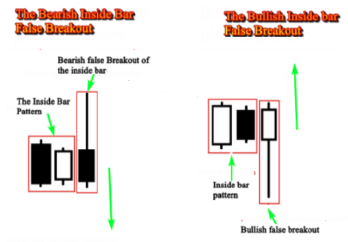
The bearish inside bar false breakout pattern occurs in a supply zone and reverses the market downward. As you can see, it is composed of two patterns. The first pattern is a an inside bar that indicates hesitation in the market, and then we have a pin bar that broke the market up and closed inside the inside bar pattern creating an inside bar false breakout. Look at the illustration below:
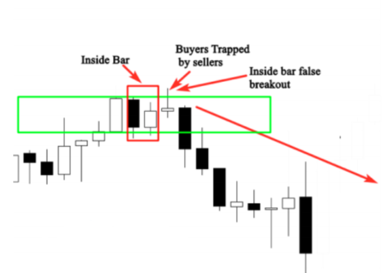
The example above illustrates a bearish inside bar false breakout that happened in a supply zone, and then reversed the market downward. Let me explain you why this pattern is important as a confirmation signal. Let’s suppose we draw a supply zone but think that the zone is not strong enough to place a limit order, and want additional confirmation to enter the market….if a bearish inside bar false breakout occurred in the zone, we determine it is a clear signal to enter. This is because the breakout of the inside bar by the pin bar motives buyers to place buy orders because they think that the market participants decided to go up after the hesitation phase, making buyers believing that the supply zone doesn’t work. But when the pin bar closes inside the inside bar, buyers got trapped in a false breakout by big players, and the market goes in the opposite direction.
The bullish inside bar false breakout happens in a demand zone and reverses the market up – sellers got trapped by big players thinking that the demand zone is not strong and the market is going to break it, but when the pin bar that made the breakout closes inside the inside bar pattern, it becomes clear that this breakout was only a trap and the demand zone is worth it. See the illustration below:
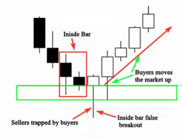
As you can see in the illustration above, when prices reached the demand zone, the market formed an inside bar false breakout, which is a trap that was made by buyers to make sellers think that the market is going to break the demand zone. But, when the pin bar closes inside the inside bar, this is clear evidence of a false breakout of this level and the market is likely to reverse. Now let me give you a chart example of a supply zone that needs a confirmation and how the inside bar false breakout helped us confirm our entry. See the illustration below:

Notice the market formed a good supply zone, but the zone was not strong enough, because the market spent some time before moving down, and it also found resistance – so we should wait for a confirmation when prices approach
this level. The formation of the inside bar in the supply zone tells us that the market is in a hesitation phase which gives more strength to the zone. The hesitation means that the area is taken into consideration by the market participants, otherwise it will be broken up easily. The formation of the pin bar that broke the inside bar made buyers think that the market went out of the hesitation phase and it is likely to break the zone and continue to go up, but the close of the pin bar inside the pattern created what we call a false breakout of the inside bar and showed us that buyers were trapped by sellers in a very critical area in the market, which is the supply zone.
This information confirms the strength of the zone and help us to enter the market with confidence. We place a market order at the close of the pin bar, and a stop loss above the supply zone, and the profit target is the next support level. Look at another example below:
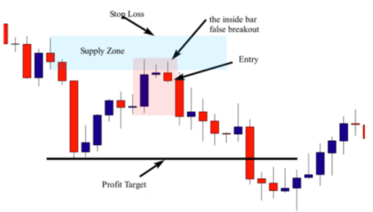
In this chart, the market formed a nice drop-base-drop supply zone. The basing candle is the pin bar pattern, so to draw the zone, you draw the proximal line at the nose, and the distal line at the upper shadow. Let’s try to qualify the zone. As you can see the move is quick and strong, the candles are big, the previous support level is broken, the zone is fresh, and the risk to reward ratio is good.
When the market retraced back to test the supply zone, prices formed an inside bar false breakout pattern which i a reversal signal that indicates that buyers are trapped by sellers and the market is likely to go down. So, to enter this trade, you can place your entry at the close of the pin bar that caused the false breakout, your stop loss should be placed above the supply zone, and your profit target is the next support level. Look at another chart example of an inside bar false breakout signal that was formed in a demand zone.

The chart example above shows us a bullish inside bar false breakout that was formed in a demand zone. As you can see, the area was not strong enough because it found resistance and the move was not that strong, so to avoid taking a risky position we need a confirmation signal. The formation of the inside bar false breakout was a powerful confirmation signal to enter the market. We place a market order at the close of the pin bar that made the false breakout, and a stop loss below the demand zone; the profit target is the next resistance level. Look at another example below:

Here, the market formed a drop-base-rally demand zone, the move is quick and strong, the candles are big, the previous resistance level is broken, and the zone is fresh. The risk to reward ratio is good, so we can enter the
market immediately after the formation of the inside bar false breakout pattern. Your entry should be placed at the close of the candle, and the stop loss below the demand zone. The profit target is the next resistance level.
Note that there are variations of the inside bar false breakout. The examples covered in this lesson were only with a pin bar as a false-break structure. However, you can find inside bar false breakout patterns with two or three bar false breaks, but I consider them less ideal than an inside bar false breakout with a pin bar.
This is the reason why I recommend you to focus only on inside bar false breakout patterns with a pin bar or a tailed bar, because this signal has a high probability win rate especially when it occurs in a supply or a demand zone.
The pin bar as a confirmation signal
Hey everyone, in previous lessons you learned how to identify supply and demand zones and you learned how to qualify valid and strong zones. But no matter how strong the zone is, you will always need to seek additional confirmation before taking any trading decisions. One of the most important price action patterns that can be used as a confirmation signal is the pin bar candle pattern.

The general idea of what we’re going to do is use our current understanding of how to trade pin bars as our trigger for entering trades at supply and demand zones. Let’s take a look at this example.
We have a clear demand zone here.

The move is quick and strong. The candles are big, which indicate that this move is likely made by financial institutions. The zone is fresh because it has not yet been tested, the previous resistance level is broken, and the risk to reward ratio is very attractive. When the market retraced back to test the zone, we just don’t enter the market blindly. We still need additional confirmation to place our buy orders. So as you can see in this example, the formation of the pin bar here indicates rejection. This means that sellers were rejected by buyers when the market approached this demand zone. The pin bar candlestick pattern indicates that the reversal is very likely to happen. This information is important to us as supply and demand traders because it helps us confirm our entries. So to enter the market we can do one of two things. We can place a buy order at the close of the pin bar or a buy stop right above the high of the pin bar. And our stop loss goes below the distal line. The profit target is the next resistance level. As predicted, the market went strongly higher after the formation of the pin bar candle pattern was broken. Here’s another example.
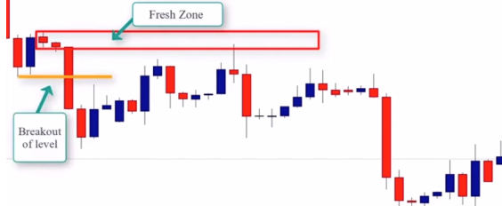
Here we have a clear supply. As we can see, the move is quick and strong. The candles are large, the zone is fresh, and the previous support level is broken. And then lastly, the risk to reward ratio is very good. When the market retraced back to test the supply zone, prices were rejected forming this bearish pin bar. The strong rejection is an additional confirmation that helps us take our trading decision with more confidence. So to enter this trade we can either place a sell order at the close of the pin bar or a sell order below the low of the pin bar low. Our stop loss is above the distal and the profit target is the next support level.

Here’s another example. We have a clear supply zone. As we can see the candles are big, the move is quick and strong, the zone is fresh, and the previous resistance level is broken, and the risk to reward ratio is very attractive.
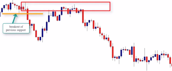
When the market retraced to test the supply zone, we actually got two price action signals to possibly enter. We got a bearish pin bar, as well as a doji candlestick. So to enter the market we can place a sell order at the close of the pin bar or below the low of the pin bar.

The stop loss again is above the distal, the profit target is the next support level. So this is how we use pin bars as a confirmation signal in conjunction with supply and demand zones. We’ll see you in the next lesson.
The inside bar as a confirmation signal
Hey everyone, in this lesson we’re going to learn how to use the inside bar candlestick pattern as a confirmation signal when trading supply and demand zones. An inside bar is a two candlestick pattern which indicates price consolidation. It consists of a mother bar, which is the first bar in the pattern, followed by the inside bar.

The inside bar pattern shows a pause or indecision in the market. When this pattern occurs in a demand or supply zone, it should certainly be taken into account. Let’s look at this example here.

As we can see, we have a rally, base, drop, supply zone. Rally, base, drop, supply. The move is quick and strong. The candles are big and the risk to reward ratio is good. The basing candle is the doji candlestick. So if we draw the zone, we draw the proximal line at the lower shadow and the distal line at the upper shadow to get the potential supply zone. When the market retraced back to test the supply zone, we have a nice inside bar pattern. The formation of this inside bar gives us important information. The market is in a decision phase. The breakout of this pattern means that the sellers decided to push the market lower. So when we spot patterns like this in a supply zone, we should enter after the break out of the inside bar or the mother bar or the low of, and the stop loss should be placed above the distal line and the profit target is the next support level
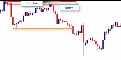
Let’s look at another example.

This is a rally base rally demand zone. Rally base rally demand. The zone is very strong as you can see, but let’s make sure the zone respects all the other factors that characterize a quality demand zone. Here we can see the quick and is moving strong. The previous resistance level is broken. The zone is fresh and offers a very good risk to reward ratio. The pin bar is also the basing candle. So to draw the zone, we draw the proximal line at the nose of the candle and the distant line at the lower shadow.

As we can see, when the market retraced back to the demand zone, we had clear rejection and also formed an inside bar candlestick pattern. So now we have two important pieces of information. We have a very strong level, which is the demand zone, and you know that buyers and sellers are in an indecision phase. So we have to pay attention to this price action pattern because the market will follow the inside bar breakout direction. So after the breakout of the mother bar or the inside bar, we should then look to place our buy orders. Remember our stop loss is placed below the distal line and our profit target is the next resistance level.

Let’s look at our final example.
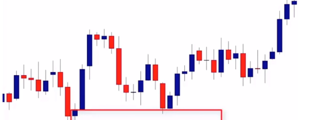
Here we have a drop base rally demand zone. Let’s qualify the zone. We have Quick and Strong Move. The candles are big, which indicate that there is a bank or financial institution behind the move. The previous resistance level is broken. The zone is fresh, and the risk to reward ratio is good. So right now, we have all the qualifications for a good move. The basing candle is that inside bar. To draw the zone, we draw the proximal line at the close of the second candle and the distal line at the lower shadow. So as we can see, when the market retraced back to this demand zone, prices form a nice inside bar pattern. So to enter the market, we can place the buy order after the breakout of the pattern and our stop loss is below the distal line.

The profit target is the next resistance level. This trade provides us with more than a 3 to 1 reward to risk ratio. This is how we use the inside bar candlestick pattern as an entry signal in combination with supply and demand zones. We’ll see you in the next lesson.
The engulfing bar as a confirmation signal
Hey everyone, in this lesson we’re going to learn how to use the engulfing bar pattern as a confirmation signal in combination with supply and demand zones.
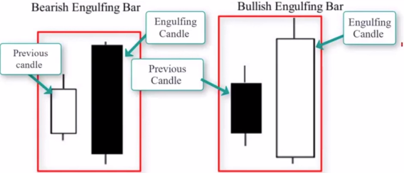
The engulfing candlestick engulfs or overshadows the previous candle and the main characteristic of an engulfing candle is the previous candle will fit into the engulfing candle. The size of the engulfing candle is bigger than the previous candle. There are two types of engulfing patterns. The first one is the bullish engulfing pattern and it happens frequently in demand zones and indicates that buyers are stronger than sellers. We also have the bearish engulfing candle and this pattern occurs frequently in supply zones and indicates that sellers are stronger than buyers. This candlestick pattern can be used as a confirmation signal when trading supply and demand zones. Let’s look at this example.
Here we have a rally base rally demand zone.
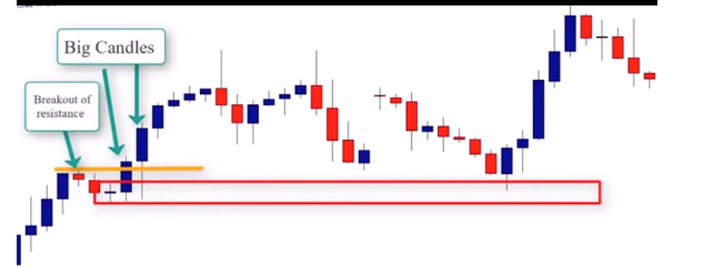
The basing candle is a doji candlestick pattern. So if we draw the zone we draw the proximal line at the upper shadow and the distal line at the lower shadow to get our demand zone. And as we can see the zone is quick and strong, the candles are big, and the previous resistance is broken. Furthermore the zone is fresh and the risk to reward ratio is good. So when we go to the market and the market so in the when the market retraced back to test the zone prices form a nice engulfing bar pattern. The formation of this candlestick pattern indicates that buyers are stronger than sellers and they are likely to dominate the next leg higher.
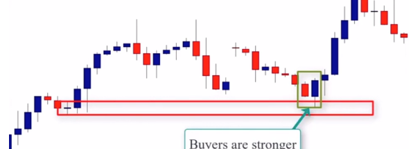
So to enter this trade, we can enter at the 50% retracement of the engulfing candle range.
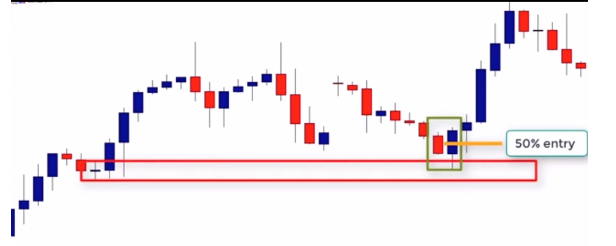
This will allow us to have a more favorable risk to reward ratio. So whenever we find a large engulfing bar, we want to look to place a limit order at around 50% of the candle’s branch. Sometimes the market will leave without you, but most of the time the market will retrace back to fill our order and then prices go and reach our profit target. As we can see in this example, price retraced back to reach the beginning of this engulfing bar and the market went higher. So if you enter at the 50% of the candle retracement, you would join the market right at the right time. Our stop loss is placed below the distal line and the profit target is the next resistance level.

This trade provided us with a 3 to 1 reward to risk ratio.
In this example, we have a rally base drop supply zone.

The basing candle is that falling pin bar. So to draw the zone, we draw the proximal line at the lower shadow and the distal line at the nose. As we can see the zone is strong, but the sellers still find some resistance. As you can see there is some rejection here, some rejection here, and another one here. So sellers were rejected by buyers, but despite of this rejection the zone is still strong because the candles are big and strong.

The previous support level is broken and the zone is fresh and the risk to reward ratio is good as well. So when the market retraced back to this zone we had a nice engulfing candlestick pattern but here’s the problem the candle is large if we enter at the close or the low of that engulfing bar and place our stop loss above the demand zone we will not have a good risk to reward ratio. So the only way to keep a good risk to reward ratio is to enter at approximately 50% of the candles range.
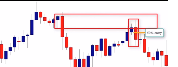
If we enter at 50% of the candles range, we will then join the market because prices retrace back to fill our order and then the market moves lower. So by adopting the 50% entry method, we can always keep a favorable risk to reward ratio and as we can now see the trade offers us at least a two to one reward to risk ratio. Here’s another example – this time we have a clear demand zone the move is quick and strong the candles are big and the previous resistance level is broken the zone is fresh and the risk to reward ratio is very attractive.

When the market retraced back to test this zone, we have a nice engulfing bar as a confirmation signal, but we do not want to enter at the close or at the high of this engulfing bar because our risk to reward will not be favorable. The best way to enter here is at a 50 percent retracement of that candle body.
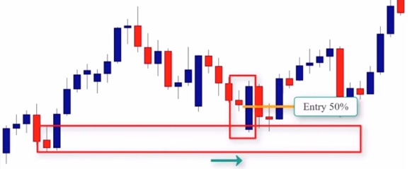
The stop loss would be below the distal line and the profit target is the next resistance level. So this is how we use the engulfing bar candlestick pattern as a price action signal in combination with supply and demand zones. We’ll see you in the next lesson.
The inside bar false breakout as a confirmation signal
Hey everyone, in this lesson we’re going to learn how to use the inside bar false breakout as a confirmation signal in combination with the supply and demand zone strategy. So what is an inside bar false breakout?

An inside bar false breakout is an inside bar pattern followed by a false breakout. In other words, an inside bar pattern, then price snaps back in the other direction. When this pattern occurs in a supply or demand zone, it can also be used as an entry signal. Looking at this example here, we have identified a supply zone.
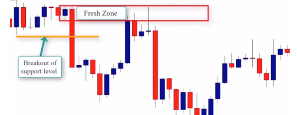
As we can see, the move is quick and strong. The candles are big. The previous support level is broken. The zone is fresh. And the risk to reward ratio is attractive. When price returned to this zone, the price formed an inside bar false breakout. This pattern shows us that the buyers are trapped by sellers because the inside bar means indecision in the market. In other words, buyers and sellers are still in an indecision phase. The breakout of the inside bar means that the market is no more in an indecision phase and could go higher. So buyers will enter after that breakout thinking that this supply zone does not work. But what happened is prices will return and close inside that pattern forming the false breakout.
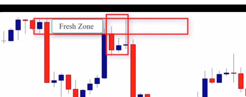
This false breakout indicates that buyers are trapped by sellers and this pattern can be used as a confirmation signal to enter the market. So you can place a sell order at the close of the pin bar or at the low and the stop-loss goes above the upper shadow and the profit target is the next support level. And this should say sell rather than buy. Let’s look at another example.

As we can see here, the market is strong, the market is rallying, the market is strong, the candles are big, the previous level of resistance is broken, the zone is fresh, and the trade offers a good risk to reward ratio. When the market retraced back to test the demand zone, prices formed a nice inside bar false bar falls breakout. So to enter this we can enter at the close of the pin bar or at the high, place a stop loss below the lower shadow or below the distal line and the profit target is the next support level. In this example we have another clear demand zone.
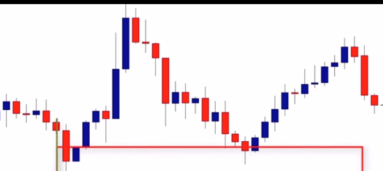
The basing candle is that inside bar. So to draw the zone we draw the proximal line at the close of the inside bar and the distal line at the lower shadow. When the market returns to test this zone, we have an inside bar false breakout pattern. To enter the trade, we can place a buy order at the close of the pin bar or at the high, a break at the high, stop loss goes below the lower shadow or below the distal line and the profit target is the next demand zone.

So this is how we can use the inside bar false breakout pattern as a confirmation signal in combination with supply and demand zones. We’ll see you in the next lesson.
If you have followed the previous lessons closely, with enough attention, you should now be able to open your charts and locate the most powerful supply and demand zones. You know how to draw the zones, how to evaluate their strength, and also have the ability to decide whether to take a limit order or a market order. If you still have difficulties locating supply and demand zones on your charts, I highly recommend to go back and take a look at the previous lessons because it is critical in moving forward with identifying the golden zones in the lessons ahead.
In this module I will reveal a secret that nobody will tell you about, and you will never find online. Let me ask you something…Have you ever heard about, “the Golden Ratio?”
It is a very special number, approximately equal to 1.618 that was discovered by Leonardo Fibonacci who was a mathematical scientist. This magical number appears many times in geometry, art, architecture, and other areas.
Nature relies on this divine proportion to maintain balance. If you still don’t believe, take honeybees for example; if you divide the female bees by the male bees in any given hive, you will get 1.618! Sunflowers, which have opposing spirals of seeds, have a 1.618 ratio between the diameters of each rotation. This same ratio can be seen in relationships between different components throughout nature; everything in this universe is governed by this divine proportion.
But the question is; does this magic number also govern financial markets? Actually, the financial markets have the same mathematical base as these natural phenomena, besides, traders are humans, and this magical number is engraved in the human brain as well. That means that if we can identify the golden ratio in a financial market, we can easily predict the future movement of price.
Don’t fret – you don’t need to calculate or even be a scientist to find out this magical number on your chart, because studies have already been made to find this golden ratio when analyzing financial markets.
When analyzing financial markets, the golden ratio is translated into three percentages, which are as follows: 32.8%, 50% and 61.8%. To find these ratios, all you need to do is to use a tool called Fibonacci Retracements. This tool uses horizontal lines to indicate areas of support and resistance and are calculated by first locating the high and low of the chart. Then, five lines are drawn. The first at 100% (the high on the chart), the second at 61.8%, the third at 50%, the fourth at 38.2% and the last at 0%. After a significant movement up or down, the new support or resistance levels are often at or near these lines. Look at the illustration below:
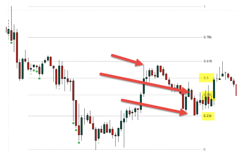
The chart example above shows how the market reacts to the golden ratios, and as you can see, the retracement move was at the 50% Fibonacci ratio; the second retracement was at 38.2% and the third retracement was at 23.6%. I shared this example only to show you how financial markets are governed by Fibonacci ratios.
We are not going to use all these ratios to trade the market, but we are going to find supply and demand zones that holds the golden ratio, because these zones work like magic. We will combine the mathematical ratio that governs the financial market and the way banks and financial institutions trade the market.
In other words, we will try to find strong supply and demand zones that hold the golden ratio. These zones are the golden zones, and believe me, you will be amazed about how uncanny the accuracy is . Before we dive in, let me help you understand how to use the Fibonacci retracement tool, because if it is not used correctly, the results will not be as good as you want.
What is the Fibonacci Retracement Tool and how
do you use it?
One of the first things you need to know about Fibonacci Retracement Tool, is that it is not an indicator, it is just a tool to measure potential price retracement levels and can be found in almost all trading platforms.
How to draw Fibonacci retracement levels:
To draw a Fibonacci retracement, you only need to identify impulsive moves and retracement moves in an uptrend or a downtrend, and then find the price level where the impulsive move started. In simple terms: find out the start of the impulsive move and the price level where it ended.
1-Then, click and activate the Fibonacci tool on your
trading platform;
2-Then, click at the start of where the impulsive move started
and drag it to where the move has ended.
You will see Fibonacci retracement levels on your chart – if you did it correctly, the first point at which you clicked will show 100, then 61.8, then 50, then 38.8 and 23.6. These are default values that you should stick with, because it is used by most banks and financial institutions. See the illustration below:

As you can see, this is an example of how to use Fibonacci on your charts in a downtrend market. When you identify the impulsive move, you click on the fib from the start of the move and drag it to the end of it, as shown in the chart above. Look at how the market started reacting when prices approached levels from 38% 50% and 61.8%. Now let me give an example of an upward impulsive move (see below).

This is an example that illustrates how to use the Fibonacci Retracement Tool during an upward move; as you see, you start drawing the Fibonacci tool at the beginning of the move, which is 100%, and then you drag it to the end. Look at how prices reacted when the market touched 38%, 50%, and 61.8% Fibonacci ratios. Don’t bother yourself with trying to understand why the market was rejected from these levels, because this is not important for the moment. The most important thing is to know how to draw fib levels correctly, because this will help you identify golden supply and demand zones using the same tactic.
How to use fibonacci retracement to identify golden zones
First of all, golden zones are supply and demand zones that hold the Fibonacci golden ratio, which is the 61.8% or the 50%. As I said before, these ratios are very important, especially the 61.8% – this is the ratio that is engraved in our brain, and governs trader’s decisions in the market.
Let me tell you something about the human brain because I think that it is important to understand how your brain works and how it is governed by the golden ratio 61.8%. If you can understand this logic, you will clearly understand how the crowd makes their decisions in the market, and you will be able to predict with high accuracy when the market will go down or up based on this mathematical formula that controls the emotional part of our brain.
The human brain consists of neuron cells and microtubules. It is based on three fundamental parts: the primitive brain (Ganglia), the limbic system (Paleomammalian), which is in control of our emotions, and the Neocortex, or the “rational” part of the brain. No matter how intelligent we are, our collective behavior is based on the limbic system and our rational thinking is governed by intense emotional attributes, such as fear, insecurity, desire, pleasure, greed… and, in pursuit of our collective goal, we are often motivated to act irrationally and tend to behave in an impulsive manner. This herding behavior can seem random, but in fact, it functions following certain patterns.
In financial markets, we buy when we feel it is the best time. We are motivated by our desire to win, and when the market goes against us, we hurry to get out because we are afraid to lose more money. These behaviors form repetitive patterns in the market. This is the reason why we can see corrective moves and impulsive moves. Scientists have found that the natural tendency of collective human decision-making follows a unique pattern that is reiterated by the ratio of 61.8%. This ratio, often referred to as, “the golden mean”, is derived from the Fibonacci number sequence. That means that significant trading decisions that are made by a group of market participants follow this sequence, and if we can find it in our chart, we can predict what the market participants are going to do when the market approaches this ratio.
In the beginning of this course, I showed how you can find and use the Fibonacci Retracement Tool. We are no going to use only this tool to find high probability entry points in the market; our strategy is going to be based on supply and demand zones, IN combination with 61.8% and 50% Fibonacci retracement levels. This strategy is very powerful, and works like magic for two important reasons: When you identify powerful supply and demand zones, you follow banks and financial institutions footprints in the market. You know that if a bank buys from a point when the market goes back to test this point, the price is likely to reverse.
The second reason is that you know that the collective human decisions of banks and financial institutions are governed by the ratio of the 61.8% and 50% Fibonacci sequences. Hence, you don’t only know how banks and financial institutions trade, but you can also use this sequence that governs their collective trading decision to identify high probability entry points in the market. Let me give you an example below:

As you can see in the chart above, we have two important supply zones that were formed in the market. We now know where banks and financial institutions placed their orders and when the market is likely to reverse. However, if we can use Fibonacci retracement levels, we can detect where the 61.8% or 50% levels are located in the market – see the same chart below:
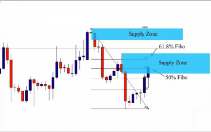
As you can see in the chart above, using Fibonacci retracement showed us that the second supply zone holds the 61.8% and 50% Fibonacci retracement. So, we now have two important elements; we have a supply zone based on banks and financial institution strategy, and we have a 61.8% Fibonacci ratio that governs the collective trading making decision of those large traders. So, both technically and mathematically, we have a very powerful supply zone. Look at what happened next:

As you can see in the chart above, when the market approached the supply zone that holds the 61.8% and 50% Fibonacci ratios, prices went down; because it is a golden zone. A golden zone is a supply or a demand zone that holds the 61.8% or 50% Fibonacci ratios, and these zones work perfectly well because they combine the way banks and financial institutions trade, and the human nature that is governed by the golden number 61.8%, when it comes to a collective trading making decisions.
Before we decide whether to take this trade or not, since we don’t know if the market will continue to test the first supply zone or not, we need a confirmation pattern. As you can see, we had a nice inside bar false breakout pattern that indicated that the market is likely to go down.Let me now give you another example of a demand golden zone to show how you can find it and how it works:
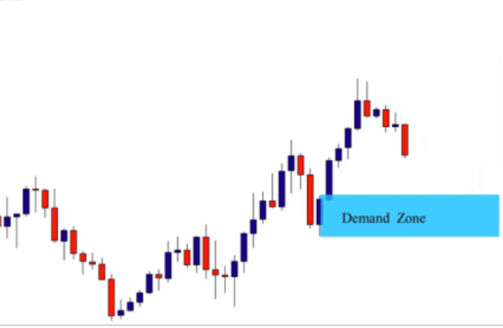
As you can see in the chart above, this is a demand zone that was formed in an uptrend market; it is a very nice zone, but we will try to use Fibonacci retracement to see if it is a golden zone or not. See the same chart with Fibonacci retracement below:

As you can see in the chart above, the second demand zone holds the 61.8% Fibonacci ratio, which makes it a very interesting zone to watch. So, when the market approaches this zone, we can wait for a candlestick pattern signal to form and then we can buy from this point. See what happened next
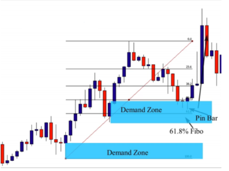
As we see, the demand zone is considered to be a golden zone because it holds the 61.8 % Fibonacci retracement. Since there is another powerful demand zone below it, we don’t really know what the market is going to do. So in this instance, we need to wait for a candlestick pattern signal to enter the market. And as you see, the formation of the pin bar candlestick pattern was a great indication that the zone will work, and it should be taken into consideration. So, right now you know that a golden zone is a supply or a demand zone that holds 61.8% Fibonacci ratio. But if you look at the previous examples, you will notice that these zones can hold the 50% Fibonacci retracement as well, and they can be considered golden zones. This is because the 50% Fibonacci retracement is a pattern that most banks and financial institutions take into consideration to predict the end of a pullback and the beginning of a new impulsive move. And this pattern has a huge impact on the market participants decisions. The supply and the demand zone that hold the 50% Fibonacci retracement is considered to be a golden zone as well.
Supply and Demand golden zone trading tactics
Now that we have a general idea about golden zones, and know that when we combine supply and demand zones with the 61.8 % and 50% Fibonacci retracement levels, we have an even greater probability of success. You should not forget that these Fibonacci ratios are only a factor of confluence that confirm our setup and give it more strength – what ultimately matters the most is the zone itself. If you trade a very weak supply and demand zone that also holds the 61.8 % ratio, our chances of winning the trade still decrease. We don’t base our trade on Fibonacci retracements but only use this tool only as a confluent factor. Your priority is to find strong supply and demand zones, and you can go back to the previous lessons to see how we evaluate supply and demand zones if needed. It is important to identify the right zones, and then we can use the
Fibonacci retracement ratios to see if they are golden zones or not. I want to remind you of the steps that you should follow to make sure the supply and demand zones are correct:
-Top down analysis: when you identify a supply or a demand zone you should see if it is formed with the trend or against the trend.
-Time spent in the zone: look at how the price left the zone; strong and quick moves give us a clear idea about the strength of the move.
-The freshness of the zone: how many times the zone was tested, fresh zones are the better
-Candlestick size: look at the size of candles; strong candles mean strong moves, and strong moves indicate a bank order.
-The minimum risk to reward ratio: you need to see if the trade can allow you to win at least twice relative to what you risk; this is what will make you a winner in the long term; not the strategy but the risk to reward ratio. These elements should be taken into consideration when identifying a supply or a demand zone.
I remind you of those steps, because I don’t want you to fall in the trap and trade the 61.8% and 50% instead of trading supply and demand zones. REMEMBER, the supply and demand zones are what matter most – we try to follow the banks and financial institutions footprints, and when we identify where banks and financial institutions did take their orders, we can then apply Fibonacci retracements as a confluent factor to see if the zone holds the golden ratio or not. Let me now show you another example of how we identify golden zones and how we can trade it:

In the illustration above, there are two supply zones. We will only focus on the second supply zone, because it is the closest zone to price, so let’s try to evaluate the strength of the zone. Look at how the market left the zone; it didn’t spend too much time in an indecision phase before moving down.
This move can be considered a strong move. The candle that made the move is big as you can be seen by the first red candle. This indicates that there is a bank or financial institution behind the move. What about the freshness of the zone? As you see the zone is going to be tested for the first time which makes it very attractive as a supply zone. Now let’s do our top down analysis to see if the zone is formed with the trend or against it… If our trading time frame is the daily, our higher time frame is going to be the monthly. Let’s look at the monthly chart below:
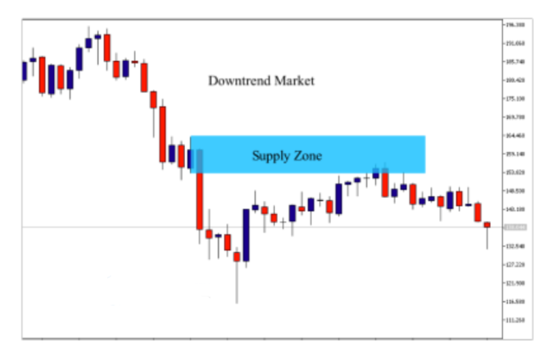
This is an illustration of the monthly chart and we can gather two important elements from it: As you can see the market is trending down, which is an important element that supports our daily supply zone. The second element is
that the market tested a monthly supply zone and it is likely to go down again. When analyzing a bigger time frame, we try to answer two important questions:
– we check if the trend is going in our favor or going against us?
– we seek a technical element or a price action setup that can help us predict what the market is going to do in the future
In our example above we have a downtrend, so we can simply say that the trend goes in our favor. The second element that supports our trading decision is the monthly supply zone that dropped the market down.
Let’s suppose that the market was trending up
– what can we do in this situation? Should we ignore the trade on the daily time frame?
It is important to trade with the trend because trading is all about probabilities, so we try to take all odds in our favor. But when trading supply and demand zones, we don’t respect this rule in two cases:
1) if we have a technical element or a price action setup that can help us predict what the market is going to do in the future. For example, let’s suppose that the monthly time frame is up, and it is against the daily time frame, but prices on the monthly are going to test a powerful supply zone. This technical element will help us predict a reversal in the market. So, this powerful supply zone on the monthly will support our selling decision on the daily chart.
2) The second case is when we identify a strong supply zone , and we have all the elements that indicate a very strong supply zone…for example, the move is quick and strong, the zone is fresh, the risk to reward ratio is attractive, and we may choose to take this trade against the trend if we have a candlestick pattern that confirm our entry…. such as a pin bar, an engulfing bar, and inside bar, and inside bar false breakout, a failed pin bar … Now let’s go back to our chart example – we have evaluated the strength of the zone, and we have found that the move is strong.
It is also quick because the market didn’t spend too much time in the zone, the candle size is big and the bigger time frame (monthly ) is in our favor…so right now everything encourages us to take the trade. The last element that you should evaluate before you decide whether the trade is worth it or not, is the risk to reward ratio. Let’s see if the trade has a good risk to reward potential or not, look at the chart example below:

This is the same daily chart, and as you can see when drawing the supply zone, we can easily measure our risk. The risk is the amount of ticks/points/pips between your entry point and your stop loss. And the profit or the reward is the amount of ticks/points/pips between the entry point and the exit point. We see the amount of ticks/points/pips that you are going to win if the
market goes in your favor is four times the amount of you will risk. You will not always find trades with 1:4 risk to reward ratio, but for a supply or a demand zone to be accepted it should provide at least 1:2 risk to reward ratio. So, the last element that validates the strength of this supply zone is good.
Now that we have all elements in place that indicate that the trade has a good potential, let’s now see if it is a golden zone or not, ie, if it holds 61.8 % or 50% Fibonacci retracement.
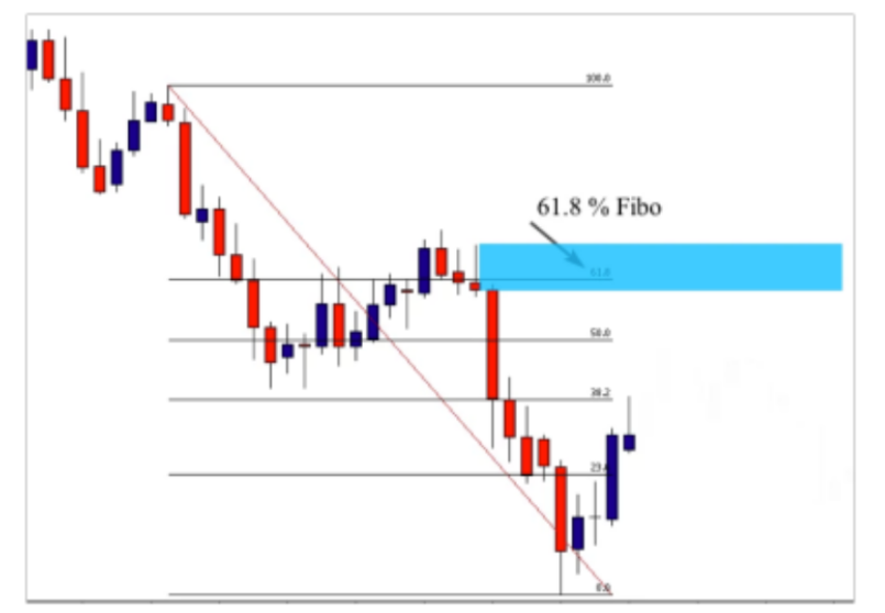
As you can see on the same chart, the supply zone holds the 61.8 % Fibonacci ratio which makes it a golden zone. We didn’t start by
looking at the Fibonacci retracements first; we started by evaluating the zone to see if it is valid or not, and then we use Fibonacci retracement to see if it is a golden zone or not.
You can trade this zone without using a Fibonacci retracement because it is already a valid zone, and displays a favorable risk to reward ratio. We must continue to wait for a confirmation, because we don’t know if the market will respond to this zone or to the next one above it. The fact that this zone holds 61.8% ratio represents a confluent factor that gives more strength to it. Our trading decisions are not only based only on where banks and financial institutions place their orders, but also the golden ratio that controls the collective human trading decisions. Now that you have all elements in hand, let me show what happens when the market approaches the supply zone – look at the chart below:
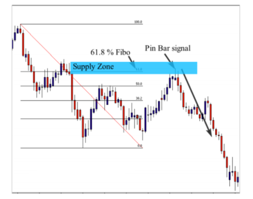
This is the same daily chart as we saw above. The market approaches the 50% Fibonacci retracement and drops down, but we can’t sell the market from this level, because the supply zone is above it, and this is what matters most to us. When the market goes back again and approaches the supply zone that holds the 61.8% Fibonacci retracement, the market formed a pin bar to indicate that buyers were rejected from this level and gave us a signal to sell the market from this golden supply zone. Let me now show you how you can enter this trade.
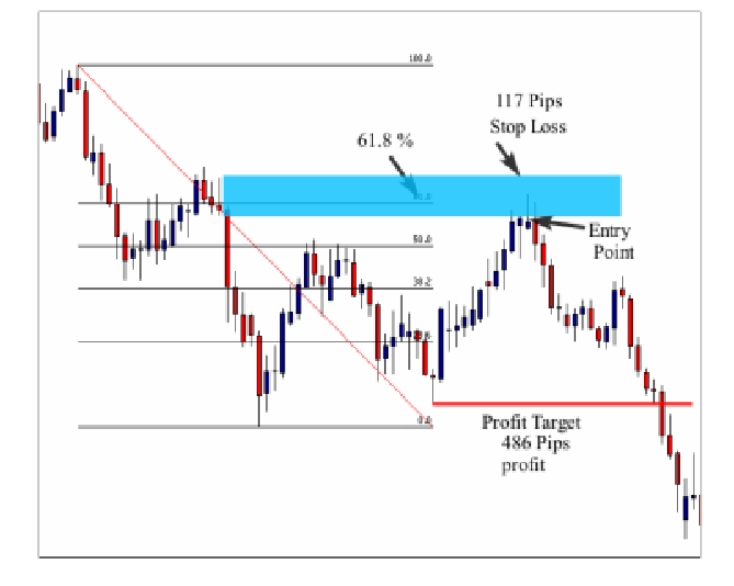
After the formation of the pin bar candlestick pattern, we can enter the market by placing an entry order after the close of the pin bar and a stop loss above the supply zone – our profit target is the next support or demand zone. This trade provided us with approximately a 4:1 reward to risk ratio, because we risked 117 pips to win 486 pips. Let me give you another example of a demand zone to show you how we can identify and trade golden demand zones. Look at the chart below:

As you can see on the chart above, the market broke a resistance level and went up, so we can say that we are in an uptrend on the 4h chart. We now look for demand zones that are in line with the uptrend, but before doing that, let’s see the higher time to check if our trade is going to be with the trend or against it. Look at the weekly chart below:
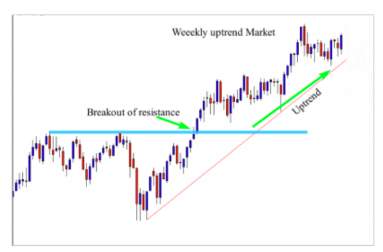
The weekly chart shows that the market is also up trending, broke the resistance level and went out of the consolidation phase. We can then say that the weekly chart is in line with our trading
time frame, which is the 4h. We did our top down analysis to see if the trend is going up on the weekly chart so wes now go back to the 4h chart and see if we can identify some demand zones.

As you can see on the chart, we have two demand zones. If we try to evaluate their strength, we note that both are strong because they are formed in line with the higher time. The move is quick and the risk to reward ratio is good as well. So, we can say that these demand zones are worth risking our money.
In this case, we trade the second one if the market forms a candlestick pattern when it approaches the zone – such as a pin bar, or an engulfing bar or any other confirmation
pattern that we have talked about in previous lessons. If the market doesn’t respond to the second demand zone, we can trade the first as well, only if we identify a confirmation pattern that forms when the market approaches the zone.
But what If I told you that one of these zones is considered to be a golden demand zone. Let’s draw the Fibonacci retracement from the beginning of the move till the end of it to see what happens.
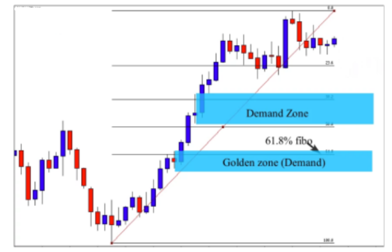
As you can see, using the Fibonacci retracement helped us identify a golden demand zone – the first demand zone holds the 61.8 % golden ratio which makes it stronger than the second one. Remember, we can consider an entry if the market gives a signal when it approaches the second demand zone. But if we wait for the first one, we have a stronger case to make the trade because we are aware that banks and financial institutions likely placed their orders in that zone.
We of course have another mathematical element that shows you where the collective human trading decisions will be influenced – based on the 61.8% ratio – which is ingrained in our brains. See what happens next.

The market was rejected when the market approached the second zone. The pin bar that was rejected didn’t touch the demand zone. On the other hand, the market spends some time in the zone and look at how many bars that are near the second demand zone before the pin bar finally rejects. This indicates that the second zone is not that interesting, because if there were big orders that
were placed by a bank or a financial institution, the market would clearly reject from the second demand zone. We can trade the second demand zone only if the red pin bar that was rejected had formed inside the demand zone or at least touched it.
Now look at the golden demand zone. When the market approached this zone, it was strongly rejected, and we had a good pin bar that formed as a confirmation to enter the market. Why did the second demand zone not work but the first one did? What makes it more powerful?
….because it holds the golden ratio that influences our collective trading decisions in the market.
This is a secret that nobody will tell you about, and you are lucky because you now see the power of the 61.8% golden ratio which is engraved in your brain, in my brain, and in the banks and financial institutions – folks who place millions of orders from their offices. This magical number affects our collective trading decisions, and when you can use it correctly in combination with supply and demand zones, the magic happens in your trading account… 🙂
Most of our analysis will be right, because they are based on the power of money that drives the market. When you identify supply and demand levels, you are following the guys who move the market up and down…and when you identify the 61.8% and 50% levels, you are spotting areas where our collective trading decisions will be affected. So, by doing this, you are combining the power of money and the power of the golden ratios that governs our trading decisions. Let’s go back to our chart and let me show you how you can enter the trade and where to place your stop loss and profit target. See the illustration below:

This is the same chart we have been discussing, and as you can see, this trade provides us with a good risk to reward ratio. The pin bar confirmation pattern is a little bit longer…so,we have two types
of entries. We either enter after the close of the pin bar that was rejected from the golden demand zone, or we enter at the 50% pullback of the pin bar candle. This is a more conservative entry that will allow you to make more points/ticks if the market goes in your favor…but sometimes the market goes up without retesting the 50% of the candle, and we can miss the trade
It is all up to you to take the type of trade that you want. Your stop loss is going to be below the demand zone, and your profit target is the next resistance level – this trade example has a potential of more than 3:1 reward to risk ratio.
The basics of the Fib retracement tool
Hey everyone, in this lesson we are going to learn the basics of the Fibonacci Retracement Tool. To be able to use the Fibonacci Retracement Tool, we have to differentiate between two important moves when it comes to trending markets.
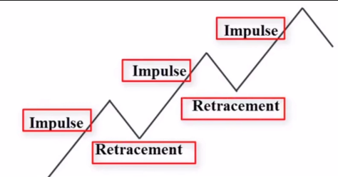
Impulsive moves and retracement moves. If you cannot differentiate between these two important moves, you will never be able to use the Fib Retracement Tool correctly. So what is an impulsive move? The impulsive move are those that push prices higher in an uptrend market and drive prices lower in a downtrend market. Let’s look at another example of a downtrend market. As you can see the market is trading down. So in this example this is the first impulsive move, this is the second one, and this is the third one.
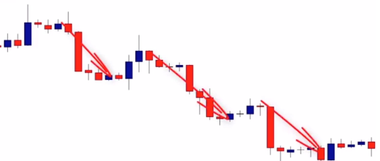
What you have to know as a price-action trader is that after an impulsive move comes a retracement move. What is a retracement move?

Retracement moves are seen in price corrections during an overall larger uptrend or downtrend. As you can see in this example, the market formed an impulsive move followed by a short retracement move, another impulsive move followed by another retracement move, and a trading market moves this way.

So to make money in this type of market, we have to be able to identify the end of the retracement and the beginning of the impulsive moves. To do so, most traders use a Fibonacci retracement tool to predict the end of the retracement and predict the beginning of the impulsive move. That is why it is called the Fibonacci Retracement Tool. So now let me show you how to use the Fib Retracement Tool for beginner traders who don’t know how to use it.
The Fib Retracement Tool is a standard tool that is free on most charting platforms. You bring the tool up and as we can see we have a Fib Retracement that has different levels .236, the .382, the 50%, .618, and the 100% levels.

So what we want to focus on are the 50 and 618 fib retracement levels because these are the most important retracement moves that occur in these impulsive and responsive moves. Now let’s look at an example.

As you can see, we have an impulsive move down. We know that the beginning of the impulsive move is here, and the end is at this point. To predict the end of this retracement move in the beginning of the next impulsive move we can use our Fibonacci retracement tool. We start from the beginning of the impulsive move and draw it to the end from the high to the low and as you can see when the market approached the 50 and 618 levels prices were rejected indicating that the end of the retracement and the beginning of the next impulsive move lower. The same thing happened here.

As we can see, we have an impulsive move. This is the beginning of the impulsive move, and this is the end.
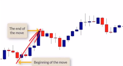
When price approached the 50 and 618 Fibonacci retracement levels, the market was rejected, forming a nice inside bar. Let’s look at another example.
So, in this example, we see the beginning of the impulsive move here. And here is the end of the impulsive move. So let’s now pull out our Fibonacci retracement. We start from the beginning and draw it up until the end. And as we can see, the market retraced back to test the 50 and 618 retracement levels. The market was rejected, it formed an inside bar, and was the beginning of the next impulsive move higher.

Let’s look at one last example.

This is the beginning of the next impulsive move, and we draw it to the 50% retracement level, rejected and begun its next leg and impulsive move higher.
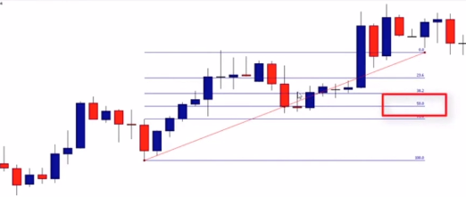
So hopefully by now you have an idea of how we use Fibonacci levels in trading supply and demand. In the next lesson we’re going to learn how to combine Fib levels focusing on the 50 and 618 retracement levels with supply and demand zones.
Supply and Demand with the trend
In the previous lesson, you learned how to combine the power of supply and demand zones with the 61.8% and 50 % Fibonacci retracement levels to spot golden zones and make the best trading decisions. This strategy is one of the
most powerful strategies that you can ever use in the market because it is based on the law of supply and demand that governs financial markets, and the golden ratio that governs our collective trading decisions. If you have these two elements in hand, chances are you will become a successful trader.
One of the difficulties that you will encounter while trying to identify and trade supply and demand zones is the top down analysis. I get a lot of emails about this topic, and I recognized that most traders get confused when doing top down analysis because they find different scenarios, and sometimes they find it difficult to decide what to do in certain cases. In this module, I’m going to cover all the scenarios that you will encounter while analyzing your charts, and how to gather the right information from your top down analysis.
Our top down analysis is based on two important time frames- the trading time frame, and the higher time frame. As traders, we have different personalities; some traders like to trade smaller time frames and other traders like to trade bigger time frames. There is nothing wrong with a smaller or a bigger time frame. You need to choose the time frame that fits your personality or the trading style that fits your psychology. But whether you trade bigger time frames or smaller time frames, when analyzing your charts, you need to stick with the following rules:
When trading the 5 minute, 10 minute or the 30 minute time frame, your higher time frame is going to be the 4h. When trading the 1h time frame, your higher timeframe is
the Daily. If you are a swing trader and you want to trade 4h, you should look at the weekly as a higher time frame, and when trading the daily time frame, your higher time frame is the monthly. You should stick with these rules, because this is how successful traders analyze and trade the markets. You should not base your trading decision on one timeframe.
Trading with the trend
As you always hear, the trend is your friend. You should always trade with the trend, because trading with the trend is the easiest way to make money in the market. Supply and demand zones that form in line with the trend are easier to trade than the ones that form against the trend. What do we mean by trading with the trend? Trading with the trend means that if you trade the 1h time frame, the trend in this period should be in line with the higher time frame which is the daily. In other words, the trend in your trading time frame should be in line with the trend in your higher time frame. Look the chart example below:

On this chart, the market is making lower highs and lower lows indicating a downtrend market. The last red big candle broke the previous demand zone which signals that the market is still going down. By looking at the daily chart, we know that the trend is down, so now let’s look at our trading time frame which is the 1h – see the chart below:

As you can see on the 1H chart, the market was ranging, and then price broke the support level and heads lower indicating a downtrend. On the daily chart, which is the higher time frame, the market is down, and on the 1H chart
which is our trading time frame, the market is also down. We can say that the trend in the trading time frame is in line with the higher time frame and we should now focus on supply zones that are in line with the downtrend. Look at the chart below:
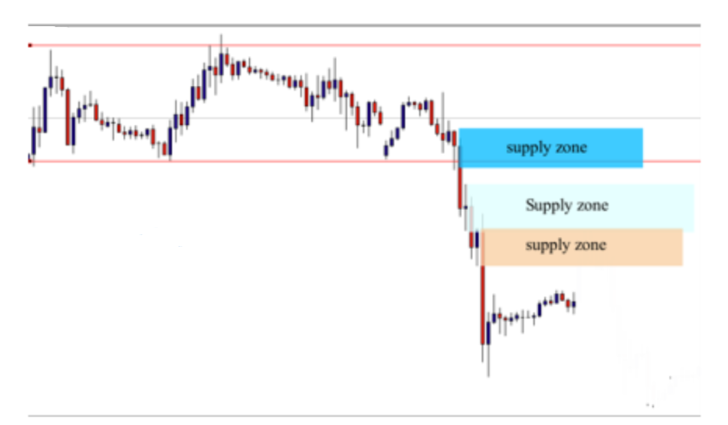
As you can see, we have three powerful supply zones and don’t really know which one of these zones that the market will respond to. Let’s draw our Fibonacci retracement to see if one of these zones holds the golden ratio.

On the chart above, the second supply zone holds the 61.8 % golden ratio, and the third supply zone holds the 50% Fibonacci retracement. Both supply zones are powerful, but we wait for the market to approach the third supply zone, and look for the formation of a candlestick trading signal. See what happens when price approached the third supply zone below:

When prices approached the golden supply zone, it formed a pin bar that was rejected from it. It was also rejected from the golden supply zone that was above it. Now let’s look at how we can enter this trade, because there are different entries that depend on the strength of the zone, as well as your personality. In this case, there were three supply zones but we don’t know which one will be responsive, so we do not place resting limit orders. We should wait for a confirmation from the market to make sure that the supply zone is valid. The formation of the first pin bar candlestick pattern was a great opportunity to enter the market, so we now have two different type of entries.
The aggressive entry: this entry type is neither good or bad, it just depends on your personality and your risk tolerance. Aggressive traders usually enter the market immediately after the close of the pin bar candlestick pattern. The stop loss is above the supply zone, and the profit target is the next support level. Look at the chart below:
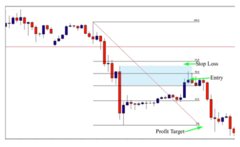
The example above shows an aggressive entry that was made immediately after the close of the pin bar. The stop loss was placed above the supply zone. The advantage of this entry is that you are sure that you will join the trade if the market goes in your favor. The disadvantage is that the stop loss is going to be tight. If you place it above the second supply zone, you will not have a good risk to reward ratio. The conservative entry consists of entering the market when prices test the 50% of the range bar. The stop loss is placed above the second supply zone. See the chart below:

As you can see on the chart above, you can place a limit order at the 50% of the pin bar, and the stop loss above the second supply zone. The advantage of this entry is that your stop loss is placed in a safe place, and if the market goes in your favor, you will be in a trade with a good risk to reward ratio. But the disadvantage is that sometimes the market doesn’t retrace to test the 50% of the range of the pin bar. This happens frequently in the market and you may miss a lot of opportunities. I cannot tell you what is the best for you; nobody can- because it all depends on your personality and your risk tolerance.
Sometimes I take aggressive entries, and sometimes I take conservative ones. They both work perfectly well, but only with time and practice, you will decide which type of entry you would take when you spot a high probability setup in the market.
Trading supply and demand zones against the trend
Trading with the trend is the easiest way to make money in the market, and I highly recommend you to stick with the trend if you are a beginner. Trading with the trend will give you more confidence in your method,
and it will teach you how to be patient, because the market trends only 30% of time and spends 70% of the
time ranging. If you stick with the trend, you will trade less, because there will not be opportunities every single day. Trading less means taking less risks and protecting your trading account.
This quality is what most traders need to become profitable, because traders think that they have to always be in the market. They end up taking low quality trades and destroy their entire trading account. There are times when trading against the trend can be very lucrative, and in fact some of my most profitable trades have come from betting against the trend. With experience, you need to learn how to trade supply and demand zones that form against the trend as part of your arsenal.
In this lesson, you will learn how to trade supply and demand zones against the trend, and you will know the criteria that you should take into consideration when trading a zone that forms against the trend.
When we are talking about trading with the trend or against the trend, we need to answer an important question – which trend are we talking about?
….the trend of our trading time frame, or the trend of the higher time frame?
As you know, in our top down analysis, we have two important time frames, the higher time frame that shows the bigger picture and the trading time frame in which we
take our trading decisions.
If you want to trade the 4h time frame for example, you should look at the weekly time frame, because it is the higher time frame. If the weekly is up, and the 4h is up, you should look for a buying opportunity on the 4h. This allows
us to trade with the trend. In other words, you are following the bigger picture.
But if the weekly is up, and the 4h is down, and there is a good selling opportunity on the 4h time frame, if you decide to sell the market on the 4h – we are not trading with the trend but against it. When talking about the trend, we are talking about the trend of the higher time frame. It is the primary trend that you should watch before switching to the trading time frame. Does it follow the higher time frame or not? If it follows the higher time, this means that you are in a trend, but if it is against it, this means you are against the trend.
How to trade supply and demand zones against the
trend?
We don’t trade all supply and demand zones that form against the trend. There are strict conditions that you should respect to filter the zones and pick up high
probability areas in the market.
The first element that you should take into consideration is the strength of the zone, ie, make sure the zone is strong.
-The second element is the freshness of the zone; the area should be tested for the first time
-The third element is the risk to reward ratio: your trade should have a good risk to reward ratio
-The zone should provide you with a candlestick pattern signal to enter the market.
If the zone holds the golden ratio, either a 50% or 61.8% retracement, you further increase your odds. However, if it doesn’t hold the golden ratio, we can still consider the tarde – the golden ratio adds an extra layer of confluence
that gives more strength to the zone. Let me now give you an example below:
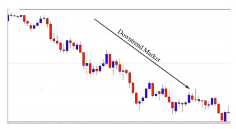
On this chart, the trend is down….when we switch to the smaller time frame, we can consider taking supply zones because they are in line with the bigger time frame, but we can also trade demand zones if they are strong enough and respect the criteria that we talked about previously. See the hourly chart to see how we can deal with demand zones against the trend.

As you can see on this 1H chart, there are two powerful supply and demand zones; the supply zone that is in line with the daily time frame, and the demand zone that is against the trend. When the market approaches the supply zone, we can trade it with confidence because it is with the trend, and it is a very strong zone. The demand zone is against the trend, so we should pay attention to the following criteria:
-The beginning of the move: as you can see the move is very strong, there was no resistance from sellers (three powerful blue candles) and indicates that there was a bankbehind this order.
-The breakout of the previous resistance or supply zone: if you look left, you will find that this move broke the previous supply zone, and the breakout was very powerful.
-The freshness of the zone: as you can see the zone is fresh and it will be tested for the first time, so it is a very interesting zone to watch.
-The risk to reward ratio: the risk to reward ratio is attractive, this trade can provide us with more than 1:2 risk to reward ratio if the market goes in our favor. These elements are very important, and you should take them into consideration when evaluating a zone that is formed against the trend. Now we need only a candlestick pattern confirmation to enter the market. See the chart below:
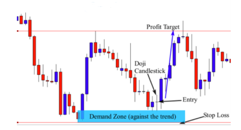
As you can see, when the market approached the demand zone, price formed a Doji candlestick pattern. This candlestick indicates indecision in the market at this period of time and this is normal because the zone is very hot –
even if it was formed against the trend. That can create some confusion for the market participants because they don’t really know what to do, and as a result, we have a Doji candlestick pattern.
The formation of this candlestick pattern that was rejected from the demand zone is a great signal to enter the market. We can place a buy order at the close of the Doji, and a stop loss below the demand zone; the profit target is the next resistance level. Let’s see another example below:

On this daily chart, we see the market is trending down. When switching to the hourly chart, we can trade demand zones that are in line with the daily uptrend, but we can also trade supply zones that form against the trend if they are very strong and hold the criteria that we discussed in the previous examples. See the chart below:
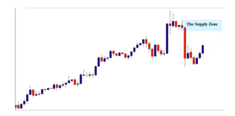
As you see on the hourly chart above, the market was trending up as well, but it formed a very powerful supply zone against the trend. Look at the strong move (red candle). You can clearly see that the move is strong, and when the market approaches this level, we can predict another move down. See what happens next:

As you can see, when prices retest the supply zone, the market formed a Doji candlestick pattern, which is a nice signal to enter the market. We place a sell order at the close of the Doji candle, and the stop loss above the supply zone, the profit target is the next support or supply level.
Remember that before taking this trade, we checked if the zone respects the criteria that we discussed previously; after making sure that the zone is valid, we decided to take the trade after the formation of the Doji candlestick pattern confirmation.
-When waiting for a confirmation signal, remember you may not always find a Doji candle; there are different setups such as a pin bar, a failed pin bar, an inside bar, an inside bar false breakout, or an engulfing bar. (look at the confirmation pattern lesson).
-The examples discussed in this lesson were focused on the 1h time frame as a trading time frame, and the daily as the bigger one. You can follow the same steps to trade the 4h time frame, but the bigger time is going to be the weekly, and the monthly (bigger time frame) for daily charts.
Case Study: The Higher time frame is ranging, and the trading time frame is trending
When you are making your top down analysis, you will face different scenarios and sometimes it will seem confusing. However, if you follow these strategies and tactics, you will find it easier than you think. Let’s suppose you are in a situation where the higher time frame is ranging, and the trending time frame is trending. Let me give you an example below:

This is a weekly chart, as you can see the market is trading between support and resistance levels, or, we can say between supply and demand zones….it is a ranging market. Let’s switch to the trading time frame which is the 4H to see what is happening in this period of time.
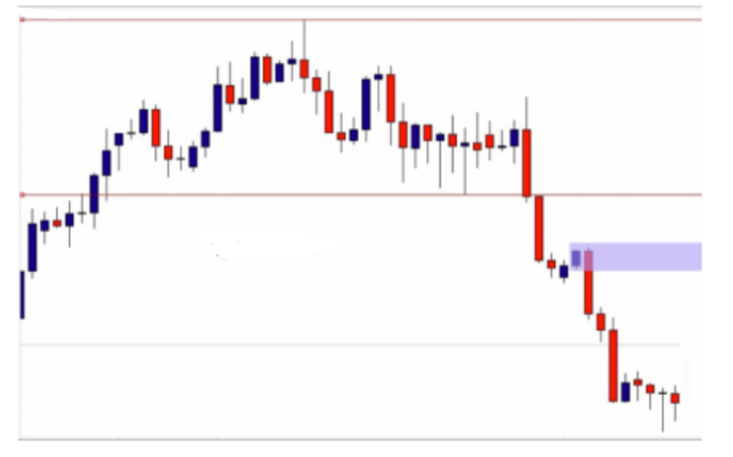
In the 4H chart above, we see that the market broke out of the range and started trading down, and have noticed a nice supply zone. But let’s first make sure if the higher time frame supports the zone or not. Let’s go back to the higher time to analyze it and see what information we can gather from it. See the chart below:

On the weekly time frame, the market is ranging, but we can gather the following information:
-The market got rejected from a resistance level, which means that sellers are stopping buyers from going up and they are willing to drop the market down. (look at the rejected candle).
-The false breakout of the resistance level indicates that buyers were trapped by sellers, and the market is likely to go down to test the next support level.
This information helps us predict the future movement of price on the weekly chart, and can see clearly that the market is likely to go down and retest the next support level. When we switch to our 4h trading time frame, we will trade all supply zones that are in line with our bigger time frame analysis. Look at the 4h time frame again.

This is the 4h time frame, and as you can see, there are two powerful supply zones that formed after the breakout of the range. They are in line with our bigger time frame analysis, and they are worth trading if the market goes back to retest one of them. By making our top down analysis and evaluating the power of the supply zone, we can clearly see that these areas represent a good opportunity to enter the market. All we need now is to wait for a candlestick pattern formation when the market retests the first or the second one. We now know what we should do if the market retraces back to the first or second supply zone. Let’s also use use a Fibonacci retracement level to see if the second zone holds the golden ratio – this information can be an additional factor of confluence that can support our trading decision. Look at the chart below:

As you can see in the chart above, the second supply zone holds the 50% Fibonacci retracement which is considered to be a golden ratio that controls our collective trading decisions in the market. We now have this additional information that can give us more confidence in our trade. Let’s see what happens when the market approached this zone. The market was very responsive to the supply zone that holds the 50% Fibonacci retracement. The formation of the Doji candle (that can be considered as a pin bar) was a confirmation to enter the trade. Our entry should be at the close of the pin bar. The stop loss is above the supply zone, and the profit target is the next support level. That’s all, set your trade and forget it.
Case Study: The higher time frame is ranging and the trading time frame is trending
The next scenario that you will face when making your top down analysis is when the bigger time frame is ranging, and the trading frame is trending down. Let me show you an example below:
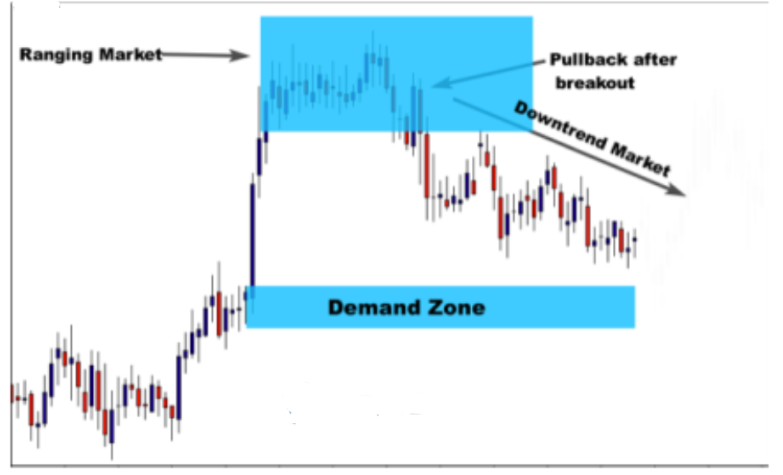
This is a H1 chart, and the market is ranging. It broke out of the range, pulled back and then went down. We can say that the market is trending down. But this market will face a powerful demand zone against the current trend. What should we do in this situation? Do we have to trade this demand zone when the market approaches it and forms a candlestick pattern signal? Or do we have to ignore it because it is against the current trend?
To get a good answer, we need to analyze the market on the higher time frame to take an idea about the bigger picture and predict what is going to happen in the future. See the chart below:
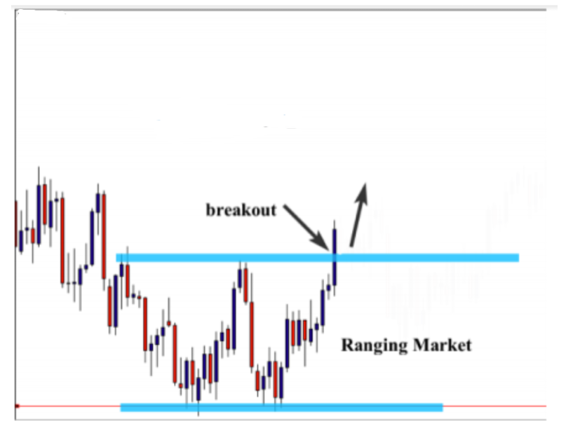
As you can see on the daily chart, the market was trending down, it formed a double bottom reversal, and then broke out of the range. Look at how the market broke out of the
range! The formation of the double bottom reversal pattern at the end of the downtrend and the strong breakout of the range indicated that the market would change direction and will go up on the higher time frame. The most important information that we get from analyzing the daily time frame is that the market is likely to go up. When switching back to the 1H time frame, we will see that by trading the demand zone, we are not trading against the trend, but we are trading with the trend (the trend of higher time frame). See the chart below:

As you can see on the 1H chart, the market reversed when it approached the demand zone. If we didn’t make our top down analysis to see what happens in the higher time frame, we may hesitate to take this trade because we will think that it is against the trend – but the fact is that the trade is with the trend. We didn’t trade this demand zone by chance; we first checked if it is valid or not by evaluating the strength of the move, the size of the candles, the freshness of the zone, and the risk to reward ratio. Once we made sure that the move was made by a bank or a financial institution, we switched to the higher time to make our top down analysis. When we determined everything lined up, we watched the zone and waited for the market to approach it.
When the market approached the zone, it formed a tailed bar that was rejected from this area and indicated that the zone is responsive, and we should make our buying trading decision. As usual, to trade this setup, we place a buy order at the close of the tailed bar, and a stop loss below the demand zone; the profit target is going to be the next resistance level. Now, set your trade and forget it.
Case Study: The higher time frame is ranging and the trading time frame is ranging
This is another scenario that you will find when making your top down analysis. When analyzing the higher time frame, you may find that it is ranging, but when you switch to the trading time frame, you find that it is trading between support and resistance levels….so what can we do in this situation?
As you know, our purpose from making top down analysis is to understand what is happening in the higher time, so when we switch to our trading time frame, we then see if our decisions are in line with the bigger picture scenario. Let me now show you an example of a nice demand zone that I identified on this 1H chart.
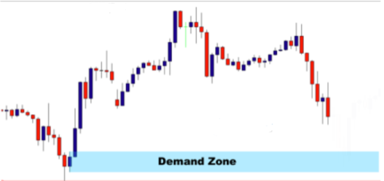
As we can see the move is strong (look at the three blue candles). The market did not spend much time in the zone and the candle size of the move is acceptable. The breakout of the previous resistance level (look left) validates its strength, and the freshness and the potential risk to reward ratio of the zone makes it more attractive. This zone is tradable, and we can take a trade immediately when the market approaches the area and forms an obvious candlestick pattern signal. But what about the higher time? Does the higher time frame validate our trading decision? This is an important question that we should answer. Let’s look at the daily chart to see what happens on the higher time frame.
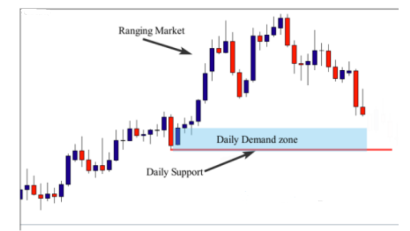
As you can see in the daily chart above, the market is ranging as well, but looking to test a nice daily demand zone. This is important information, because it helps us predict the future move of price when approaching the daily demand zone, or the support level. By analyzing the daily chart, we know that the market is going to face a huge support or demand zone, and means that the market is likely to get rejected when prices approach this level. This information supports our trading decision on the 1h chart. because the market is going to test a demand zone as well.
Since we know what we want to do on the trading time frame which is the 1H, and we are in line with what is likely to happen on the higher time – this will give us more confidence to take the trade when the market forms an obvious candlestick pattern signal. Look at what happened on the 1H chart below:

As was predicted when the market approached the demand zone, the market rejected, and formed a nice pin bar candlestick pattern. This signal was quite enough for us to place our trade. As you can see, we entered at the close of the pin bar, the stop loss is placed below the demand zone, and the profit target is the next supply zone. This trade provided us with more than a 4:1 reward to risk ratio.
Introduction to money management
Before we start this lesson, I want to tell you that until now, you have one of the most powerful trading systems on the market.
You know how to follow banks and financial footprints in the market. You know how to identify supply and demand zones
and how to evaluate the strength of the zone. You learned how to do your top down analysis the right way. I really want to congratulate you for your courage and efforts that you put into this course.
But let me tell you…what if I told you that all the strategies and tactics that you have learned will never make you a successful trader if you don’t have a powerful money management strategy.
I want to ask…do you know anything about position sizing? If you have no idea about position sizing then I highly recommend you to read this lesson carefully because this will either make you a successful or a failed trader. Position sizing is a tool that is often ignored or that many traders simply don’t know anything about. Position sizing is very important in trading and anyone actively trading the market needs to fully understand why it is important and how powerful it can be in regards to helping manage your emotions. It is far more important to measure your risk on each trade you take in dollar or percentage amount risked as compared to points/ticks/pips risked. Many amateur and experienced traders alike mistakenly assume that wider stop losses will require them to take on bigger dollar risks than smaller stop losses. This is a false assumption and is a big reason why you need to understand the role that position sizing can play in your trading success.
Position size is essentially the number of contracts or lots you are trading per trade. In futures or forex trading, this can also be applied to standard, mini or micro lots as well. For example if you are trading 2mini lots of GBPUSD, this means that you have either bought or sold 20.000 dollars’ worth of US dollars, and depending on whether the exchange rate between the British Pound and US dollar moves in your favor, you will win or lose an amount of money equal to 2 dollars per pip X number of pips moved. So, if you made 100 pips, you would have profited 200 dollars. To enable us to understand the math behind this, we will look at it from a different angle – if GBPUSD moved from 1.5600 down to 1.5500 that would be a 100 pip move. Which is actually equal to a 1 Cent price difference in the exchange rate of GBPUSD. So, we now take .0100 X 20.000 and this equals 200 Dollars.
To break it all down 1 standard lot allows you to control approximately 100.000 dollars’ worth of currency and it is worth about 10 dollars per pips. One (1) mini lot lets you control about 10.000 dollars and it is equal to 1 dollar per pip, 1 micro lot lets you control 1000 dollars and is equal to about 10 Cents per pip.
If you open a standard lot trading account and elect to trade mini lots, 10 mini lots would be equal to 1 standard lots, 50 mini lots would be 5 standard lots, etc. If you open a mini lot trading account and you elect to trade a micro lot. Then 10 micro lots would be 1 mini lot and 50 micro lots would be 5 mini lots etc.
So, in conclusion the actual size of your position depends on whether you have a standard or mini account and how many lots you are trading; micro lots are generally a function of the mini account and most brokers don’t offer strictly micro accounts. While this example pertains to the currency market, it can be applied to micro/mini/standard lot sizing in the futures market as well.
This information is important to know so that you can build your understanding of position sizing on a solid fundamental base.
The Risk to Reward Ratio
Most beginner traders think that having a powerful trading system is all that they need to become profitable. They spend years looking for that holy grail that will make their dreams come true. So, if you are one of them, I want to tell you that the win rate of a trading system has nothing to do with your success as a trader. You can lose money with a win rate of 90% or even 99% if you have a poor money management strategy. On the other hand, you can become consistently profitable with a win rate of 30%, if you have a good money management strategy.
The good news is that when using bank and institutional strategies in combination with a strict and winning money management strategy, you will have one of the most powerful trading systems. One of the most important components of money management is the risk to reward ratio, and we have talked about it in previous lessons as one of the most important conditions to validate a good supply or a demand zone. In this lesson, we will talk about risk and reward in detail and how to calculate it, and how to identify supply and demand zones with attractive risk to reward ratios. See the illustration below :

As you can see in the chart above, we have identified a supply zone, and when the market retested the zone, we noticed the formation of a pin bar candlestick pattern, or ‘quasi’ Doji candle. What matters most is not the name of the candle but the psychology behind its formation. As you can see the market was rejected strongly from the zone. So, to enter this trade, we need to place an entry at the close of the Doji or pin bar candle, and the stop loss above the zone and the tail of the candle. The distance between the entry point and the stop loss point is the risk that we will take.
How to calculate the reward?
The reward is the amount of money that you are going to earn if the trade goes in your favor. To calculate the reward ratio, we need to identify the distance between the entry and the profit target and calculate the points/ticks/pips between them. Look at the chart below

As you can see above, this is the same chart. Do not worry about what the chart is or the timeframe – this could be a chart of a stock, an etf, a commodity or a currency pair – the principles are all the SAME. By identifying the distance between the entry and the profit target we get the reward. So, by calculating that distance between our entry and our profit target we found a 1:4.5 risk to reward ratio.
Let me now give you another example of a demand zone to help you understand more about risk to reward ratios:

As you can see in this chart, we have a good demand zone – when the market pulled back to retest the zone, prices formed a nice pin bar candlestick pattern. This is an obvious confirmation to enter the market.
Your entry is at the close of the pin bar pattern and your stop loss should be placed below the demand zone. By calculating the pips between the entry point and the stop loss point we get the risk ratio. As I always say, the profit target is the next level, and in this example we had a demand zone so the next profit target should be the next resistance or supply zone. By identifying the profit target, we can easily calculate our reward ratio. We start from the entry point to the profit target point to get the amount of points that represent our reward ratio. Here in this example we have a potential of 623 pip Reward. So, we can say that this trade provides us with a 1:2.5 risk to reward ratio
Position sizing and risk to reward ratio
It is absolutely paramount to your consistent profitability in the market that you understand the importance of the risk to reward ratio and how it relates to position sizing. Before entering any trade, you need to know the exact dollar amount OR percentage of your account that you want to risk and the exact reward you think you can make on the trade. The risk to reward ratio concept is very important to understand; if you risk 100 dollars on a trade and your target is set at 200 dollars, then you are doubling your reward if you win – this is a risk to reward ratio of 1:2. It is important to realize that with a risk to reward of 1:2 you can lose on over 50% of your trades and still make money over time. In fact, you could lose 65% of your trades with a risk to reward of 1:2 and still make money. Over a series of 10 trades, if you win only 35% of them with a risk to reward ratio of 1:2 you would profit 50 dollars if you risked 100 dollars per trade.
Here is the power of the risk to reward ratio when it comes into play. Many traders erroneously believe that they must win a very high percentage of their trades to make money in the market. The fact is that your winning percentage is nearly irrelevant in whether or not you make money over the long term. What is important is if you are taking advantage of a favorable risk to reward ratio. For example, if you maintain returns of 3 times the amount you risk, your risk to reward ratio is 1:3. This effectively means you can lose 7 out of 10 trades and still make money. At 100 dollars risk you would lose 700 dollars on 10 trades. But you would make 900 dollars off your 3 winning trades because your risk to reward ratio is 1:3, thus you profit 200 dollars even though you lost 70% of the time.
You should be starting to realize how this works now and why having a high winning percentage is not relevant, and why it is crucial that you maintain a risk to reward of 1:2 or higher for every trade you take.
Risk is measured in dollars not points
Position sizing allows you to adjust the number of contracts, lots, shares, etc you trade to meet the amount of money you want to risk per trade. This allows you to use wider stops but still maintain your desired dollar risk. Many traders mistakenly believe that a wider stop loss will mean a bigger risk. If your desired risk amount is 100 dollars but you want to place your stop loss at a level that is 200 points
from your entry, then you simply adjust your position size down to meet the dollar or percentage of account you wish
to risk. If you start out risking 100 dollars, with a $1.00 stop but then decide to move your stop another $1.00, you have just increased your risk to 200 dollars (100 dollars per share x $2.00 = $200 dollars). This is a cardinal sin in trading and one you can’t afford to commit. You need to define your risk in dollars or percentage of your account before entering the trade, and then adjust your position size accordingly to meet the desired stop loss distance so as to maintain the desired dollar amount or percentage risked.
Similarly, many traders think that a smaller stop loss means a smaller dollar risk. This is not always the case; position sizing will explain this. If Joe Trader has a stop loss of 50 ticks but is trading a full contract ($10/tick)) then his risk is $500 dollars on the trade. If Susie Piper has a stop loss of 100 ticks but is trading 2 micro contracts ($1/tick) then her risk is $200 dollars on the trade. As we can see a smaller stop loss doesn’t necessarily mean a smaller risk. Position sizing determines your dollar risk on the trade, not points or ticks. So, from these examples, the takeaway lesson is that risk should always be measured in dollar amount or percentage of account, not the number of points, ticks, dollars or pips. The size of your position is what determines your risk.
How to use the set and forget method
The set and forget method simply means to place your trade and forget about it for a period of time. This method will help you stay disconnected from the markets, and it will allow you to be more disciplined because when you place the trade, and you go away, you will not give the opportunity for the market to play
on your emotions. The set and forget method will allow you to go about your life as you normally would, and even keep your day job by analyzing your daily charts, placing the trade, and letting the market decide whether you are right or are wrong. Most traders spend long hours in front of their screens trying to analyze more data and thinking that this is the best way to make the best trading decisions. The main reason why this occurs is because of your human conditioning. In our social life, we try to control everything to feel safe, and we think that the more work we do the better results we get. When we approach the trading environment with the same mindset, we spend long hours trying to understand everything by analyzing too much data, and trying to work harder more than others. This social conditioning can work against you in the financial markets.
Working hard in our social life has nothing to do with the financial market. It doesn’t mean that you will not make efforts, but all your focus should be on your trading system. You can work hard to master the trading method, and understand fully how it works, but any further research or system tweaking will eventually work against you.
When you are analyzing your charts, focus only on your strategy and don’t try to analyze economic reports, or try to see what other experts are saying about the market. This will not help you make money in the market, but do the opposite, which is to confuse you and make you feel lost.
More is better in your social life, less is better in the
financial Market
You should accept the fact that you can’t control the uncontrollable financial markets – nobody can control it, and nobody knows what is going to happen in the future. Trading is all about probabilities. This is how professional traders think about the market; they do their technical and fundamental analysis, they master their trading system, and they wait patiently for an obvious trading setup to form in the market. If there is no opportunity, they stay away for a while because they know that the market is abundant; they don’t feel pressured or anxious to trade. When an opportunity appears, they place their order, place their stop loss and profit targets and they go away. They know that any further action will probably work against them because they understand the fact that they cannot control the uncontrollable and any other action wouldn’t be a logical action. The logic of set and forget is this: if your trading edge is
present, then you execute your edge and don’t involve yourself further in the process unless you have a valid price action based reason to do so.
Traders who place their trades and stay in front of their charts watching what is happening, sabotage themselves by being emotionally involved, and that leads to over trading, increasing position size, moving their stop loss further, etc…. out of no logical reason. These bad trading behaviors always lead traders to blow up their entire trading account, because these actions didn’t come from their trading plan or their method, but it was only a reaction to control the uncontrollable market. Let me give you an example below:

As you can see in the chart above, there is a nice supply zone. When the market reached it, it formed a good inside bar false breakout pattern signal. You can call it a pin bar as well but the most important thing is to understand the
signal. When you enter your trade, the market does not always go immediately in your favor. In this example, the market reacted by trying to make us understand that the zone is not that powerful, and prices could potentially break out of it. If you don’t have confidence in your trading method, and you don’t apply the set and forget method, you will get emotionally involved and maybe you will exit the trade thinking that the zone is not working, and exit to protect yourself from losing.
When you are trading supply and demand zones, you will experience these scenarios often, and you have to understand that the market will never let you trade in peace – it will always try to play on your emotions. This is the reason why you should adopt the set and forget method, because when you place your trade, you will either win if the market goes in your favor or lose a small amount of money if you were wrong. Let me give you another example below:

In this chart above, the market formed a supply zone, and when prices reached the zone, it formed a nice pin bar entry. When traders make their entry, the market starts consolidating. If you are not patient, you will start doubting
your trade’s potential, get tired of waiting and exit your trade. This is why set and forget is important. Look at the second demand zone. When the market reached the zone, prices formed another pin bar entry, but the market didn’t go directly to the profit target. It spent time consolidating and manipulating undisciplined traders. If you take this trade and continue watching it unfold, you will likely end up exiting your trade because you will think that the market didn’t validate the demand zone. However, if you were patient enough and you didn’t exit your trade, you will spend the hardest moment in your life begging the market to go in your favor. The bottom line is – spending time in front of your charts after placing your trade is a waste of time and energy. You cannot control the market by staring at prices for hours.
You can control your results if you do these important actions:
-You place your trade
-You place your profit target
-You set your stop loss
-YOU STAY AWAY
If you realize that the market is uncontrollable and build your trading plan around this fact, you will eventually arrive at a set and forget type mentality that induces an emotional state that is conducive to ongoing-market success and consistent profitability.
Trading Tactics – Example 1
You have probably just spent several days or weeks reading through this price action trading course and have seen the various concepts I put forward. I have disclosed my trading mindset, my wisdom and knowledge, you know all my tools and all my price action entry methods and techniques. You now have one of the most powerful trading methods based on how banks and institutions trade the market. In this lesson, we will try to apply all the knowledge that I shared with you, so you will understand how to approach your trades step by step by following rules and strategies we discussed in previous lessons. Let’s start by the first trade’s example below:

Look at this H1 chart above. We can clearly see there is a very strong move that attracts our attention. This move cannot be made by retail traders and is certainly the result of a bank or institutional order…we are in front of a powerful demand zone. The first thing that we should do is to draw the zone. Look at the chart below:

As you can see on the chart above, we identified the beginning of the move to spot the basing candle, and in this example, the tweezer bottom was the basing candle. So, we draw the proximal line which is the closest line to current price at the close of the bullish candle, and the distal line at the close of the bearish candle. As a result, we get a nice demand zone.
However, this is not quite enough to take the trade – this is only the first step, and the next step is to evaluate the zone and see if it is worth our hard-earned money or not. Look at the chart below:
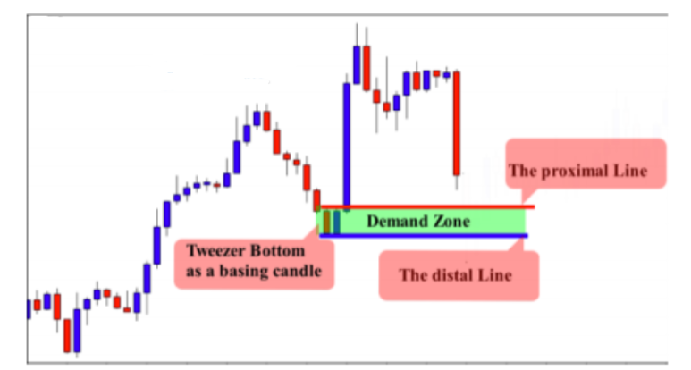
This is the same chart where we identified a good demand zone. We need to now evaluate it and see if it is a valid zone or not.
These are the following factors that we took into consideration:
-The beginning of the move: as you can see the move was strong and quick, and the market didn’t spend too much in the zone. This indicates that the order was placed by a big bank or a financial institution.
-The candle size of the zone: the candle size is big and showed that the buyer invested a large amount to push the market higher in a very short period of time.
-The breakout of previous resistance level: the strength of the move was confirmed by the breakout of the previous resistance level.
-The freshness of the zone: as you can see the zone is fresh, and it will be tested for the first time.
These factors help us evaluate the strength of the zone – remember, we don’t trade any zone that we find on our chart. But what about the risk to reward ratio? Let’s see how we calculate our risk to reward ratio:

By comparing the risk and the reward, we can clearly see that the trade has a good potential and provides us with a good risk to reward ratio. This is only the first impression that we get from looking at the chart. To calculate the risk to reward ratio, we need to wait for a confirmation pattern that forms in the demand zone.
Another factor of confluence that makes the trade setup more attractive is the 61.8 golden ratio. When we use the Fibonacci retracement, we can see that the area is a golden zone that holds the magic Fibonacci ratio. See the illustration below:

As you can see on the chart, by using Fibonacci retracement, we found that the area of demand is a golden zone because it holds the golden ratio. So, this factor of confluence will give us more confidence in this trade. Now let’s move to the top down analysis and see if the zone is in line with the trend or against it – let’s go to the daily chart below:

On the daily chart, which is the higher time frame of the hourly, the market is trading down, but the trend on a higher time frame is against our trade on the H1 time frame….what should we do in this situation? In this situation we have two options:
-To ignore the trade if the zone is not strong enough
-To take the trade against the trend if the zone is very strong, and we have an obvious candlestick pattern signal.
In this case we should take this trade even if it is against the trend because the zone is very strong. Look at the move and the candle size – both show the strength of the zone, and the risk to reward is attractive as well. Besides, the zone holds the 61.8 golden ratio which makes it even stronger. We still need to wait for an obvious candlestick pattern signal to confirm our entry. Let’s go back to our trade to see what happened:

As you can see, when the market approached the demand zone, we noticed that the price was rejected from this area and means that sellers found a powerful level and could not break it. The tail of the both candlesticks show us how sellers were rejected from the demand zone.
-The first breakout of the demand zone was another indication that shows us that sellers were a victim of a bear trap. And this manipulation or what we call it “false breakout” is always made by banks and institutions to trap traders; they tag their stop loss and then go in the opposite direction. This is what happened in the chart above.
-We have a pin bar candlestick pattern that formed in the demand zone and indicates the beginning of a buying pressure. That’s what we are looking for. This candlestick pattern confirms our entry. See the chart below:

As you can see on the chart above, the formation of this candlestick pattern confirms our entry and encourages us to place a buy order. So, we place our entry at the close of the pin bar. The stop loss should be placed below the tail of the red candle. And the profit target is the next supply zone. See how we calculate our risk to reward ratio below:
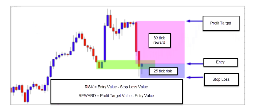
As you can see in the chart above, we use this simple formula to calculate our risk to reward ratio:
The Risk = Entry Value -The Stop Loss Value
The Reward = Profit Target Value – Entry Value
Our risk is 25 ticks and our reward is going to be 83 ticks, which represents a 3:1 risk to reward ratio. After you calculate your risk to reward ratio, adjust the amount of ticks that you are going to risk to the percentage of your
trading account that you risk per trade.
Let’s say you have a $10,000 dollar trading account, and you risk only 3% per trade. That means, the risk amount of money per trade is $300 dollars, or 3% of your trading account.
Now let’s adjust the 25 ticks risk to $300 dollars to see how many dollars we will risk per point – let’s do the math $300
/25 ticks = $12 dollars per tick.
So, in this case, you will risk $12 per pip, and if stop loss is hit we will lose 25 ticks or $300 dollars, which represents
3% of our account.
If our risk is more than 25 ticks, let’s say a 100 tick stop loss, we adjust it to the $300 dollars risk per trade – let’s do the math: $300 /100 = $1 dollars per tick. So, if the market hits your 100 tick stop loss, we lose $300 dollars which is 3% of our account.
Please remember to adjust the number of ticks you risk to the percentage of your trading account that you wish to risk per trade. This allows you to not need to tighten the stop loss in order to avoid losing too much, because your risk will always be 3% no matter how many pips your risk. Now let’s go back to our original chart to see what happens next:

As you can see in the chart above, the market goes in our direction and gives us 83 ticks of profit and provides us with a 1:3 risk to reward ratio. Let’s suppose that you have a $10,000 trading account, and you risk only 3% per trade. Let’s say you took 10 trades this month with a 1:3 risk to reward ratio. Let’s also say that on these 10 trades, we lost 7 trades,
and won 3….
7 losing trades = ($2100)
3 winning trades = +$3000)
Total: +$900
In almost the worst scenario, we lose 70% of your trades, but finish the month with +$900 in profit. This is the power of the risk to reward ratio combined with supply and demand zones.
Trading Tactics – Example 2
In the last example, we saw how to trade a demand zone that formed against the trend. We will not trade all supply and demand zones that form against the trend, but if the zone is strong enough and there is a high probability candlestick pattern signal with a good risk to reward ratio, we can consider the trade – otherwise, we may miss a solid trading opportunity. To find supply and demand zones in the market, we only have to look at the charts, and try to spot successive large candles. Let me show you an example below:

On the chart above, we notice a huge move down made by sellers. When analyzing the charts, look at the beginning of the move, the candle size, and the strength of it. This is not a normal move, because retail traders alone cannot move the market this way and it is possible the move was made by a bank or institution. As you can see, the beginning of the move is quick and strong, and the market didn’t spend time in the zone. This
is good information and shows us that the order was made by a financial institution. The move was very strong – look at the red candles; they are big and strong which indicates that this is an institutional order with a lot of inventory behind the move.
The zone is fresh, and it will be tested for the first time, and this gives more strength to the area because when the zone is tested a couple of times it loses its power. Now we know that we are in front of a solid supply zone- don’t worry if you still have issues identifying the zone, because with time and practice, you will easily be able to spot supply and demand zones just from the first look. Let’s draw the supply zone. See the chart below:
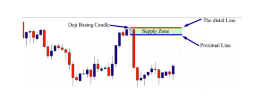
To draw a supply zone, you need to identify the basing candle. In this example, the basing candle is a Doji. We draw the distal line at the upper shadow and the proximal line at the lower shadow. Now that we have our supply zone, we evaluate the risk to reward ratio to see if the zone is worth trading or not. Look at the chart below:

As you can see on the chart above, the risk to reward ratio is attractive – as a reminder, here is the formula:
The risk = The entry value -The stop loss value
The reward: The profit target -The entry value
In the chart example above, I placed the risk and reward in different colors so that you can see that the trade provides approximately a 1:7 risk to reward ratio. This means that the amount of money at risk will be doubled seven times over if the market goes in our favor. These types of trades should not be missed because they don’t happen every single day…and when they do, we should look to pounce on it. Let’s suppose that this trade was a winner. This gives us confidence and allows us to trade without fear or stress, because we now need to lose eight trades in a row to become negative. This should not happen if you use the supply and demand strategies properly, and one of the biggest reasons why I recommend you take risk to reward ratio into consideration. This is what will make a difference in your trading account. Now we need to do our top down analysis and see if the higher time frame is going to work with or against us. As we are analyzing the 4h time frame, we then go to the higher time frame, which is the weekly. Let’s look at what happened on the weekly chart:
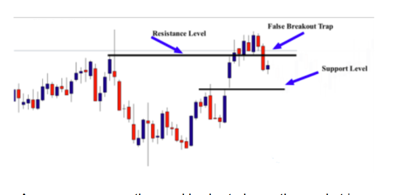
As you can see on the weekly chart above, the market is ranging. We have a false breakout at the resistance level and indicates that the market is likely to go down. However, there is another support level that will probably stop the market from going down. We don’t really know what is going to happen, but what we do know is that there is manipulation at the resistance level that will likely move the market down. Prices are going to test the support level so we will trade the distance between the false breakout and the support level on the H4 time frame. I will take the trade even if the market on the weekly is against the H4 time frame. Why?….because the trade setup has all the odds to go in my favor. We did the top down analysis to look at the bigger picture and see if there are some details that can help us confirm our entry, or warn us to pay closer attention. In this example, the false breakout at the resistance level is an indication that the market will go down at least to test the support level, and give us an opportunity on the H4 time frame if we have a candlestick pattern signal. Now we have all of the key information in our hands – we have a powerful supply zone, a good risk to reward ratio, and we have a false breakout of resistance on the weekly that supports our decision. We now need a candlestick pattern signal to enter the market. Check out the chart below to see what happens next:

On the chart above, the market reached the supply zone and formed a nice inside bar candlestick pattern. So, we can consider a short entry immediately after the breakout of the inside bar, and the profit target is the next support level. See the chart below:
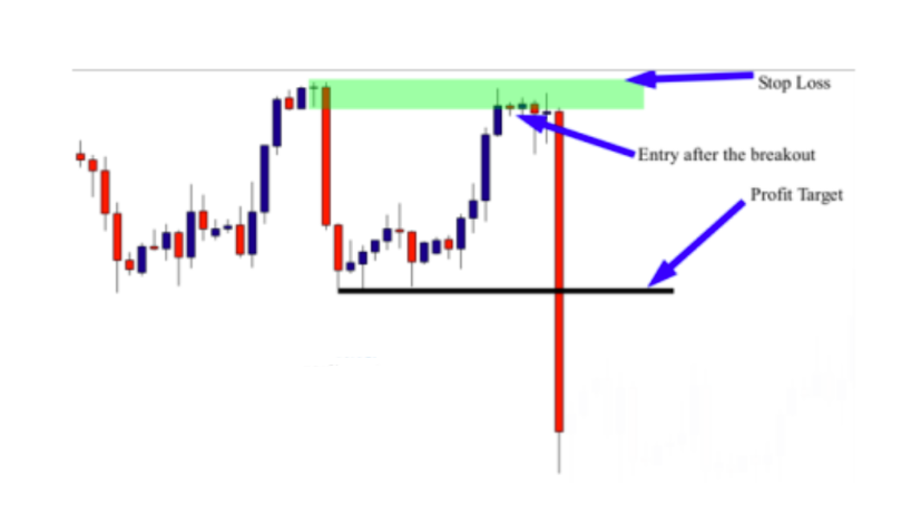
We place the entry after the breakout of the inside bar, and the stop loss above the supply zone, the profit target is the next support level. Look at what happened after the formation of the inside bar – another bullish pin bar formed to indicate that the supply zone is likely to be broken, and the zone will fail. Imagine that you placed an entry and you kept watching what happened – how would you feel when you see the pin bar formation? Well, you would probably be afraid because you think that the zone will fail. So, as a reaction, you will either move your stop loss or close the trade. But look at what happens next? A huge news candle formed after an economic news release and the market went down strongly. If you were trapped by your emotions, you will miss a lot of money on this trade. If you adopt the set and forget philosophy, you will not let the market play on your nervousness, so you will set the trade and forget it. When you come back, you will find that the trade went in your favor and made you money without fear and emotion.
Trading Tactics – Example 3
Supply and demand trading is all about being contrarian and taking setups at the best times, and trading from value areas in the market. I gave you different examples to show you how to find and trade supply and demand zones. This is the same strategy that banks, funds and other institutional traders use to make money. So what do you have to do? You need to follow the rules and apply the method.
I want to remind you – this is not the holy grail, but a powerful method that can make you a consistent trader. You should accept losing trades from time to time because you are not a bank; you are using a bank trading system. You should also know that banks and financial institutions lose trades from time to time as well.
What will make a difference between someone who makes money using this strategy and someone who keeps losing using the same method, is money management. This is why I always recommend you adopt strict money management rules, because without it, you will not make money in the long term.
Let me now share with you another trading example to help you better understand the steps that you should follow to trade a supply and demand zone. Let’s look at the chart example below:
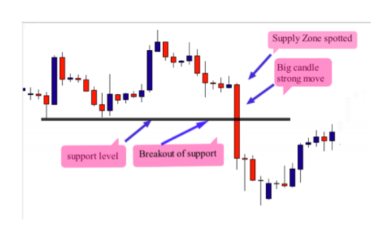
By analyzing the chart above, we can see that there is a strong move that was made by sellers. The red candle that formed the move is very big, and the beginning of the move is quick. The breakout of the previous support level confirmed the strength of the move, so we can see that we are in front of a supply zone.
Now let’s do our top down analysis to see what the market is doing on the higher time frame, or the weekly chart below:

By analyzing the trend of the higher time frame, we can clearly see that the trend is down, and supports our trade on the 4H time frame. So, by utilizing top down analysis, we now are confident with the setup that plays in our favor. This gives us more strength to our trade setup because we know now that we will trade with the trend. The next step is to draw the supply zone on the 4h time frame and calculate our risk to reward ratio – look at the chart below:
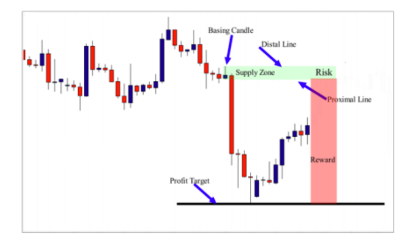
To draw the supply zone, we identify the basing candle, and in this case, we have a pin bar as a basing candle. We draw a distal line at the upper shadow of the candle, and a proximal line at the lower shadow. When drawing the supply zone, we can get an idea about our risk, and as you can see, we will not risk too much compared to the reward. In fact, we have at least a 1:8 risk to reward ratio.
The risk to reward ratio of this trade is very interesting, and this is one of the most important elements that you should take into consideration. Supply and demand zones alone with a low risk to reward ratio will not help you become a winner in the long term. Always focus on trades with at least 1:2 or 1:3 risk to reward ratio. The last element that we should consider before entering the market is the candlestick pattern signal. We need to wait for a candlestick signal, whether that is a pin bar, an inside bar or an engulfing bar…. look at the illustration below to see what happens when the market reached the supply zone:
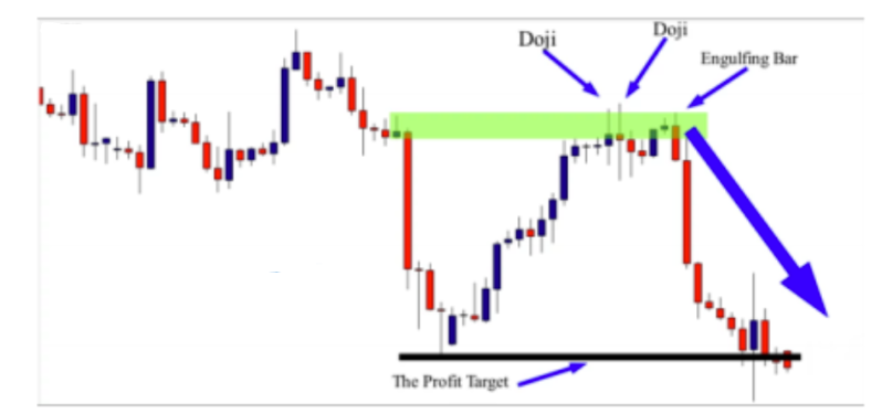
When prices reached the supply zone, the market was rejected and formed a Doji candle. We can enter the market after the close of the Doji, and our stop loss should be placed above and away from the zone with the profit target at the next support level. If you missed the first Doji candle entry, you can enter at the close of the second Doji. If you miss it as well, there is another engulfing bar signal opportunity, so you place your trade at the close of the engulfing candle, and the stop loss above the supply zone. The profit target is the next support level.
The main goal from sharing these trading examples is to help you master trading supply and demand zones by following the easy steps that I have mentioned in previous lessons. These trading examples are a reminder of what you learned in this course. If you still find it difficult to identify a supply or a demand zone on your chart, it may be that you were not focused enough when reviewing the lessons. If you do not understand something, please go back and review the lessons carefully. I wish you the best of luck in your trading endeavors!
How emotions can affect your trading results
Most traders spend time learning trading strategies and analysis skills but don’t even bother to learn the emotional aspect of trading. It is true that technical and fundamental analysis skills are the aspects of trading that are commonly talked about on financial news channels and trading blogs, and they are easier to learn.
However, it is the emotional skills that determine how successful a trader can become. The truth is that a great percentage of retail traders fail in trading, and the reason for that is not far from a lack of mental discipline and emotional control. Emotions are those strong feelings and attachments you have as a human being. In normal life circumstances, your emotions are normal ways of expressing yourself, but in the trading world, your emotions may be doing
more harm than good. In this article, we will look at why you need to control your emotions when trading and the most difficult emotions that can hinder your success in trading.
Read on!
The importance of mastering your emotions as a trader Experienced traders know that their emotions do not contribute anything to their trading success, rather, it can cause them to make some costly mistakes. So, they try all they can to put their emotions under check and focus on the things that matter, which is to properly execute their strategies without fear or favor. Trading is a game of odds — some trades will be winners, while some will be losers — and the way you feel has no effect on the outcome of any trade. The most paramount thing is to have a strategy that has an edge in the market — more winners than losers or bigger winners and smaller losers.
You should have a strategy that clearly defines the criteria that must be met before you enter or exit a trade. With that, you shouldn’t concern yourself with the outcome before placing a trade, and even after the trade, the result shouldn’t bother you, as it has nothing to do with the next trade you are going to take. Profits shouldn’t bring joy, neither should a loss bring sorrow. While you can enjoy the fruits of your profits with your family and friends at a later time, there is no point entertaining the feeling of achievement when you are in front of your trading screen. Doing so may lead you to make unnecessary mistakes that will affect your profitability.
For instance, you may be so excited about the last win that you fail to identify the next trade setup, or you place another trade when your trade criteria have not been met. Similarly, after a losing trade, you may be so worried about being wrong again that you miss the next trade setup, and if the setup ends up a winner, you will start regretting why you never took the trade. Since the profitability of any strategy depends on taking all the trade setups that occur in the market and executing them properly, omitting trades or not taking them properly will definitely reduce your chances of success. Worse than that, unguarded emotions can make you betray your risk management strategies — trading without a stop loss — which is the perfect recipe for blowing your trading account. Thus, the ability to control your emotions is the first skill you have to learn as a trader if you want to succeed. Not mastering your emotions can sabotage your efforts.
The emotions that hinder your trading success
There are so many emotions that can prevent traders from being successful, and each trader may be dominated by a different set of emotions. Generally, the most difficult emotions that hinder traders from being successful in trading include the following:
Fear
Fear is a distressing emotion that is triggered by the feeling of an impending danger, which may be real or imagined. When a trader is overcome with fear, he/she tend to act on survival instincts without reasoning, and the response is to stay away from the cause of danger, which in this case is the situation in the market. In trading, fear can manifest in four different ways:
Fear of losing: This can make a trader use a tight stop loss or close a trade before it even has the chance to play out.
Fear of being wrong: It can make a trader not to take the next trade
Fear of missing out: This can make a trader, who has been on the sideline, to jump in so as not to miss an opportunity, and ends up entering a trade when the market is about to reverse.
Fear of letting a profit turn to a loss: Here, the trader leaves money on the table by taking his profit too early.
The first step to overcoming any of these fears is to be aware of them and know when you are feeling any of them. When you acknowledge the feeling of fear, make efforts not to act by the dictates of the fear, and instead, follow what your trading plan stipulates for that situation.
Greed
This is an excessive desire to make the most money in the shortest possible time. In trading, greed manifests as the desire for a trade to produce an unrealistic amount of
profit. It makes a trader stay in a trade for too long, trying to milk every last tick. The trader focuses on how much more money he could make if the price continues moving in his favor and forgets the possibility of the price turning against him and wiping out all the profit and even leading to a loss — more like going from heaven to hell. To overcome greed, you should understand that unrealized profits are profits only on paper. A trade can only be a winner if the profit is booked. But that doesn’t mean you should take your profits too early (the fear of letting a profit turn to a loss). Instead, you should have a solid trade management plan, which is to have a target profit for each trade or a profit trailing strategy.
Hope
This is the feeling of expectation (which in most cases is unrealistic) and desire for a specific thing to happen. While fear is the most common emotion among traders, hope is the most deadly emotion a trader can have when trading, and here’s why. Hope can keep a trader from closing a trade that is not working out. It is hope that can make a trader not to use a stop loss, increase his stop loss while already in a trade, or worse still, practice the martingale strategy — all these can lead to catastrophic losses and even blowing a trading account. If you wish to succeed in your trading career, you should know this: in the markets, hope is for the hopeless. Nobody cares about what your expectations are. You should trade what you see and not what you expect — have a strategy and follow it to the letter.
Overconfidence
Having confidence in your trading strategy and your ability to execute it is good when trading, but overconfidence can be very bad for you. Overconfidence is that feeling of invincibility you get when you are on a
winning streak. The euphoria that comes after every win can make you start seeing trading as a riskless adventure, which can lead to making poor decisions in the subsequent trades — for example, trading bigger lot sizes. It often ends with a catastrophic loss. When you are on a winning streak, you should know that you are not invincible, so you should be more cautious. Don’t increase your lot size because you are on a winning streak. Rather, follow your trading plan and only increase in accordance with your account balance.
Inability to pull the trigger
This often shows that the trader lacks confidence in his strategy and his ability to properly execute the strategy. It can also be as a result of a perfectionist attitude — analysis paralysis. When a trader is unable to pull the trigger because he is afraid that the trade may not be a winner, he will end up missing the trade, and if the trade moves in the anticipated direction, he may start chasing the trade and end up losing. To avoid this condition, back-test your strategy, and if it is a profitable one, forward test it in a demo account until you’re convinced that it is profitable. Then follow it strictly.
Exiting a trade prematurely
This occurs when a trader has the fear of letting a profit turn to a loss. A trader develops this attitude after watching his profits get wiped out on many occasions, probably out of greed. But prematurely exiting trades isn’t the solution. Rather, it limits the trader’s potential for success over the long term because the risk-reward ratio will be against him. The best solution is to have a profit target that is at least twice the risk or to use a trailing stop.
Indiscipline
Lack of discipline will often lead a trader to make careless mistakes when trading. The mistakes can range from putting the wrong lot size or entering the wrong order to forgetting to put a stop loss or missing out a crucial element of his trading rule. To improve your ability to be disciplined and strictly follow your trading plan, you need to keep a copy of your trading rules in front of you when trading. Also, create a checklist that you must tick before taking any action in the market.
Lack of commitment
When a trader is not fully committed to his trading, he tends not to take his trading seriously. He trades only when he feels like trading will be fun, but trading is a serious business and not a hobby. The problem with not being committed to your trading is that you will miss a lot of trade setups that your strategy has identified. And, since the profitability of the strategy is premised on taking all the trades identified by the strategy, randomly trading some setups may skew the outcome.
Lack of focus
If you are not completely focused on what is happening in the market when you are trading, your chances of making a big mistake are high. Trading is mentally tasking because the brain is processing so much information at the same time, so there is no room for distractions. To enhance your ability to focus on the market, your trading room should be serene. It should only have the things you need for trading and nothing else.
Impatience
A lot of traders are naturally impatient in everything they do, and trading is no different. But patience is a necessary virtue for any trader who aspires to be successful. An impatient trader is more likely to jump the gun (enter a trade when the setup hasn’t fully formed), move the stop loss to breakeven too early and get spiked out, or close a trade prematurely. The best way to prevent these situations is by strictly following your trading plan, and making sure that you act only when the criteria for the action are met.
Anxiety
This can come from not being sure of which trades to take and how often to trade, and it follows a prolonged period of losing streak. Anxiety is a state of panic or apprehension which reduces your ability to think clearly and make sound trading decisions. Most of the time, anxiety gives rise to trading erratically without a strategy, and the result will be more losses and more panic. To control anxiety during trading, you can try some relaxation techniques, like deep breathing, yoga, mindfulness exercises, etc., or you take a break.
Regret
Regret is that feeling of disappointment or sadness you get when something has not happened the way you wanted it. For example, when you take a huge loss and the market turns back immediately or when you refuse to take a trade and it turns out to be an easy winner. The implication of this emotion is always thinking about the past and not looking for future opportunities. Regrets can lead you to miss more trades because you won’t see them. But most importantly, it can make you shift your stop loss next time or chase a missed trade. To be a successful trader, you must learn how to always put the past in the past. Learn from your mistakes and move on.
Final words
Although your emotions are normal feelings that express what is going on inside of you, when left unchecked during trading, they can be your worst enemies. It is best you understand them and try to be aware of them when trading. Again, I wish you the best in trading and hope you have enjoyed this course!